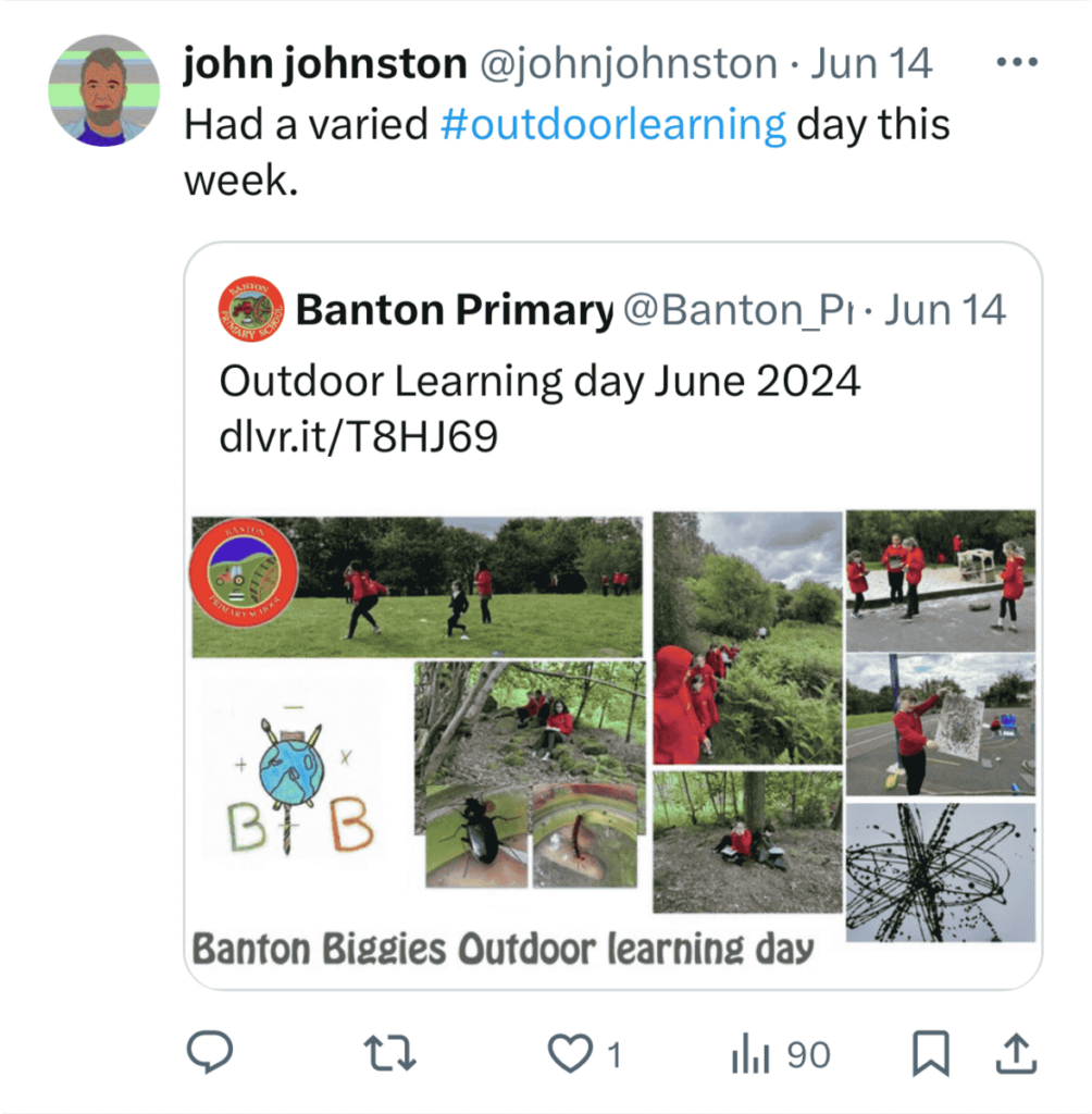
- Use featured images
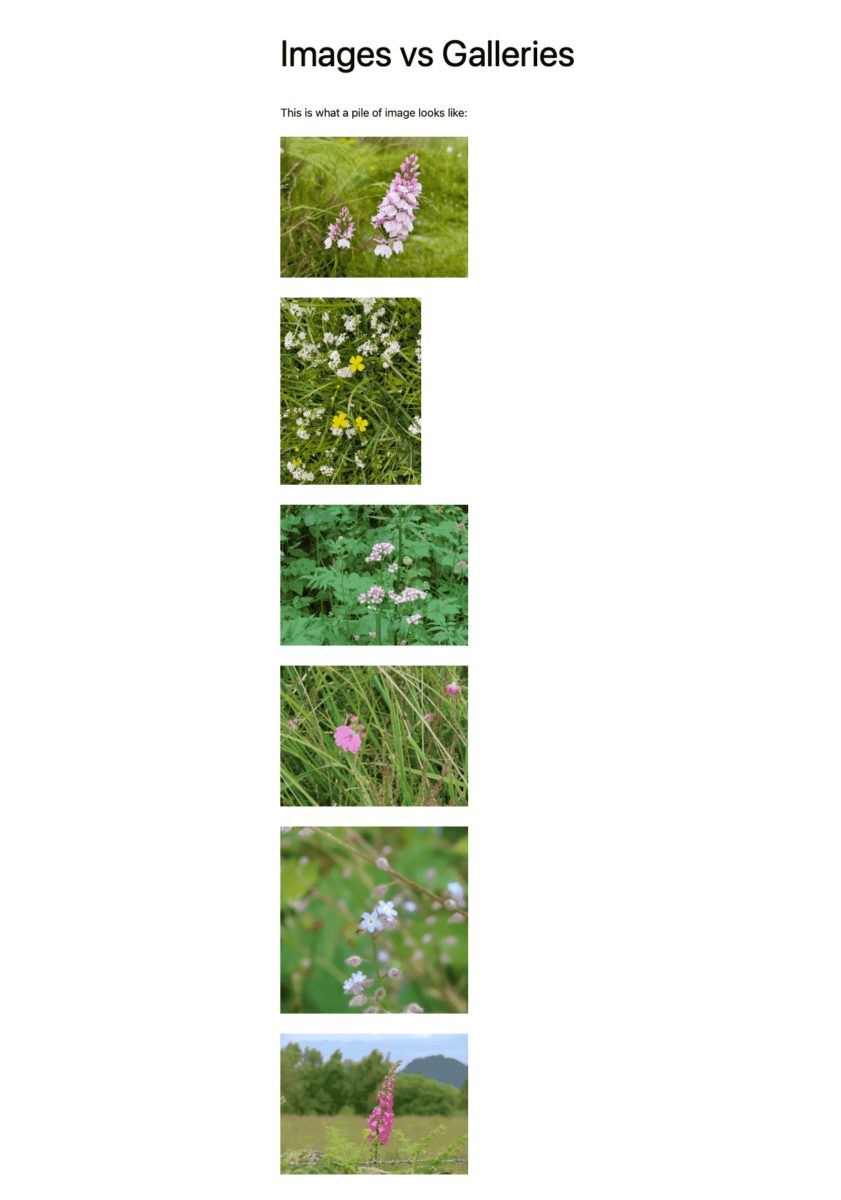
- Use galleries not piles of images
- Be selective and annotate images
Featured Images
A feature of WordPress that not too many Glow Bloggers use at the moment is the Featured Image.
Features images can be added to posts and will be used by the blogs theme, either to display on the post and/or to provide navigation. They could be thought of as the image that represents the post.
For example the Tips page on this help site uses a query loop block to display a list of tips. The newer themes, use this method to display list of posts on the home or news page.
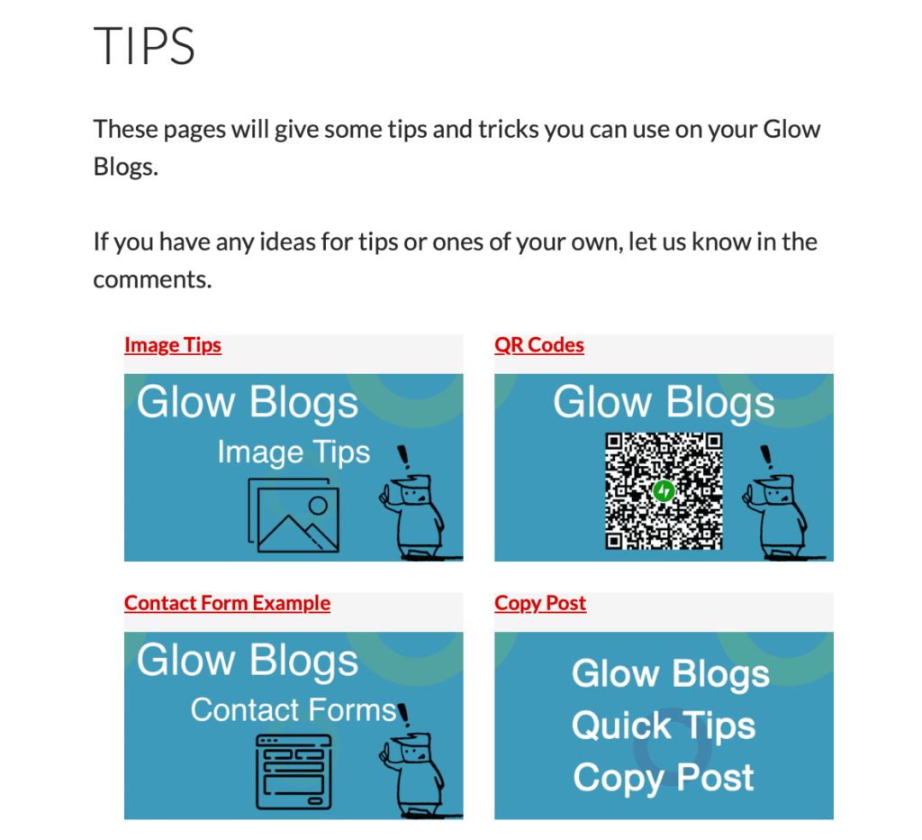
Screenshot of tips page, showing an example of the query loop. All images come automatically from the posts.
Featured Images will also show up if links are added to social media. This can make your tweet look a lot better.
Galleries
If you are busy it is often tempting to add a pile of photos into a post, perhaps to make sure everyone is included.
This can make rather unattractive posts. Better to use a gallery and limit the posts. You may find you can communicate the story of your post in a better way.
Images organised into a gallery. These look better and adding captions will improve the post for your readers too.
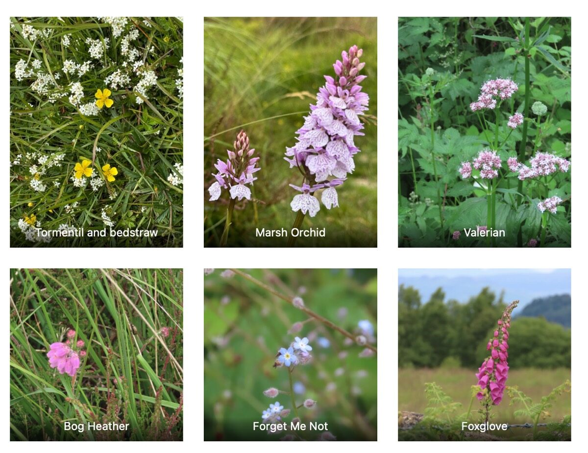
You can also add captions to images in a gallery. This can help you tell your story and make for a more powerful post.
Bonus Tip If you use the block editor, you can drag a set of photos either just onto the space or a photo block and it will automatically change into a gallery.

