Design
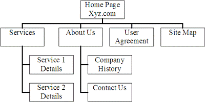
The structure of a website can be planned using a site map. This will show how the pages in the site link together, usually in a hierarchical structure.

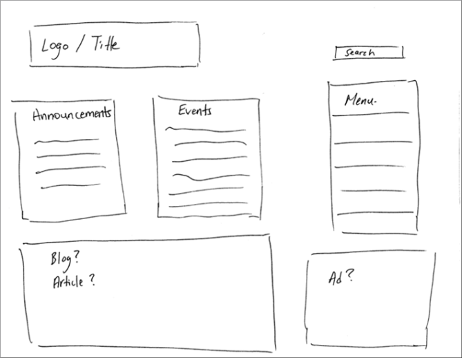
The layout of individual pages can be planned using wireframes. These will show how text, graphics, links, etc will fit together on the page.

You may also consider noting formatting information, such as colours and fonts to be used.
Multi Level Structure
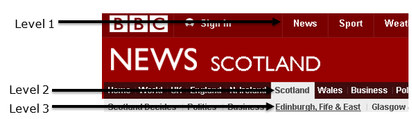
- A multi-level navigation structure involves sub-levels of navigation.
- It can be useful for keeping websites with a lot of information organised.
For example, the BBC website, allows you to choose a category, then another category within that, then another category within that, and so on.

HyperText Markup Language
HTML is a language used to define the content of a webpage, using a variety of tags.
- An HTML page begins with the <head> element. This can include a variety of other elements which give information about the page, such as the title, meta information, location of style sheets, etc.
- After the <head> comes the <body>. The <body> element contains the content to be displayed.
Some more advanced HTML tags you should know:
| Tag |
Notes |
Example |
| <title> |
- Included in the <head> element of the page.
- Defines a title in the browser toolbar
- Displays a title for the page in search engine results
- Provides a title for the page when it is added to favourites
|
<title>
ACME Corporation home page
</title> |
| <meta> |
- Included in the <head> element of the page.
- Provides information about the page, not visible in the browser.
- There is no ending </meta> tag.
|
Example 1
<meta name=”description” content=”ACME Corporation – Unlikely contraptions for all your needs”>
Example 2
<meta name=”keywords” content=”ACME, inventions, traps, contraptions”> |
| <style> |
- Allows CSS (see below) styles to be defined within an HTML document
- Included in the <head> element of the page.
|
<style>
p{margin-left:20px;}
body{
background-image:url(“background.gif”);
}
</style> |
| <script> |
- Used to define a client-side script (see below), such as JavaScript.
- Alternatively, can provide a link to an external script file.
|
Example 1
<script>
document.write(“Hello World!”)
</script>
Example 2
<script src=”js/lightbox.js”>
</script> |
| <button> |
- Used to create a clickable button
|
<button type=”button”>Click Me!</button> |
CSS Cascading Style Sheets
CSS is a language used to define the look and formatting of HTML documents.
CSS can be included within an HTML document, but it is preferable to link the HTML to a separate CSS file.
Using a separate CSS to define the formatting of HTML documents can help to give a consistent look across a website, save time and create more efficient code.
The look of all pages in a site can be changed by editing only the CSS file.
CSS can be used to provide different style rules depending on the type of device being used to view the webpage.
The rules of cascading stylesheets state that:
- embedded styles within the text over-rule all others
- document level styles, defined in the document , over-rule external Stylesheets
- external stylesheets only apply if they are not over-ruled by the other 2 methods
body
{
background-color:#d0e4fe;
}
h1
{
color:orange;
font-weight:bold;
}
p
{
font-family:”Times New Roman”;
font-size:20px;
} |
This CSS sets the background colour for the body of the page, the colour and style of any text within <h1> tags, and the font and size of any text within <p>.
Any HTML file which is to use this formatting would simply include a line like this in the <head> section:
<link rel=”stylesheet” type=”text/css” href=”mystyle.css”>
Where “mystyle.css” is replaced with the name of the CSS file. |
Static Webpages
A static webpage looks exactly the same every time it is accessed, the content does not change.
Dynamic Webpages
Dynamic webpages can contain different content depending on the conditions in which they are accessed, meaning that users can be presented with a page relating specifically to their needs.
Database-driven pages are the most common example of dynamic pages. If information changes in a database which the page accesses, then the content of the page will change to reflect this. For example, online shopping, banking, buying tickets, etc.
Interactive Webpages
Interactive webpages offer a more immersive experience, allowing the user’s actions to affect the content. Creating interactive pages usually involves the use of JavaScript or Flash.
Scripting
Including sections of program code in your website, to help make it more dynamic or interactive, is called scripting.
Client-side scripting
- A section of code is sent to the client computer and executed there, in the browser.
- It is commonly used to add interactive elements to a webpage.
- JavaScript is a language commonly used for client-side scripting.
Server-side scripting
- A section of code is executed by the web server.
- It is commonly used to create dynamic webpages, often connected to a database on the server.
- Popular languages for server-side scripting include PHP, ASP, Perl and ColdFusion.
Compression
Appropriate use of compression can reduce the load times of webpages.
The webpage itself can be compressed, reducing the amount of data which has to be sent to the client computer. The browser will decompress the page before displaying it.
SEO (Search Engine Optimisation)
SEO is the process of improving the ranking of your webpage in search engine results, in order to increase traffic.
Some SEO techniques include:
- Making sure each page of your site has a unique, concise and descriptive title contained in the <title> tag.
- Using the description <meta> tag to include a summary of each page.
- Using concise URLs.
- Submit an XML sitemap to the companies which run the search engines
- Using brief, descriptive filenames and alt text for images
Search engines and web crawlers
- A web crawler (aka spider) is a piece of software which follows links from web page to web page, analyses the text on each page, and indexes the pages with related keywords.
- Search engines then use this index to find relevant pages when you carry out a search.
Optimisation of code
Load times of webpages affect traffic. By making code more efficient, file sizes, and therefore load times, can be reduced.
Some techniques include:
- Using a single CSS file to hold all the formatting information for the site.
- Putting all JavaScript into a single external file, to reduce fetches from the server.
- Remove/reduce internal commentary and white space.
Accessibility
Web accessibility means making sure that all users can easily access and navigate your website.
Some ways in which accessibility can be improved include:
- Using CSS media queries to identify the type of device accessing the webpage, and adjust display accordingly.
- Using appropriate alt text for images, as these can be read by reader software.
- Make all functionality accessible from the keyboard.
- Make all text content easily readable and understandable.
Usability
Usability refers to how easy your website is to use.
Some ways in which usability can be improved include:
- Making main navigation easily identifiable, with easily identifiable links.
- Using consistent style throughout.
- Ensuring the most important content is above the “fold” (the point where the bottom of the screen cuts off the page).
- Including a clear path to contact details and information about the organisation.
Beta testing
Beta testers carry out testing on the final website before it goes live.
Beta testers could be anybody not involved in the development of the site, such as potential customers.
The purpose of beta testing is to identify any problems that occur in normal use.
Usability testing
Usability testing involves testing how easy the website is to use.
Eye-tracking
- Eye tracking software and hardware allows testers to analyse the way in which a user reads the information on a webpage.
- This can help in adjusting the layout to focus attention on the most important information.
Think aloud
- Think aloud testing involves users describing their thought process as they try to complete a task on a website.
- This can help in identifying design issues which may cause problems for users.


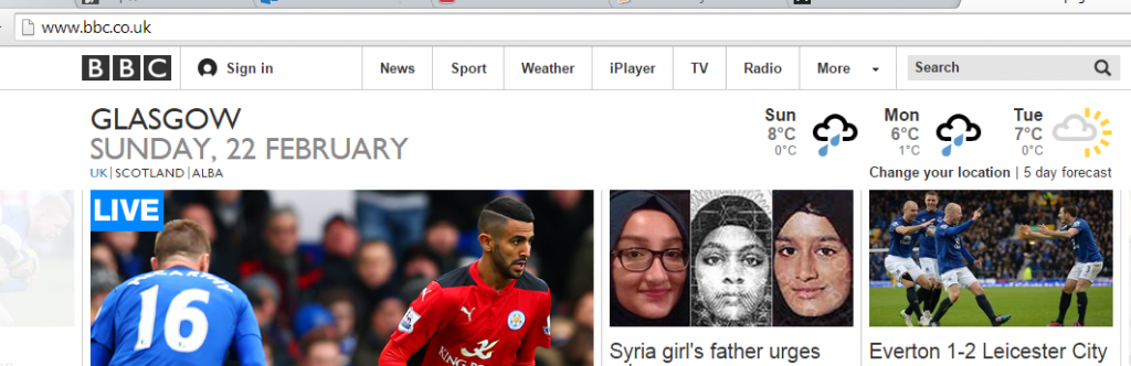
 Over the years the BBC website has seen a number of changes. These changes were often driven by the rise of new technology.