This task requires me to compare and contrast different food packaging and decide which one is my personal favourite and why. As well as this, I have to decide on the message they give out and to whom the message would be for. Lastly, from this I will look at how this can be used in a primary classroom before designing food packaging of my own which will appeal to my audience of choice.
Pachaging for Food Item Number 1 – Heinz Beans
 Design
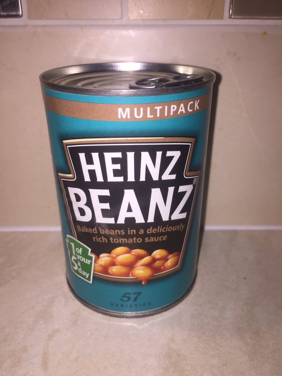
The design of the beans is simple but very effective. The shape of the black badge in the centre is printed all most heinz products,although it is not always black, eg. Tomato Ketchup. This badge makes the product stand out as the plain background allows the letters to be more eye-catching. It has a mini badge which states that the product is one of your 5 a day, this will bring in the healthy eaters to the product as they will know it can be nutritious. The design also allows for the content of product to be displayed as it shows the beans on the bottom. A metal tin would also be used for stacking purposes as well as to help keep the product fresh and well contained.
Colour
The colours themselves are not the most outstanding although like previously said the black background of the badge makes the lettering catch the eyes of he consumers. This is because of the colour contrast between the white and the black. The green badge for the “5 a day” is also quite eye catching as it is a much brighter shade of green than was used for the background. I think the colour green was used here to represent health and green vegetables as that is the colour that is mostly representative of being of good health, having energy and making good choices, in this case choosing to have a healthy lifestyle.
Letters
Again, like I have mentioned previously, the white lettering on the black background will place emphasis on the white writing. The lettering underneath the white writing give a further description of the product contained in the tin.
Message Given
I feel like the message given by the packaging of Heinz Beans is that they are healthy and easy to make, considering that they come in a sauce so do not need to be prepared. I feel like they are also advertised to appeal to an older age range as the packaging is more neutral than a child aimed product.
Packaging for Food Item Number 2 – Cereal

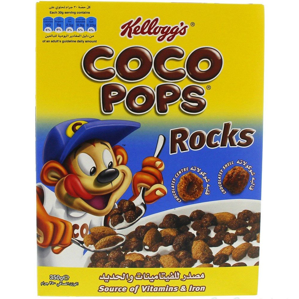
Photo Taken From Google Images – www.luluwebstore.com
Design
The design of this product is most definitely aimed at children, the cartoon monkey tells us this. As well as this the product also has a chain of media adverts which are cartoon stories which appeal to children. The yellow colour of the box will also make the product eye catching and therefore lure potential consumers in.
Colour
The colour scheme that has been used on the box of this product allows the product to stand out. The bright yellow packaging is eye catching and can also have reference to the sun, which in this case can refer to the product being eaten on sunny mornings and as yellow is an energetic colour, allows the consumer to think it can give them happiness and energy as they start their day.
Letters
The lettering on the box is made to look like chocolate which is a main selling point of the cereal. The lettering is also printed in a large font and is centred on the packaging, on the plain yellow background to allow the consumer to easily and clearly see what the product is.
Message Given
I feel like the message given by the packaging of the Coco Pops cereal is that it is child friendly, chocolate loving children will love it. However, although it is chocolatey the box is also clear to state that the child, or consumer, will still gain essential vitamins and iron from the product because of this, this product will also appeal to adults/parents as it can allow them to have stress free breakfast times as they know their child will enjoy while getting their essential nutrients at the same time.
My Preference
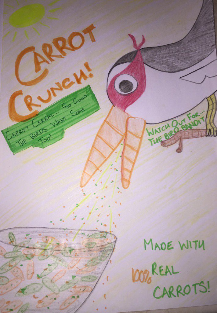
The product which I prefer is product number 2 as i feel like it has a very clear motive and has a clear appeal to children. However also with this product we can see the way in which the advertising attempts to draw in adults by promoting the healthy side of the product. This is the product which I took my inspiration from in order to create my own product.
My Product and Explanation
 This is the product that I created. I took the inspiration from the Coco Pops children’s cereal. I began to give the product a character, whom in this case is Bird Bandit. I used alliteration as for me that is what would stick in my mind.Giving the bird character carrots for a beak also promotes the main aspect of the cereal which is carrots. Towards the bottom corner of my product i have written that the product contains “100% real carrots” in an attempt to make the product appeal to the parents of children so they know the product is healthy. Again I used the bright yellow backdrop in order to try to make the product more eye catching.