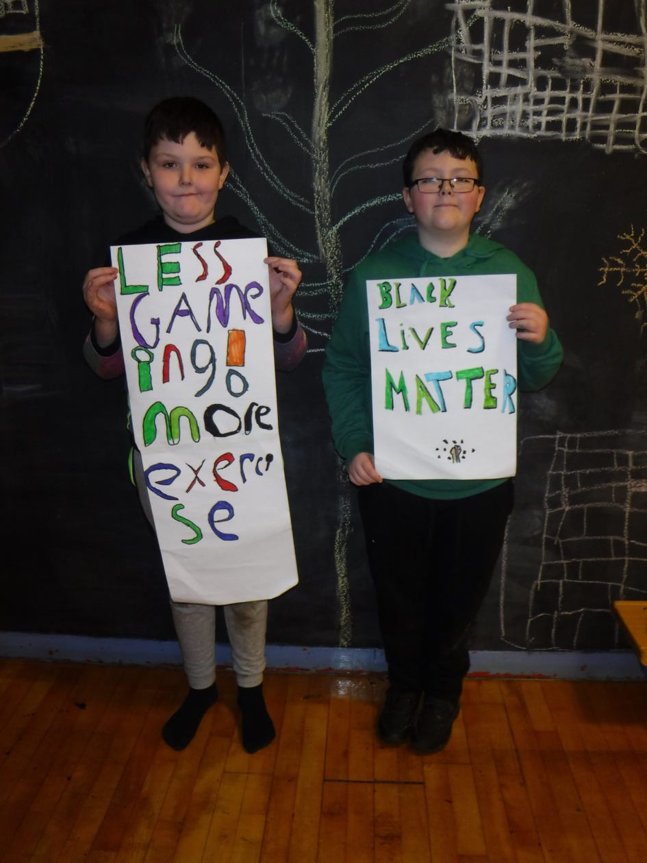
Hello Bruce,
Thanks for sharing your posters on the blog. They both have clear messages. I like the shadow effect on the Black Lives Matter poster. The poster recommending more exercise makes me feel energetic because of the bright colours – well done. (Are there a couple of extra capital letters in that one, though?!)
Brilliant work, Bruce and James. I could see your artwork sitting pretty in some gallery somewhere. Well done!
Very powerful messages! I like the shading you have used on your lettering James – very eye catching. Bruce, I like the colours you have used and your message is very important. Try not to switch between capitals/lower case letters in the same word though.