All posts by Ms Bernstein
Artist: Lichtenstein
Artist: Kahlo
Designer Cassandre
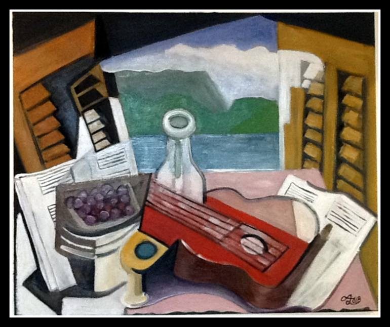
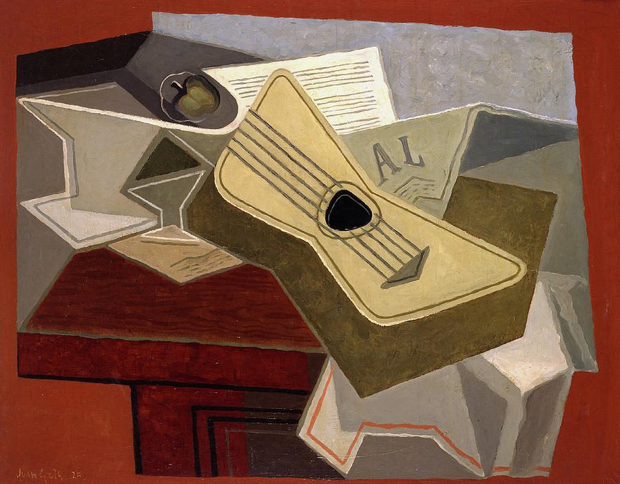
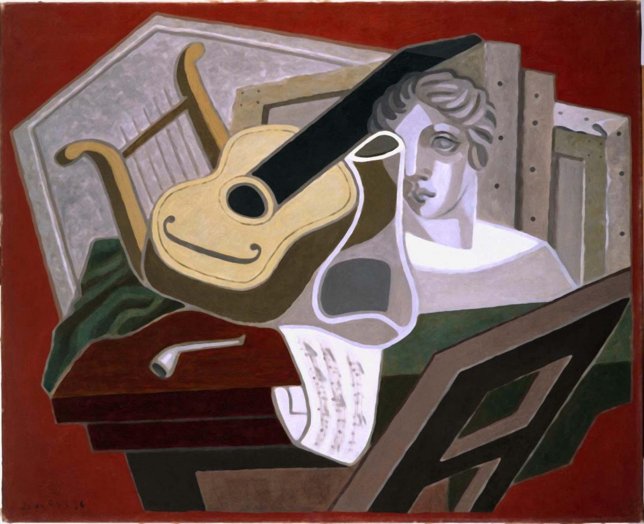
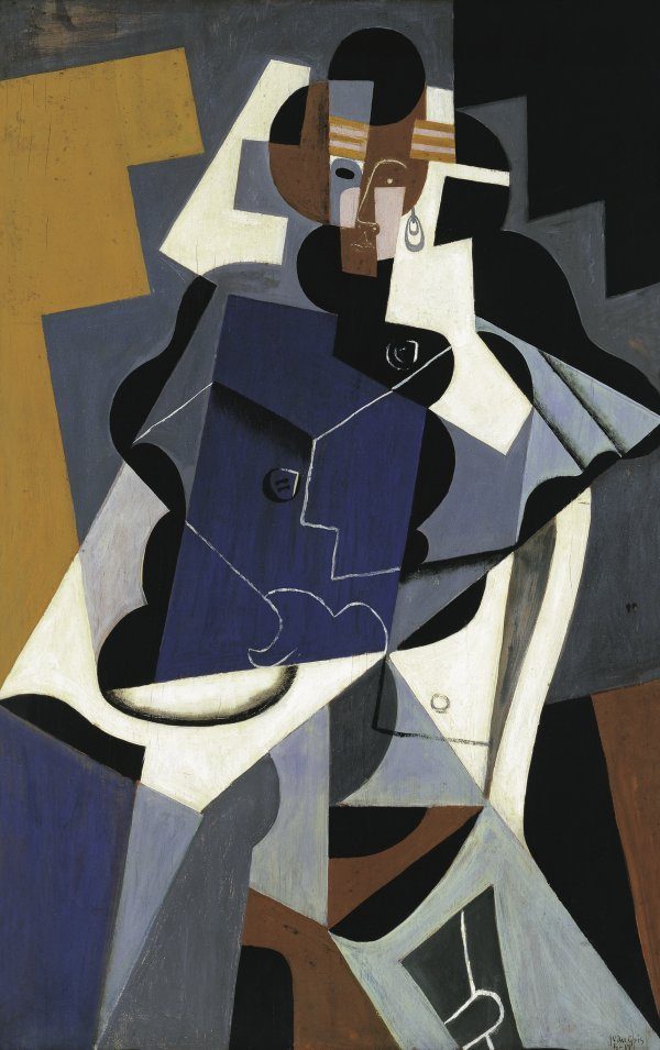
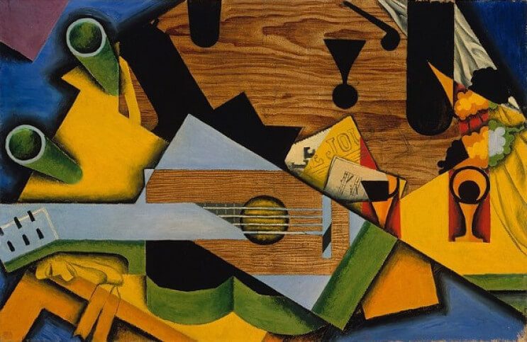
Artist: Gris
BGE Buildings


BGE Homework

- Line drawing of a biscuit
- Teach a friend/parent carer how to draw a tie
- Create a fact file on the artist Matisse
- Drawing of an item of your choice using tone
- drawing of a toothbrush and toothpaste
- Tonal drawing of a kettle
- drawing of a piece of fruit or veg using line and tone
- bring in different types of papers
- self portrait using collage and words
- drawing of your choice
- detailed drawing of a can of soup
SaveSave
Movement: Scottish Colourists

Artist: Hundertwasswer


Hundertwasser
Friedrich Hundertwasser was born in 1928 in Vienna.
He died in 2000 on his way from New Zealand to Europe on board the Queen Elizabeth 2.
Hundertwasser was a Painter, architect, ecologist and visionary.
Hundertwasser noted that there are no straight lines in nature and many of his paintings depicted spirals which he saw everywhere.
Hundertwasser often depicted trees like lollipops
two clips on Hundertwasser
this clip is a catalogue of his work


watch this space
SaveSave
BGE: Matisse, Painting with scissors

https://www.youtube.com/watch?v=rLgSd8ka0Gs

SaveSave
SaveSave
SaveSave
SaveSave
BGE: Visual Elements

COLOUR:
Colour is the visible range of the spectrum. Colour expresses mood through its warmth, coolness, strength or weakness. Colour can be balanced, harmonious, related or opposed. Colour is described by the system of primary, secondary and tertiary. Colour is described as shades, tints and hues
Wordbank
Bright, Dull, Strong, Vibrant, Light, Bold, Subtle, Vivid, Dark, Drab, Deep, Contrasting, Hue, Tint, Shade, Spectrum, Rainbow, Palette, Colour-schemes, Complementary, Warm, Cool, Rich, Pale, Soft, Hard, Intense, Pigment, Tinge, Wash, Glowing, Garish, Harsh, Crude, Limited, Loud, Clashing, Pastel, Primary, Secondary, Tertiary, Neutral, Balanced, Harmonious, Saturated, Opposite, Related, Clear, Pure, Muted, Brilliant, Symbolic, Decorative, Matching, Sombre, Subdued, Restrained, Graded, Faded, Varied, Monochromatic
PATTERN:
Pattern is the arrangement of similar or repeated lines, shapes, forms, tones or colours. Pattern can be regular, rhythmic, or random, symmetric or asymmetric. Pattern can be natural or human created. In repeated pattern, the basic unit is a ‘motif’.
Wordbank
Decorative, Rhythmic, Applied, Repeating, Repetitive, Random, Varied, Regular, Simple, Complex, Natural, Man-made, Positive, Negative, Ornate, Bold, Subtle, Loose, Tight, Optical, Geometric, Mechanical, Organic, Tartan, Woven, Ornamental, Floral, Chequered, Polka Dot, Criss-Cross, Abstract, Spotted, Dashes, Linear, Circles, Squares, Triangles, Symbols, Squiggles, Splashes, Motifs, Striped, Diagonal, Random, Natural
TEXTURE:
Texture is the tactile quality of a surface – what it feels like. Texture can be represented in three dimensions. Texture can be represented in two dimensions creating the impression of a tactile surface.
Wordbank
Fine, Smooth, Rough, Rounded, Tactile, Feel, Touch, Soft, Hard, Coarse, Shiny, Satiny, Furry, Bumpy, Rippling, Wrinkly, Crinkly, Jagged, Scaly, Silky, Hairy, Ribbed, Grooved, Notched, Woven, Raised, Ridged, Dusty, Crumbly, Abrasive, Cracked, Velvety, Silky, Spongy, Waxy, Greasy, Spiky, Fleecy, Woolly, Crumpled, Uneven, Indented, Scratched, Scraped, Ragged, Grainy, Pitted, Metallic, Slimy, Dry, Glassy, Oily, Fluffy, Polished, Glossy, Blobby
In paintings, brushwork can be: Gestural, Rhythmic, Free, Messy, Controlled, Neat, Directional, Angular, Careful, Rapid, Swirling, Loose, Tight, Impasto
TONE:
Tone is the variation of shade from dark to light. Tone can be used to define shape, form, pattern and texture. Tone can create contrast.
Wordbank
Light, Dark, Soft, Subtle, Strong, Contrasting, Gradual, Graded, Gradation, Sombre, Monotone, Limited, Subdued, Separate, Distinct, Indistinct, Clear, Deep, Muted, Varied, Dull, Highlight, Half-tone, Mid-tone, Shadow, Range, Even, Dramatic, Heavy, Light-Source
MOOD AND ATMOSPHERE:
Mood and atmosphere is the ‘feeling’ given off by a painting or piece of work. Mood and atmosphere can be created by use of colours, subject matter, use of media, texture, shape and tone.
Wordbank
Happy, Sad, Depressing, Lonely, Busy, Hectic, Bustling, Serious, Gloomy, Lazy, Relaxed, Comfortable, Mysterious, Scary, Bored, Movement, Lively, Stormy, Calm, Humorous, Funny, Stillness, Creepy, Desolate, Industrious, Anxious, Hushed, Dangerous, Innocent, Haunting, Cheerful, Oppressive, Cold, Warm, Dull, Dramatic, Poverty, Derelict, Suffering, Friendly, Formal, Celebration, Party, Grief, Aggressive, Angry, Cool, Exciting, Sullen, Nervous, Sleepy, Sociable, Humble, Menacing, Luxurious, Elegant, Traditional, Surreal, Serene, Tranquil, Peaceful, Majestic
SHAPE AND FORM:
Shape defines an area in a piece of two dimensional work. Shape can be produced by the application of line, tone, colour, pattern or texture. Form is three dimensional shape, or shape in space.
Wordbank
Solid, Geometric, Regular, Irregular, Positive, Negative, Organic, Natural, Man-made, Hard-Edged, Distinct, Indistinct, Rounded, Circular, Oval, Triangular, Spherical, Square, Angular, Rectangular, Oblong, Oval, Cubed, Cylindrical, Symmetrical, Asymmetrical, Flat, Long, Tall, Deep, Wide, Narrow, Pointed, Bold, Elegant, Contour, Silhouette, Relief, Profile, Outline, Figure, Moulded, Cast, Deformed, Carved, Modelled, Built, Assembled, Clearly Defined, Distorted, Sharp, Concave, Convex, Hollow, Ellipse, Bulbous, Tubular, Twisted, Bent
BGE:Colour Wheel


create a piece of art and compare your work to a famous artist.
Colour
Colour is the visible range of the spectrum. Colour can express mood by being, warm or cool, strong or muted. Colour can be described by the system of primary, secondary and tertiary colours. Colours can consist of shades hues opposite harmonious and tints.
Wordbank :bright, dull, strong, bold, subtle, vivid, vibrant, light, dark, drab, deep, contrasting, hue, tint, shade, spectrum, rainbow, palette, colour scheme, complementary, warm, cool, rich, pale, soft, wash, loud, pastel, primary, secondary, tertiary. harmonious, opposite, muted, monochrome.

The basic colour wheel is a collection of 12 colors which include:
three primary
three secondary
three tertiary colours.
In design, selecting colour schemes for your project can sometimes be challenging. Learning the basics of the colour wheel and how colors relate to one another will help you create colour schemes that both make sense and are pleasing to the eye.
PRIMARY COLOURS: Red, Yellow, and Blue

SECONDARY COLOURS: Violet, Orange, and Green
These secondary colour hues are created by mixing equal parts of two primary colours together.
Red + Blue = Violet
Red + Yellow = Orange
Blue + Yellow = Green

Blue (primary) + Violet (secondary) = Blue-Violet
Red (primary) + Violet (secondary) = Red-Violet
Red (primary) + Orange (secondary) = Red-Orange
Yellow (primary) + Orange (secondary) = Yellow-Orange
Yellow (primary) + Green (secondary) = Yellow-Green
Blue (primary) + Green (secondary) = Blue-Green

SaveSave
SaveSave
SaveSave
SaveSave
BGE: Still Life
Design Discipline: Shoes
Movement: Impressionism

Impressionist Artists
How to tell them apart.
|
Artist |
Manet |
Monet |
Renoir |
Degas |
| Subjects | Updated Old Masters themes, painted contemporary scenes with hard edges | Landscapes, waterfront scenes, series on filed of poppies, cliffs, haystacks, poplars, Rouen Cathedral; late work: near-abstract water lilies | Voluptuous, peach-skinned female nudes, cafe society, children, flowers | Pastel portraits of human figures in stop-action pose; ballerinas, horse races, cafe society, laundresses, circus; lake work: nudes bathing |
| Colours | Dark patches against light, used black as accent; early: sombre; late: colourful | Sunny hues, pure primary colours dabbed side by side (shadows were complementary colours dabbed side by side) | Rich reds, primary colours, detested black &emdash; used blue instead | Gaudy hues side by side for vibrancy: early soft pastel; late: broad smears of acid coloured pastels |
| Style | Simplified forms with minimal modeling, flat color patches outlined in black | Dissolved form of subject into light and atmosphere, soft edges, classic impressionist look | Early: quick brushstrokes, blurred figures blended into hazy background; late: more Classical style, solidly formed nudes | Offbeat angles with figures cropped at edge of canvas, asymmetrical composition with void at centre |
| Advice | Not much of a theorist but did say artist “simply seek to be himself and no one else” | “Try to forget what objects you have before you, a tree, a house, a filed or whatever. Merely think, here is a little square of blue, here an oblong of pink, here a streak of yellow, and paint it just as it looks to you.” | “Paint with joy, with the same joy that you would make love to a woman.” | “Even when working from nature, one has to compose.” |
SaveSave
BGE: Web pages

http://www.tate.org.uk/kids/games-quizzes/art-lab
https://www.eduweb.com/insideart/index.html
A game which explores a painting from the inside out. You ‘escape’ from the painting after answering ‘ Who? / What? / Where? / How? ‘ questions.
https://www.metmuseum.org/learn/kids-and-families
Includes art games like “What is it?”, activities, interviews, stories, art in the classroom, a FAQ about the museum, and more.
Critical Studies: Cubism Word Bank

Cubism Word Bank
Greatest influence was Cezanne • Worked with Picasso • Impressionism; Cezanne – different
viewpoints • African Sculpture
Objectives
• Combined several viewpoints • Forms and Planes were rearranged on the
canvas • Did not want to create the illusion of reality on a
2D surface • rejection of single viewpoint perspective • lots of preliminary sketches before final
composition was created • limited their palette to sepia and grey • Colour was not as important Form was • observer had to decipher and recreate painting • Hints of objects • monochromatic colours • harsh angles with hints of curves • flatter more transparent paint • distorted perspective • experiments with the analysis of form
Phrases • multiple planes / strong verticals • muted, monochromatic colours • abandoned traditional perspective • exploring different viewpoints
- sharp, angular shapes / cubes • limited their palette to sepia and grey • strong tonal gradations • horizontal brushstrokes • contrast of curves and sharp angles • highlight sense of form and structure • structure of cubes and planes • the use of multiple viewpoint is evident • making fun of conventional still life
Things you should research:
- Analytical cubism
- Synthetic cubism
- Cezannes and other influences influence
- Cubist arts challenged conventional forms of representation
- Cubists aim was to develop a new way of seeing which reflected the modern age
- A typical Cubist painting depicts real people, places or objects, but not from a fixed viewpoint. Instead it will show you many parts of the subject at one time, viewed from different angles, and reconstructed into a composition of planes, forms and colours. The whole idea of space is reconfigured: the front, back and sides of the subject become interchangeable elements in the design of the work.
- Cubism was invented around 1907 in Paris by Pablo Picasso and Georges Braque.
- Cubism was the first abstract style of modern art.
- A Cubist painting ignores the traditions of perspective drawing and shows you many views of a subject at one time.
- The Cubists introduced collage into painting.
- The Cubists were influenced by art from other cultures, particularly African masks.
- There are two distinct phases of the Cubist Style: Analytical Cubism (pre 1912) and Synthetic Cubism (post 1912)
- Cubism influenced many other styles of modern art including Futurism, Constructivism and Expressionism.
SaveSave
SaveSave
SaveSave
Critical Studies: Scottish Colourist Word Bank
Critical Studies: Art Nouveau Jewellery Word Bank

Word Bank Art Nouveau Jewellery:
- engraved in a decorative manner
- highly decorative pieces
- the surface is decorative and ornate
- work displays true craftsmanship
- motifs
- An example of technical mastery…
- High quality tailoring was evident
- Hand finished to perfection
- Uses elegant decorative art style
- Pays particular attention to finish and detail
- sinuous lines
- elongated and curvy lines
- the whiplash line is evident and indicates Art Nouveau
- stylised shapes and forms
- Exuberant
- exotic
- emotive
- expressiveSTYLE:sinuous, elongated, curvy linesthe whiplash linevertical lines and height
stylised flowers, leaves, roots, buds and seedpods
the female form – in a pre-Raphaelite pose with long, flowing hair
exotic woods, marquetry, iridescent glass, silver and semi-precious stones
Influences:
Arts and Crafts Movement, Art Nouveau shared the same belief in quality goods and fine craftsmanship but was happy with mass production
The names
Charles Rennie Mackintosh – architect and designer of furniture and jewellery
Alphonse Mucha – posters
Aubrey Beardsley – book illustrations
Louis Comfort Tiffany – lighting
René Lalique – glass and jewellery
SaveSave

