

Visual Impact: did it attract your attention?
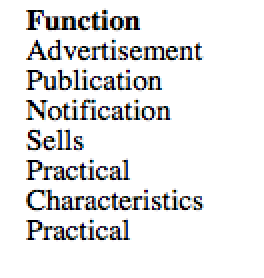
Function: what is the function? Does it do what it is meant to?
Communication: does it clearly give a message? Is it successful?
Target Audience: who is aimed at? What tells you this?
Image: is it attractive, dull aggressive or amusing?
Influences: has it been influenced by a designer, artist or art movement?
Similarities: can you see any similarities to other poster designers?
Reproduction: is it lithography or a screen print?
Layout: is it balanced or not?
Techniques: is it cut paper, spray paint, or etching?
Colour: is it bright, subtle or clashing?
Typography: is the lettering appropriate? Traditional, modern, sympathetic?
Environment: where would it suit?
Function: what is the function? Does it do what it is meant to?
Constructed: has it been constructed well?
Practicality: is it practical?
Image: is it attractive, dull aggressive or amusing?
Form: Discuss its shape
Materials: what materials have been used?
Texture: Do you liken the surface? Why?
Construction: has it been made well? Is it safe? Is it sturdy?
SaveSave

