Actual logo

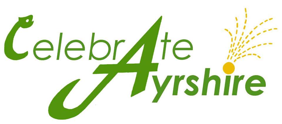
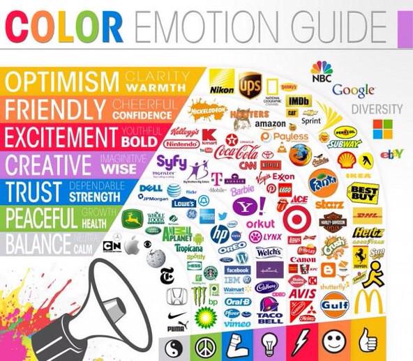
Celebrate Ayrshire – green and gold – connotations of health, nature, luxury.
Note how the elongated A which begins Ayrshire also links with “celebrate” and draws attention to “Ate” linking food, celebration and location. The dot above the I becomes a firework and is the only other colour apart from the deliberately chosen blank space (negative space) of white. Why white and not black? The colours might have looked bolder against black so why was white chosen? Is it more summery? Will it be changed to black later on in the year? Sans serif font. The “A” almost looks like a 4 – is it suggesting 2014? So many connotations in one little logo. Is the “C” a snake’s head, evocative of some monster? Can you be this clever? Of course you can!


