1. The medium of this text is print. By close reference to the text say why this medium has been chosen.
(2 marks)
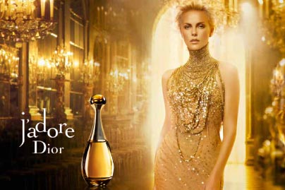
(This magazine advertisement is an example of a print text.) It has been done in print so that the target audience can see a permanent, still advert in their magazine at home, or when they flick through the magazine in a waiting room, salon or newsagents.
It can target women directly through something they have already bought and looks similar to the fashion shots elsewhere in the magazine.
2. Identify the purposes of this text. Describe the elements of the text that show these purposes. (4 marks)
Two purposes of this text are to make the target audience aware of the product (perfume) in the first place and to make a profit in the long term for the company who have produced it.
The product “j’adore” is both shown in the middle left side of the page and the name is on the left third.
The “pack shot” is large and so is the writing. Both stand out to the casual observer even if they do not concentrate on the advert.
This means that the unusual bottle shape and the name will register with women and they will be more likely to buy the product when they see it in the shops.
3. What is the genre of this text? Describe the elements in the text that show this genre. (4 marks)
The genre of this text is a non-fiction magazine advert for women’s perfume.
The person in the advert is female.
The product is prominently placed and it is obvious that “j’adore” is a perfume. “j’adore” means “I love” and it could mean that “I love Dior” but it could also be used as a romantic gesture between a man and a woman if he bought the perfume for her.
The actress being used to sell the product is well known for her beauty and success and by being linked to the perfume the target audience, largely female, will feel that they will get a share of the fame and success if they buy the product being promoted in the advert.
The page itself is high quality thick and glossy paper and this appeals to the sense of touch of the woman looking at the page. This suggests an association between pleasure, a sense of quality and the product itself will be made in the reader’s mind.
4. Identify the fonts that have been used in this text and give reasons for their use. (4 marks)
The font used is a sans serif font called Didot.
It is a typeface that is easy to read and it has a long association with French printing from the Age of Enlightenment.
This font was used because it can be read from a distance and as the product is French it makes sense for the company Dior to use a font that is recognisably French in nature.
The font is made even more eye catching because the words are all in lower case apart from the famous D of Dior and the letters of “j’adore” are written at different levels so that it almost looks like a musical staff.
The writing is large and filled in in white. This makes it easy to see even although the letters are placed oddly.
5. Describe how technical/cultural codes have been used to create meaning in the text. (6 marks)
[You should think about lighting, camera, focus, angle, shot-cropping, layout, slogans and straplines, colour, dress codes and so on.]
This advert looks very similar to the high fashion shots in the rest of the glossy women’s magazine and this has been done deliberately because Dior also make high fashion clothes and are a well known label.
The main colours used in this shot are gold and white.
The product itself is a rounded bottle with an elongated neck with white highlighting at the edge and it is filed with a golden liquid. It is shown as larger than it actually is relative the size of the model to show that it is the important product on sale.
The words “j’adore” and “Dior” are both in white and stand out in the left third due to their size and the contrasting colour to the gold background.
The actress Charlize Theron looks directly at the reader so that she appeals to them personally. She is deliberately placed in the right third and she resembles the bottle as much as is humanly possible. Her dress has an elongated neck and her hair is swept up so that her head resembles the rounded stopper of the bottle. Her skin has a golden glow and the dress is gold coloured and sparkling as well. There is a soft focus around her due to the bright white light from which she seems to emerge and this gives her the appearance of something unearthly, almost angelic. The shot is a mid-shot so we do not see her legs. As her legs have been cropped off, it gives her the same shape as the bottom of the bottle. Her arms are exposed but one is placed behind her hip so that she looks more like the bottle shape. She looks very thin as a result and it is likely that this is further enhanced by air brushing to look as perfect as possible. The camera angle is a shot from below to make her look even more powerful.
The gold representing wealth and thinness representing attractiveness are desirable qualities in today’s society and have been deliberately chosen to help make the product desirable and to make the expensive price tag seem worthwhile.
There is no slogan for this product because the company Dior are relying on their good reputation and association with previous quality to sell this new product.
The background is the Palace of Versailles and again this suggests that the product is associated with wealth and luxury. It looks as if the actress is dripping in gold necklaces and again this has been designed to sell us the idea that this product is luxurious.

We are being sold the idea that this product will give the target audience power, luxury and glamour.


