What is Media Studies?
Task 1 – Design a Front Cover
Plagiarism
Adverts
Task 2 – Brands
Task 3 & 4 – Looking at three adverts
Task 5 – Playing Happy Families
Task 6 – Research activity
Task 7, 8 & 9 – Analysis
Task 10 – Stereotyping
Task 11 – Let’s get Fizzy! Creative task
Comics
Task 12 – Looking at comics – target audience?
Task 13 – Cross-media – comics and animation tie-ins
Task 14 – National 3 SQA Challenge
Task 15 – Design an original Comic Strip
That’s fake! Adverts look more perfect because of manipulation.
She’s not really flawless – she’s photoshopped or some other professional image digital processing has been used.
Look at this example of what happens.
http://photoshop.videos-training.net/2010/02/design-stunning-french-perfume-advert.html
Then look at these digitally enhanced real adverts.


Real Christina!

NABs
We need to complete two more NABs very soon. We will be looking at aspects of print: -a Comic (fiction) and an advertisement (non-fiction).
Again the main thing we are looking for is to check that you understand:
Purpose – what is it for?
Codes – colour, style etc – what is it/what might it mean?
Narrative Structure – how is the story told/information put across?
Graphics – drawings, photographs etc
Target audience – what kind of person would be interested in the text?
Co-operative working – who needed to work together to make the text?
Institutional Factors – the need to make a profit etc
| Key aspect
|
General definition
|
Things to consider (not every text need be analysed in terms of the details outlined below as these are a guide only)
|
| Categories
|
The way in which a text is described.
|
Purpose, form, tone, genre
|
| Language
|
How the text is constructed
|
Mis en scene, font, camera angle, lighting, framing, layout, editing, pace. Denotation and connotation
|
| Representation
|
How people and places are constructed within the text
|
Stereotypes, non-stereotype representations, ideology, hegemony
|
| Narrative
|
How the text is organised
|
View point, structure, plot, narrative codes
|
| Audience
|
Who the text is made for and how they react to the text
|
Target audience, pleasure of the text, differential decoding
|
| Institutions
|
The factors both internal and external that effect the production of the text
|
Ownership, internal control, external control, personnel
|
Colour – what might it mean?
Use this link
http://www.mariaclaudiacortes.com/
BLACK suggests authority, power, boldness, seriousness, is
distinguishing and classic. Business wise it’s great for
creating drama and is good for a background colour (except on websites, it is very hard on the eyes). It is ideal for text on a light background. Black also implies submission and is associated with evil.
BLUE suggests security, authority, faithfulness and dignity.
For business it suggests sanctuary and fiscal
responsibility. It is the most popular and the second most
powerful colour. Blue can also be cold and depressing. Peopleare more productive in blue rooms.
BROWN suggests richness, politeness, helpfulness and
effectiveness. In business it suggests less important items.
Solid, reliable brown is the colour of earth and is abundant in nature. Light brown implies genuineness while dark brown is similar to wood or leather.
GREY suggests authority, practicality, earnestness and
creativity. Business wise it is traditional and
conservative.
GREEN suggests health, fertility, freedom, freshness,
healing, tranquillity and jealousy. Businesses use it to
communicate status and wealth. It is the easiest colour on
the eye and can improve vision. It is a calming, refreshing
colour.
ORANGE suggests pleasure, cool, excitement, cheer,
endurance, strength and ambition. For business it is good
for highlighting information on charts and graphs.
PINK suggests femininity, gentleness, well being and
innocence. For business you must be aware of it’s feminine
links and implications.
PURPLE suggests spirituality, royalty, luxury, wealth,
sophistication, authority and mournfulness. In business it
is upscale and works with artistic types. It is also
feminine and romantic. However, because it is rare in
nature, purple can appear artificial.
RED suggests excitement, strength, sex, passion, vitality,
aggressiveness and commands attention. Business wise it
associated with debt, is great for boldness and accents. The most emotionally intense colour, red stimulates a faster heartbeat and breathing.
WHITE suggests refined, purity, devotion, contemporary and
truthfulness. For business it can be sterile and refreshing. The best colour on the web for a background colour. Doctors and nurses wear white to imply sterility.
YELLOW suggests warmth, sunshine, cheer, happiness, jealousy, deceit and cowardice. Business wise it appeals to the intellectual types and is a good accent. Yellow enhances concentration, hence its use for legal pads. It also speeds metabolism. It is the most difficult colour for the eye to take in, so it can be overpowering if overused.
Green, brown, and red are the most popular food colours. Red is often used in restaurant decorating schemes because it is an appetite stimulant.
Deconstruction of perfume adverts – Made you look!
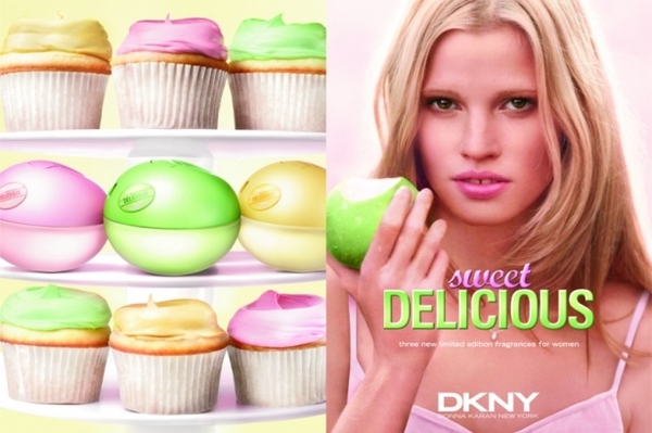
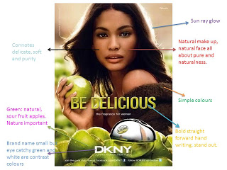
Perfume ads are designed to make you look! They are designed to be interesting enough that you don’t just turn the page over quickly. They want your money being spent on their product.
Look at what you see –
Colours – what can you see? What might it mean?
Product – name it. What connotations does this word have? Where is the product placed? Is it oversized? Is it more or less important than the person on the ad? How do you know?
Font – is it serif or sans-serif (fancy or plain)? What colour is the writing? What size is the writing? Do you know what style of font this is? Is it easy to read? Is it ornate and old fashioned? Is it modern? Is it eye catching in some way? Is it designed to help you remember the product more easily?
Image – Is it selling a lifestyle? Is it trying to tell you you will be more sophisticated/natural/young/lively/popular/rich if you buy this product?
Is the background urban or rural? (Town/city/country)
What type of scent do you think the product has? (Floral for the country, lemon for yellow, cinnamon for red etc)
The model – well known actress, well known model or someone unknown but stunningly attractive or thin or angular or with gaps in her teeth or…? Is there a “direct mode of address”? (Looking at you)
In magazines like Elle or Marie Claire the target audience is young women with an interest in high fashion and money to spend. The adverts therefore often resemble fashion shoots with flowing dresses and unusual arm or leg positions. Often the arms or legs point to the product. Often the perfume is part of a range of products available from someone normally associated with high fashion clothing – e.g. Calvin Klein, Chanel, Eli Saab, Armani etc.
How much does it cost? – Oodles of dosh! About £25,000 per glossy page – more if a double page ad or if it has a free sample or is on harder paper.
***********************************
Example responses (from real students not at this school who have posted their ideas online. I have provided links but cannot vouch for any of their other ideas being correct.):
Technical codes
Lighting
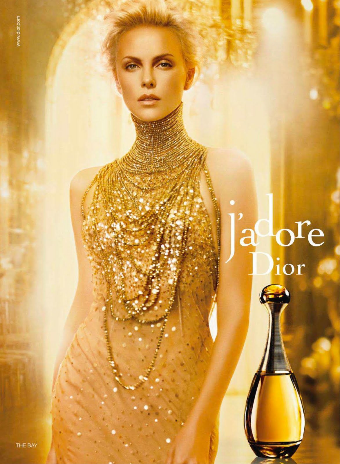
“I also like the lighting of this advertisement because it adds a hint of gold to the model’s complexion, and adds shine to the model’s golden blonde hair, enhancing the entire advertisement. The lines are clean cut, making the ad look really sleek and glamorous. ”
http://cxetheresa.wordpress.com/category/writings/
Colour
” The advert has a main theme of gold (gold earring, gold eyeliner, golden skin, gold bottle) and the background is fairly dark but shows a blurry chandelier which gives the idea that wealthy people would wear this perfume.”
“The advertisement enhances the fragrance as its setting is a hotel with gold furnishes in the slightly blurred background. This entire wash of gold in the advertisement is highly effective as it not only catches the attention of the viewer, but also brings out the classy feel of the fragrance. The choice of a hotel suiting is apt because the fragrance has a hotel print on it, which emphasises the theme.”
http://gabysmedia.blogspot.co.uk/2008/10/perfume-advert-analysis.html
“This feel is developed by the large print of the fragrance on an entire page in a background of gold. The colour choice suits the bottle, and the rectangular page accommodates the bottle very well. By using the colour gold, it suggests that this fragrance is as luxurious and precious as gold. It gives a strong, sophisticated sense of superiority to the user. More touches of gold in the model’s dress and jewelry add to the glamour of this advertisement.”
Model
The model’s eyes stare down into the camera and one eyebrow is raised which gives the impression that she knows something that the reader doesn’t and that she is in control. It makes the advert intriguing and mysterious and also makes the viewer want to be just like the model.
Target audience
This advert also should appeal to men. The model shows a lot of skin and cleavage which automatically draws a man’s attention and makes him think of his own partner in the way he is thinking about the model, which consequently should make him want to buy the perfume for his partner.
Product
The bottle of perfume is placed in the bottom, right hand corner of the advert. It is large and gold which makes it look very expensive and grand. ‘Sparkles’ have been added to the bottle to make it seem more special and they make the bottle stand out even more. Next to the bottle, it says the perfume name ‘J’adore L’absolu’. The word J’adore, meaning I Love, is in a large Serif font which I think is supposed to represent the passion of the advert. ‘L’absolu’ is in a smaller font and is in italic writing to stress the meaning of it which is ‘the absolute one’. The fact that the perfume name in French, probably appeals to the viewer because it seems more unique, more special and by owning the perfume they may think that they will also become ‘unique’ and ‘special’. In the top, right hand corner, ‘Dior’ is displayed in white, on top of the darkest background. It is also in a serif font and it gives the impression of wealth and of being ‘proper’. At the very bottom of the advert it says ‘The new Eau de Parfum: J’adore L’absolu’. Notice how it says ‘The’ instead of ‘A’, this is so the advert sticks in the viewers mind as the only new perfume that has recently been released.
Image
Curves and contours in the model’s face complement the straight, angular lines of the fragrance in the opposite page very well. The composition also plays a vital role in this advertisement. In the first image, the model is the centre of attraction, with butlers waiting to serve her and in the second image, she gives a strong, sharp stare. I feel that both compositions are highly effective in displaying the opulence of the fragrance because they have produced the fragrance of the perfume through a 2D advertisement. Viewers are able to imagine the fragrance of Fendi’s Palazzo through this striking advertisement.
**********************************************************************
Remember nothing on the page is accidental. Everything has been carefully chosen and placed where it is for a reason – to make you buy the product
**********************************************************************
Female Stereotypes target audiences:
Beauty Bunny
Alpha Female
Fashionista
Perfect Mum
Granny
Who are these adverts aimed at and how do you know?
Be a reporter – Win a Kindle!
Creative task
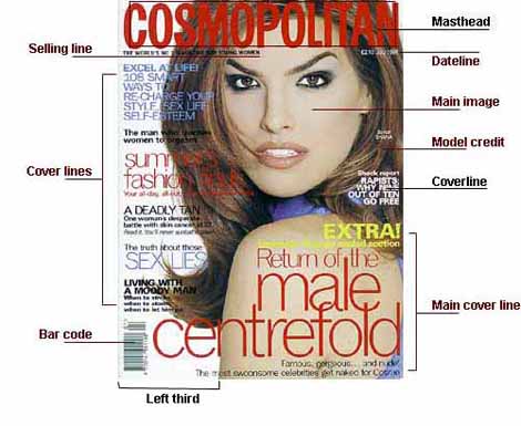
Design a front cover for a school magazine. Your target audience is teenagers and their parents.
Your front cover will need all of the following:
- Masthead – short memorable magazine title – bold, eyecatching
- Main Image – related to the school or articles which will be inside – picture credit
- Simple colour scheme – the more colours there are the more expensive it is to produce
- Large bold text used to advertise the main articles which will be inside the magazine
- Smaller sub headings of less important articles
- Bar code
- Price
- Dateline
- Rule of thirds

Adverts in fashion magazines – target audience question
A fashion magazine’s target audience is ABC1 females in their late twenties to thirties. They are very successful in attracting their audience, resulting in continual high readership and, as a result, they do not widely try to appeal to other audiences such as men. The features each month are very similar, and based around fashion, which is what appeals to its audience and is what the magazine is renowned for. Some have a variety of features which can appeal to many different audience types; including features on fashion and beauty, as well as harder hitting features about global problems and events.
Many of the women who read the glossies, particularly those perhaps who are not regular readers may buy them for aspiration and distraction purposes. Although not being able to afford the clothes and products being advertised, it gives the reader something to aspire towards, or perhaps give an insight into that lifestyle. While reading the magazine, the reader can feel as if they have more money, or live the model lifestyle, reading about the lives of famous models and actresses etc.
The adverts are deliberately designed to look as much like the glossy magazine itself as possible and usually have high fashion outfits, a sophisticated look and a stick thin model or actress selling their product.
S3 Magazine Production Task
In the month of May, S3 students looked closely at professionally produced magazines and perfume adverts. They have produced some interesting personal magazines and a sample of some of their pages are shown here. The adverts do not all comply with legal requirements but we all had fun trying to be eye-catching and informative.
Listen to the sound of your heart beat for women and for men


