Past Paper Questions – Int 1

Past papers often give us a clue about how our own exam will look. Here are the questions from the past three years for the analysis section. Think how you would have answered each one.

If you don’t know – now is really your last chance to ask!

Narrative Structure

2012    The narrative of a media text is carefully structured. With close reference to the media text you have studied, describe its narrative structure.

2011    The text you have studied has a narrative structure. With close reference to this text, describe this narrative structure.

2010    (a) The narrative of a media text is carefully structured.

By close reference to a media text you have studied, describe its narrative structure.

(for (b) see “audience”)

(c) Describe how the narrative structure you have identified has been made to appeal to the target audience(s) you have identified. Give reasons for your answer by referring closely to the text.

Representation (including Stereotype)

2012    This question asks you to think about the Representations in the text you have studied.

(a) Identify one stereotype OR one non-stereotype in the text you have studied.

(b) By referring closely to the text, describe how this stereotype or non-stereotype has been made.

2011    This question asks you to think about the representations in the text you have studied.

(a) Identify one stereotype OR one non-stereotype in the text.

(b) By referring closely to the text you have studied, describe in detail what makes this representation a stereotype or a non-stereotype.

2010    (b) Representations are made by including particular elements in the text.

Identify at least one representation in the media text you have studied and describe in detail how it has been made.

(c) The representation or representations you have identified have been carefully chosen by the institution. Give reasons why the institution made the representation(s) this way.

Audience

2012    Audiences can be described in terms of age, gender, social class, race, nationality, lifestyle and interests.

(a) (i) Identify one target audience for the text you have studied.

(ii) By referring closely to the text, describe what has been included to appeal to this audience.

(b) (i) Identify one audience who would not enjoy this text.

(ii) By referring closely to the text, describe why they would not enjoy this text.

2011    Identify one target audience from the list below, that would enjoy this text:

• an audience made up from a specific age group

• a male audience

• an audience made up of a particular social class.

(b) By referring closely to the text, describe what has been included in this

text to appeal to this audience.

(c) Identify one other target audience from the list below, that would enjoy this text:

• an audience with a special interest

• a female audience

• an audience made up of a particular nationality.

(d) By referring closely to the text, describe what has been included in this

text to appeal to this audience.

2010    The makers of media texts target audiences from particular age groups, genders, nationalities, backgrounds and interests.

Identify the target audience(s) for the text you have studied. Give reasons for your answer by referring closely to the text.

Institution

2012    Institutional factors affect media texts. These factors include:

• who owns the media company

• the effect of the law on the text

• the effect of the budget and resources on the text

• the use of stars

• the effect of advertising and advertisers on the text

• the need to make a profit

and other institutional factors.

(a)   Identify one institutional factor that affected the text you have studied.

(b)   Describe in detail how this institutional factor affected the text.

(c)    Identify one other institutional factor that affected the text you have studied.

(d) Describe in detail how this other institutional factor affected the text.

2011    Institutional factors affect the making of media texts. These factors could include:

Who owns the media company/companies

The effect of the law on the text

The effect of the budget and resources on the text

The need to obey Health and Safety laws

The use of stars

The effect of advertisers and advertising on the text

The need to make a profit and other institutional factors.

(a) Identify one institutional factor that had an effect on the text.

(b) Describe in detail how this factor affected the text you have studied.

(c) Identify another institutional factor that had an effect on the text.

(d) Describe in detail how this factor affected the text you have studied.

2010       (a) Institutional factors affect the making of media texts. These factors include:

• who owns the media company

• the need to make a profit

• the effect of budget and resources on the text

• the use of stars

• the effect of advertisers and advertising

• the effect of the law on the text

• and other institutional factors.

How has at least one institutional factor affected the text you have studied?

Unseen Analysis

Those who have completed this already will have a reward period today (Friday)

Those who were absent will have to do this section of your exam under exam conditions as soon as possible.


The Hunger Games – reminder

Words you should know

reaping – the lottery to pick the 2 children who will fight to the death

Characters

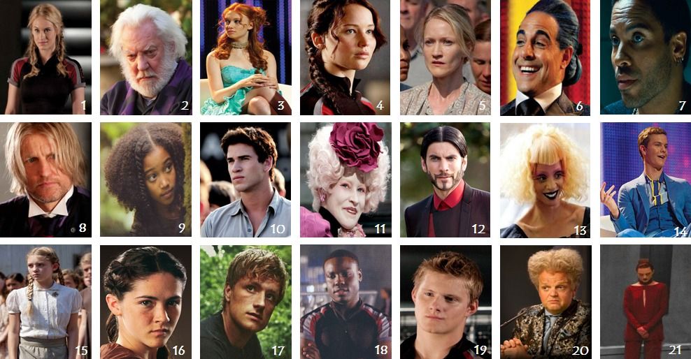
Katniss

Prim (sister)

Peta – the baker’s son (his father used to love Katniss’ mother when they were young)

Haymitch – a former winner, now a drunkard. Needs to mentor tributes from District 12

Effie Trinket – another mentor, pulls the names out of the hat

President Snow – dictator, representation of evil and powerful government – dystopian society

Cinna – Katniss’ stylist

Rue – represents innocence, shows Katniss’ need to protect rather than kill

Settings

District 12 – poor mining district

Capitol – rich city where government is situated

Still of Donald Sutherland in The Hunger Games

Forest – artificial games arena

Still of Jennifer Lawrence in The Hunger Games

Institutional Factors – marketing that product!

In starting to plan a marketing campaign, the film distributor has to decide how it will present a film to a potential audience. They need to decide what sets this film apart from all the other films that are released – they look for a film’s ‘unique selling point’ (USP). If, for example, the distributor is handling an adventure film, they will need to look for aspects of the film which set it aside from the other action adventure films. What is its “wow” factor? What makes it unique?

In deciding what the USP of a film is, the distributor will first look at the storyline to see how this differs from the other films and what the key elements of the story are. After this they will look at such things as who stars in the film, are there new and spectacular special effects in the film and who is the director? Taking all of these into consideration, the distributor will then decide which elements to stress in the marketing campaign (posters, trailers, etc.) i.e. how to position the film in the market place.

The USP of a film will help potential audiences come to an understanding of what they might expect when they go to see a film. The visual campaign – posters, trailers, etc. will stress the USP and give the audience a ‘narrative image’ (an idea of the story) of the film. We, the spectators, are consumers as well as fans of particular stars, for example, the films we watch are products and generated to reach an audience. The film industry uses elements of the film to encourage the potential audience to go to the cinema and see the film.

  • How do you find out about a film?
  • What makes you want to see a film?
  • How do you know what to expect from a film?
  • What are you paying for when you buy a cinema ticket or buy/rent a DVD?
  • Where do you watch films? At home? At the cinema?
  • Do you think that there are differences between watching a film in a cinema and watching it at home on a DVD? If you think there are, then what are they?
  • Are there some films that you HAVE to see at the cinema or doesn’t it matter?

The Hunger Games was originally shown in the cinema and was a “blockbuster” because it was so successful. They had further sales through DVD sales and merchandising of posters, clothing and other items.

  • What would have made this film better if you saw it at the cinema?
  • What would make it better to own the DVD instead?
  • Would you have wanted only one of these experiences or both?
  • Are some films good enough to watch over and over?
  • Are some films good enough to want to watch the sequels?

Character, setting, narrative, colour, light, sound, camera and editing

Character

What can you tell about a character by the way they look? Costume, hair and make up are all used to add to the actor’s performance. A character’s behaviour gives us clues about their thoughts and feelings.

Settings

Stories can be set in real places or fantasy worlds, in the past, present or future. When characters are introduced to a new setting it can change their behaviour and influence their personaility.

Narrative

Many stories follow the same basic structure – beginning – middle – end > normal – problem – new normal > equilibrium – disruption – new equilibrium (resolution)

Colour and light

Colour and light are used to create mood. Shadows and dark can create a gloomy atmosphere whereas a bright colourful scene can create a happier mood. Light can also focus our  attention on details in a scene. Colour can represent a character’s emotions.

Music and sound

A film’s soundtrack is as important as the things you see on the screen. Music, sound effects and moments of silence can help create suspense, excitement and laughter. Audiences can often tell if characters are good or bad according to the diagetic and non diagetic sounds which have been added.

Camera and editing

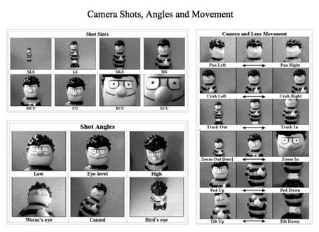
Shot types and camera angles are carefully chosen to show points of view and focus the audience’s attention. An editor’s job is to sequence each shot so the story is engaging and easy to follow.

Use these key facts to think again about the film we have been studying.

How were these all used to:

  • create the narrative structure
  • make stereotypical heroes, villains etc
  • appeal to target audiences
  • make a profit?

NABs

We need to complete two more NABs very soon. We will be looking at aspects of print: -a Comic (fiction) and an advertisement (non-fiction).

Again the main thing we are looking for is to check that you understand:

Purpose – what is it for?

Codes – colour, style etc – what is it/what might it mean?

Narrative Structure – how is the story told/information put across?

Graphics – drawings, photographs etc

Target audience – what kind of person would be interested in the text?

Co-operative working – who needed to work together to make the text?

Institutional Factors – the need to make a profit etc

Key aspect


General definition


Things to consider (not every text need be analysed in terms of the details outlined below as these are a guide only)


Categories


The way in which a text is described.


Purpose, form, tone, genre


Language


How the text is constructed


Mis en scene, font, camera angle, lighting, framing, layout, editing, pace. Denotation and connotation


Representation


How people and places are constructed within the text


Stereotypes, non-stereotype representations, ideology, hegemony


Narrative


How the text is organised


View point, structure, plot, narrative codes


Audience


Who the text is made for and how they react to the text


Target audience, pleasure of the text, differential decoding


Institutions


The factors both internal and external that effect the production of the text


Ownership, internal control, external control, personnel


Colour – what might it mean?

Use this link


http://www.mariaclaudiacortes.com/

BLACK suggests authority, power, boldness, seriousness, is
distinguishing and classic. Business wise it’s great for
creating drama and is good for a background colour (except on websites, it is very hard on the eyes). It is ideal for text on a light background. Black also implies submission and is associated with evil.

BLUE suggests security, authority, faithfulness and dignity.
For business it suggests sanctuary and fiscal
responsibility. It is the most popular and the second most
powerful colour. Blue can also be cold and depressing. Peopleare more productive in blue rooms.

BROWN suggests richness, politeness, helpfulness and
effectiveness. In business it suggests less important items.
Solid, reliable brown is the colour of earth and is abundant in nature. Light brown implies genuineness while dark brown is similar to wood or leather.

GREY suggests authority, practicality, earnestness and
creativity. Business wise it is traditional and
conservative.

GREEN suggests health, fertility, freedom, freshness,
healing, tranquillity and jealousy. Businesses use it to
communicate status and wealth. It is the easiest colour on
the eye and can improve vision. It is a calming, refreshing
colour.

ORANGE suggests pleasure, cool, excitement, cheer,
endurance, strength and ambition. For business it is good
for highlighting information on charts and graphs.

PINK suggests femininity, gentleness, well being and
innocence. For business you must be aware of it’s feminine
links and implications.

PURPLE suggests spirituality, royalty, luxury, wealth,
sophistication, authority and mournfulness. In business it
is upscale and works with artistic types. It is also
feminine and romantic. However, because it is rare in
nature, purple can appear artificial.

RED suggests excitement, strength, sex, passion, vitality,
aggressiveness and commands attention. Business wise it
associated with debt, is great for boldness and accents. The most emotionally intense colour, red stimulates a faster heartbeat and breathing.

WHITE suggests refined, purity, devotion, contemporary and
truthfulness. For business it can be sterile and refreshing. The best colour on the web for a background colour. Doctors and nurses wear white to imply sterility.

YELLOW suggests warmth, sunshine, cheer, happiness, jealousy, deceit and cowardice. Business wise it appeals to the intellectual types and is a good accent. Yellow enhances concentration, hence its use for legal pads. It also speeds metabolism. It is the most difficult colour for the eye to take in, so it can be overpowering if overused.

Green, brown, and red are the most popular food colours. Red is often used in restaurant decorating schemes because it is an appetite stimulant.

Report a Glow concern
Cookie policy  Privacy policy

Glow Blogs uses cookies to enhance your experience on our service. By using this service or closing this message you consent to our use of those cookies. Please read our Cookie Policy.