Perfume ads are designed to make you look! They are designed to be interesting enough that you don’t just turn the page over quickly. They want your money being spent on their product.
Look at what you see –
Colours – what can you see? What might it mean?
Product – name it. What connotations does this word have? Where is the product placed? Is it oversized? Is it more or less important than the person on the ad? How do you know?
Font – is it serif or sans-serif (fancy or plain)? What colour is the writing? What size is the writing? Do you know what style of font this is? Is it easy to read? Is it ornate and old fashioned? Is it modern? Is it eye catching in some way? Is it designed to help you remember the product more easily?
Image – Is it selling a lifestyle? Is it trying to tell you you will be more sophisticated/natural/young/lively/popular/rich if you buy this product?
Is the background urban or rural? (Town/city/country)
What type of scent do you think the product has? (Floral for the country, lemon for yellow, cinnamon for red etc)
The model – well known actress, well known model or someone unknown but stunningly attractive or thin or angular or with gaps in her teeth or…? Is there a “direct mode of address”? (Looking at you)
In magazines like Elle or Marie Claire the target audience is young women with an interest in high fashion and money to spend. The adverts therefore often resemble fashion shoots with flowing dresses and unusual arm or leg positions. Often the arms or legs point to the product. Often the perfume is part of a range of products available from someone normally associated with high fashion clothing – e.g. Calvin Klein, Chanel, Eli Saab, Armani etc.
How much does it cost? – Oodles of dosh! About £25,000 per glossy page – more if a double page ad or if it has a free sample or is on harder paper.
***********************************
Example responses (from real students not at this school who have posted their ideas online. I have provided links but cannot vouch for any of their other ideas being correct.):
Technical codes
Lighting
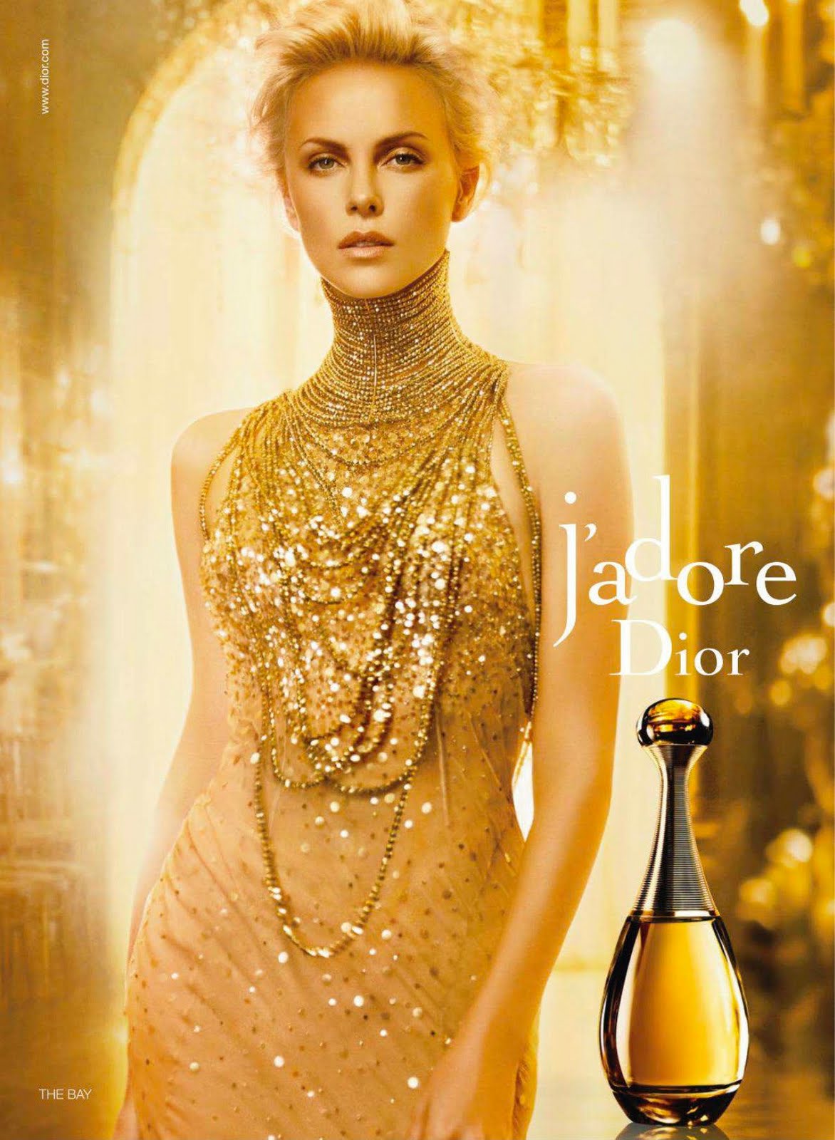
“I also like the lighting of this advertisement because it adds a hint of gold to the model’s complexion, and adds shine to the model’s golden blonde hair, enhancing the entire advertisement. The lines are clean cut, making the ad look really sleek and glamorous. ”
http://cxetheresa.wordpress.com/category/writings/
Colour
” The advert has a main theme of gold (gold earring, gold eyeliner, golden skin, gold bottle) and the background is fairly dark but shows a blurry chandelier which gives the idea that wealthy people would wear this perfume.”
“The advertisement enhances the fragrance as its setting is a hotel with gold furnishes in the slightly blurred background. This entire wash of gold in the advertisement is highly effective as it not only catches the attention of the viewer, but also brings out the classy feel of the fragrance. The choice of a hotel suiting is apt because the fragrance has a hotel print on it, which emphasises the theme.”
http://gabysmedia.blogspot.co.uk/2008/10/perfume-advert-analysis.html
“This feel is developed by the large print of the fragrance on an entire page in a background of gold. The colour choice suits the bottle, and the rectangular page accommodates the bottle very well. By using the colour gold, it suggests that this fragrance is as luxurious and precious as gold. It gives a strong, sophisticated sense of superiority to the user. More touches of gold in the model’s dress and jewelry add to the glamour of this advertisement.”
Model
The model’s eyes stare down into the camera and one eyebrow is raised which gives the impression that she knows something that the reader doesn’t and that she is in control. It makes the advert intriguing and mysterious and also makes the viewer want to be just like the model.
Target audience
This advert also should appeal to men. The model shows a lot of skin and cleavage which automatically draws a man’s attention and makes him think of his own partner in the way he is thinking about the model, which consequently should make him want to buy the perfume for his partner.
Product
The bottle of perfume is placed in the bottom, right hand corner of the advert. It is large and gold which makes it look very expensive and grand. ‘Sparkles’ have been added to the bottle to make it seem more special and they make the bottle stand out even more. Next to the bottle, it says the perfume name ‘J’adore L’absolu’. The word J’adore, meaning I Love, is in a large Serif font which I think is supposed to represent the passion of the advert. ‘L’absolu’ is in a smaller font and is in italic writing to stress the meaning of it which is ‘the absolute one’. The fact that the perfume name in French, probably appeals to the viewer because it seems more unique, more special and by owning the perfume they may think that they will also become ‘unique’ and ‘special’. In the top, right hand corner, ‘Dior’ is displayed in white, on top of the darkest background. It is also in a serif font and it gives the impression of wealth and of being ‘proper’. At the very bottom of the advert it says ‘The new Eau de Parfum: J’adore L’absolu’. Notice how it says ‘The’ instead of ‘A’, this is so the advert sticks in the viewers mind as the only new perfume that has recently been released.
Image
Curves and contours in the model’s face complement the straight, angular lines of the fragrance in the opposite page very well. The composition also plays a vital role in this advertisement. In the first image, the model is the centre of attraction, with butlers waiting to serve her and in the second image, she gives a strong, sharp stare. I feel that both compositions are highly effective in displaying the opulence of the fragrance because they have produced the fragrance of the perfume through a 2D advertisement. Viewers are able to imagine the fragrance of Fendi’s Palazzo through this striking advertisement.
**********************************************************************
Remember nothing on the page is accidental. Everything has been carefully chosen and placed where it is for a reason – to make you buy the product
**********************************************************************
Female Stereotypes target audiences:
Beauty Bunny
Alpha Female
Fashionista
Perfect Mum
Granny
Who are these adverts aimed at and how do you know?