Children, architecture and the urban environment
This TDT will explore Dundee University’s campus, which is a close-knit campus with everything that a student might need within a 5-minute walk. In particular, the TDT will focus on the main student library.
The main student library is positioned in the very middle of campus. It was creatively planned in this way to enable easy access for every student, no matter what course they were studying. Therefore, by positioning it in the centre of campus, it means students can easily access the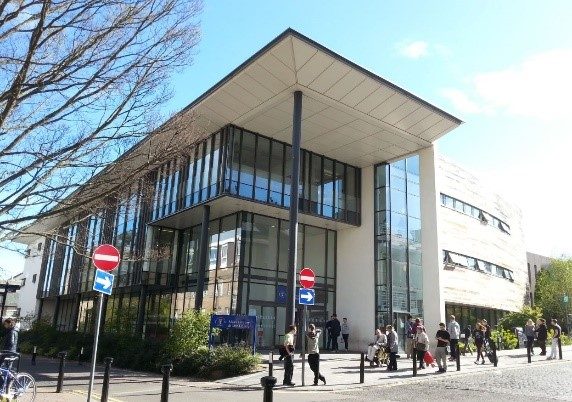 building and make full use of it. This central position also reinforces and perhaps symbolizes the importance of reading and research which lies at the heart of university study. Having the library positioned close to the student Union and the Premier is also convenient for students whether they are needing to buy snacks, paper or need a change of scenery for a lunch break.
External Appearance
The library has a very open, inviting feeling to it created by the use of the big glass windows and glass doors. Indeed, the majority of the left side of the building is formed of glass, meaning that light floods in, giving the library a bright, uplifting atmosphere which captures the sunshine. Although the majority of the library walls are glass, the remainder of the building has been built 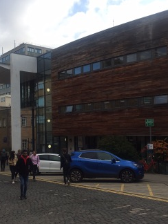 with stone and a wood-like material. This ensures that the building blends in well with its surroundings and the neighbouring buildings close by.
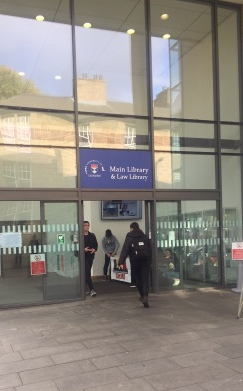
Although the creation of the library does not appear particularly decorative from its external appearance, the building does suit its function. Indeed, if there was too much décor or if the construction and architecture of the building were too extreme, then it would not fit in with its surroundings. This could also look rather off-putting, which potentially would have a far less warm, inviting feel to it, meaning that students would be less inclined to enter. Thus, the current external appearance is simple yet effective. However, inside is where the appearance of the library comes to life, providing many different rooms/floors depending on the different functions required.
Ground Floor
The bottom floor of the library provides a group study area which is suitably furnished with large tables to allow and encourage group discussions. This floor also permits people to talk out loud to their peers, thus providing students with the option of working in an area of ‘quiet noise’, as well as the option of working in groups. The floor also contains several group rooms or pods, each representing a different continent of the world (eg. Asia, America, Australasia etc.). The individual illustrations in each pod room provide distinctive colours, making the rooms more eye-catching and distinctive and therefore easy to identify. These rooms are also well lit, which allows people to work, yet the lighting is quite subtle and not harsh which creates a welcoming atmosphere. As a result of the environment, these pods have become extremely popular and are a favourite place for students to meet and discuss their studies.
The library café is also on the ground floor. The location of this function actually within the library makes it convenient for students to eat main meals or snacks without having to leave the building. Likewise, the positioning of the café by the glass windows creates a very open area with lots of natural light streaming in. This encourages a feeling of relaxation.
First Floor
This floor has recently been remodelled and decorated. Now, the decorative items for this area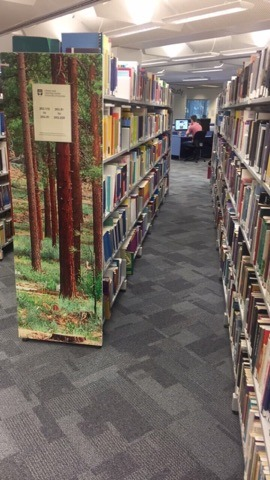
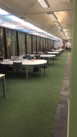 of the library follow the theme of a rainforest, with a green, pastel yellow and white colour scheme. This is actually my favourite floor as the nature theme creates a feeling of relaxation, peace and tranquillity. As such, it provides a positive atmosphere for students who are trying to study, making this floor fit for its purpose.
Second Floor
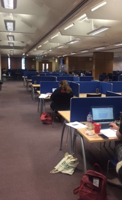 The second floor is the top floor of the library and is a completely silent area to work in. This floor is very basic with single desks spread out. Likewise, the colour scheme is a basic brown and white. Whilst not particularly aesthetically pleasing, it does create a business-like, no-nonsense type of environment where there are no distractions. This is also fit for purpose as it is useful for some students because it helps them to focus on the study task.
Overall, the main library, although a basic shaped building on the outside, strategically uses a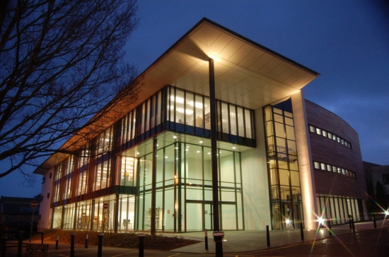 lot of large glass windows. This allows natural light in to keep it bright, giving it a modern, airy feel yet still fitting in well with the rest of the university campus.
Completing this art TDT has made me realise the numerous classifications which come under the area of ‘Art’ and how much it relates to the modern-day world and our every-day surroundings.