Collect and photograph a range of packaging such as boxes, packets and tins from your kitchen or shopping. Flatten out some of the boxes when they are empty. Make notes on the different designs, colours and letters used by the designer and reflect upon these choices and the messages they give out. Compare two different examples and evaluate why you prefer one to the other. What audience are they aimed at? How could you use this activity in the primary classroom? What else could be learned from this study. Include photographs or sketches of the packaging, your notes and written evaluation. Design and create a piece of packaging to appeal to a specific audience or market and upload this to your portfolio.
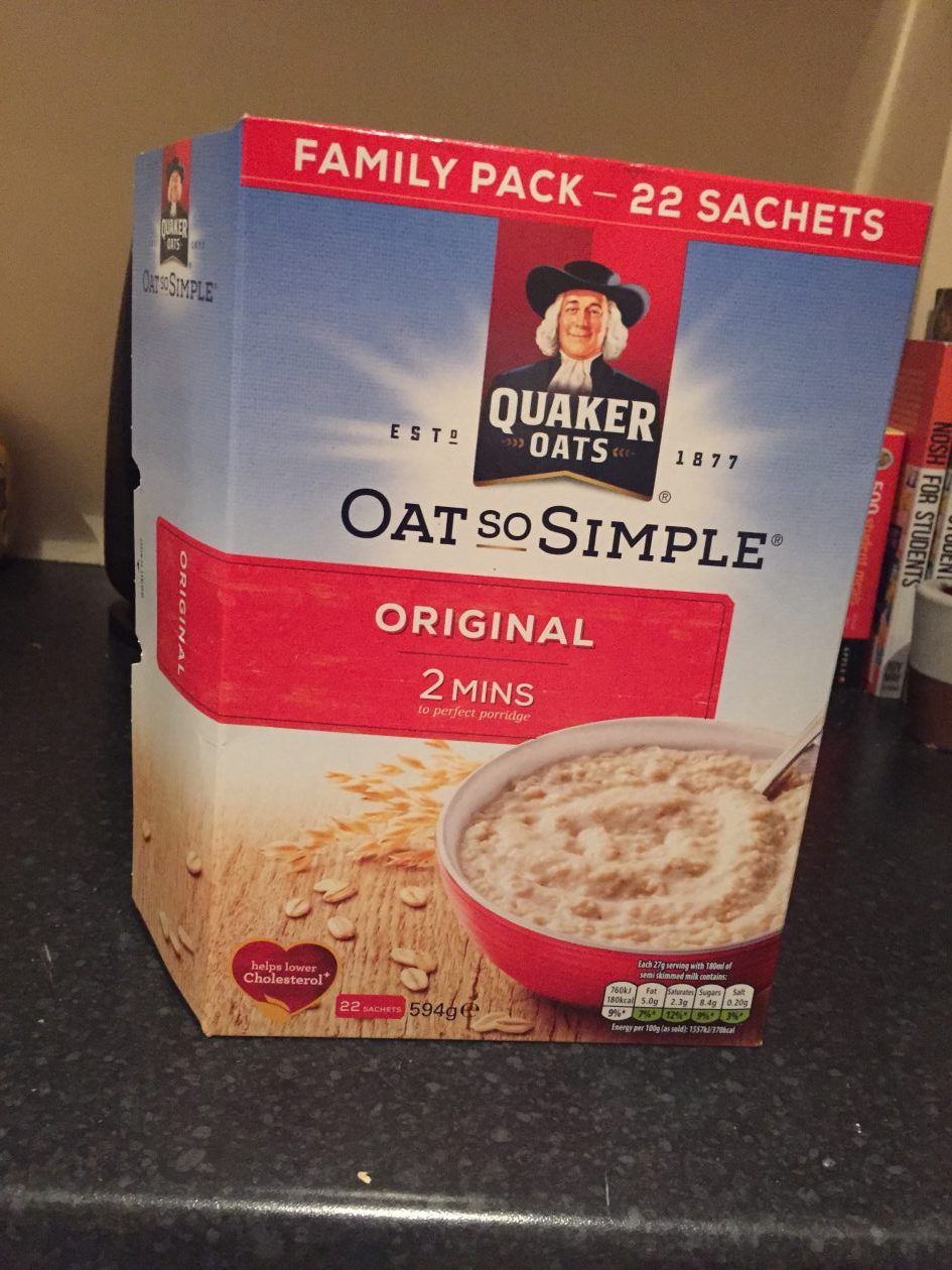
- Quaker Oats have used a sun and blue sky to identify how good your mornings will be when you have their porridge for breakfast. Minimal text is used to highlight the key points – it is simple and quick. The red colouring represents the flavouring of porridge so
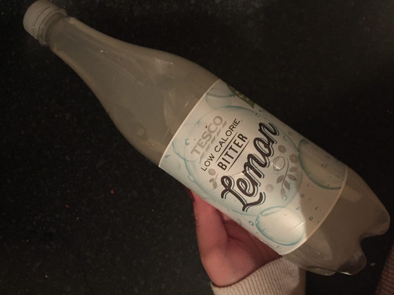
consumers can easily identify the difference between the boxes. - Tesco have used images of bubbles on their lemon bitter to emphasise the fizzy-ness of the drink. Coupled with the classic lettering used for ‘lemon’ it is visual appealing and subtle in its neutral colours.
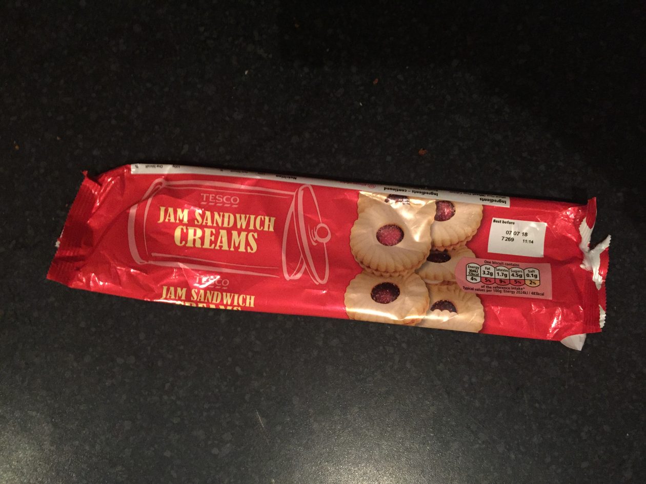
- Tesco have used a classic red colour which has proven to be attractive to the human eye and in this example is representation of the jam centre. The text is positioned within the outline of a biscuit tin to feature where the creams belong once purchased. Having several images of the biscuit on top of each other send out the message that there is lots of biscuits for the price.
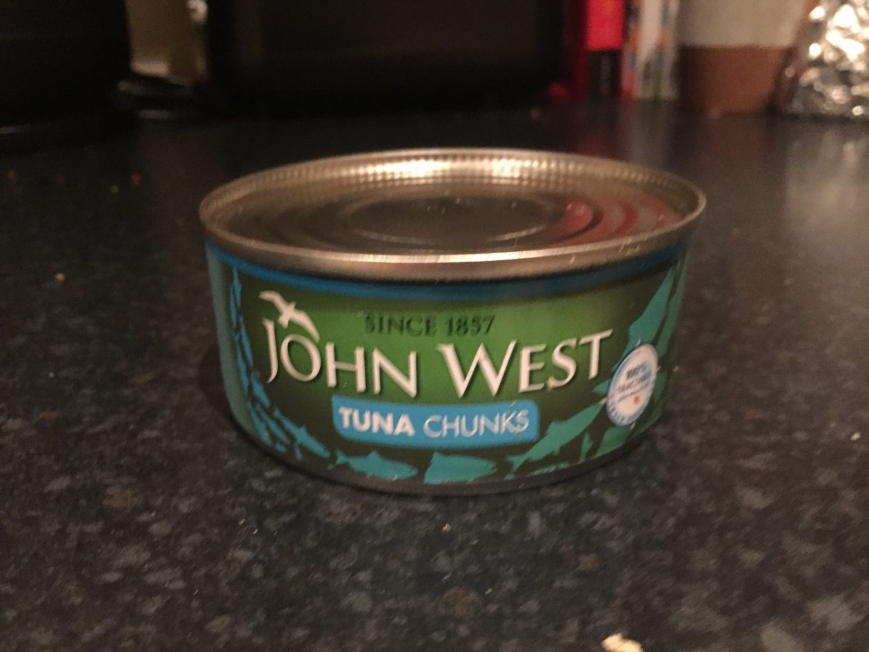
- John West have used green/blue/turquoise/aqua to represent the ocean in which tuna is obtained from. The traditional lettering and ‘since 1857’ could be there to send out the message that they are a reliable, long-standing company. The animated pictures of fish indicate what sort of product it is.
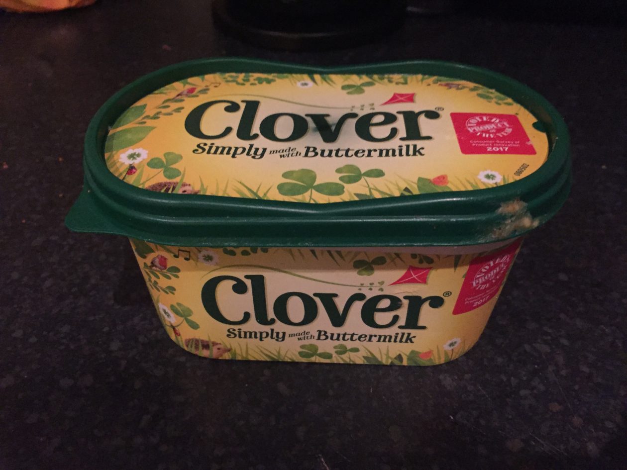
- Clover have used quite an outdoor/summer vibe for their packaging which could be to send out the message that their product is all natural. The attract to nature being that it indicates the product is much left artificial than other products, therefore, making it more desired. This is emphasised in the ‘simply made with buttermilk’ text.
- Pepsi have used a black label to blend in with the colour of the Pepsi, the attraction being it is simple to for the eye. It could be said that the red, blue and white logo is from the American flag as it is an american company. Again, the lettering is very simple and straight to the point ‘maximum taste, no sugar’ giving the consumer all the information they need.
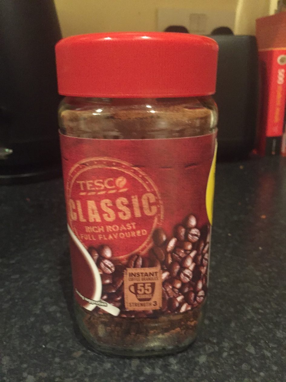
- Tesco have used quite a faded, stamp-like logo for their instant coffee to represent the authenticity of their product. The coffee beans next to the cup are used to emphasis the rich, coffee taste you’ll get from the powder just by adding hot water. Additionally, ‘serves 55’ stamp is used to show how much you’ll get for you money.
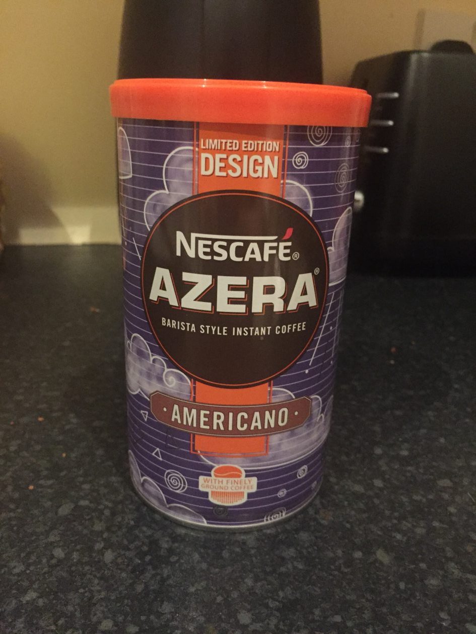
- Nescafe have gone with a slightly more ‘out-there’ design for their ‘Azera barista style instant coffee’. This packaging is meant to be visual appealing to the consumer and is intended to stand out from all the other coffee brands. Additionally, the ‘limited edition’ banner is used to emphasis the need to get it now as it won’t be around for long.

1

2

3

4

5

6

7

8
To compare the last 2 pieces of packaging for instant coffee, it is very clear they have many differences. The Tesco one is very much indeed for practicality – getting the point across but also attracting the consumer to the taste of a classic coffee. Whereas, the Nescafe one is much more visually appealing and relying on the consumer liking the design rather than the look/sound of the coffee. I definitely prefer the Nescafe one and I think this is purely down to the eye-catching design, it would most definitely attract your eye from far away in the shop whereas you would have to be intending to look at coffee and be fairly up close to find the Tesco one appealing. This one is also aimed at coffee drinkers whereas the last one could be for anyone, you could not like coffee at all but still want the nicely designed container!
You could use this activity in the primary school by asking pupils to bring in pieces of packaging from home that is their favourite and ask them to explain why, developing their aesthetic understanding. Additionally, they could have a go at designing their own packaging after researching and exploring aspects that need to be considered when designing products for the consumer. In addition to learning about advertisement and the power of visually appealing products, pupils would learn that everyone likes different things as everyone will have a different opinion on different packaging, therefore, this develops their ability to see things from other’s perspective.

Packaging for instant coffee, designed by me appealing specifically to coffee drinkers.
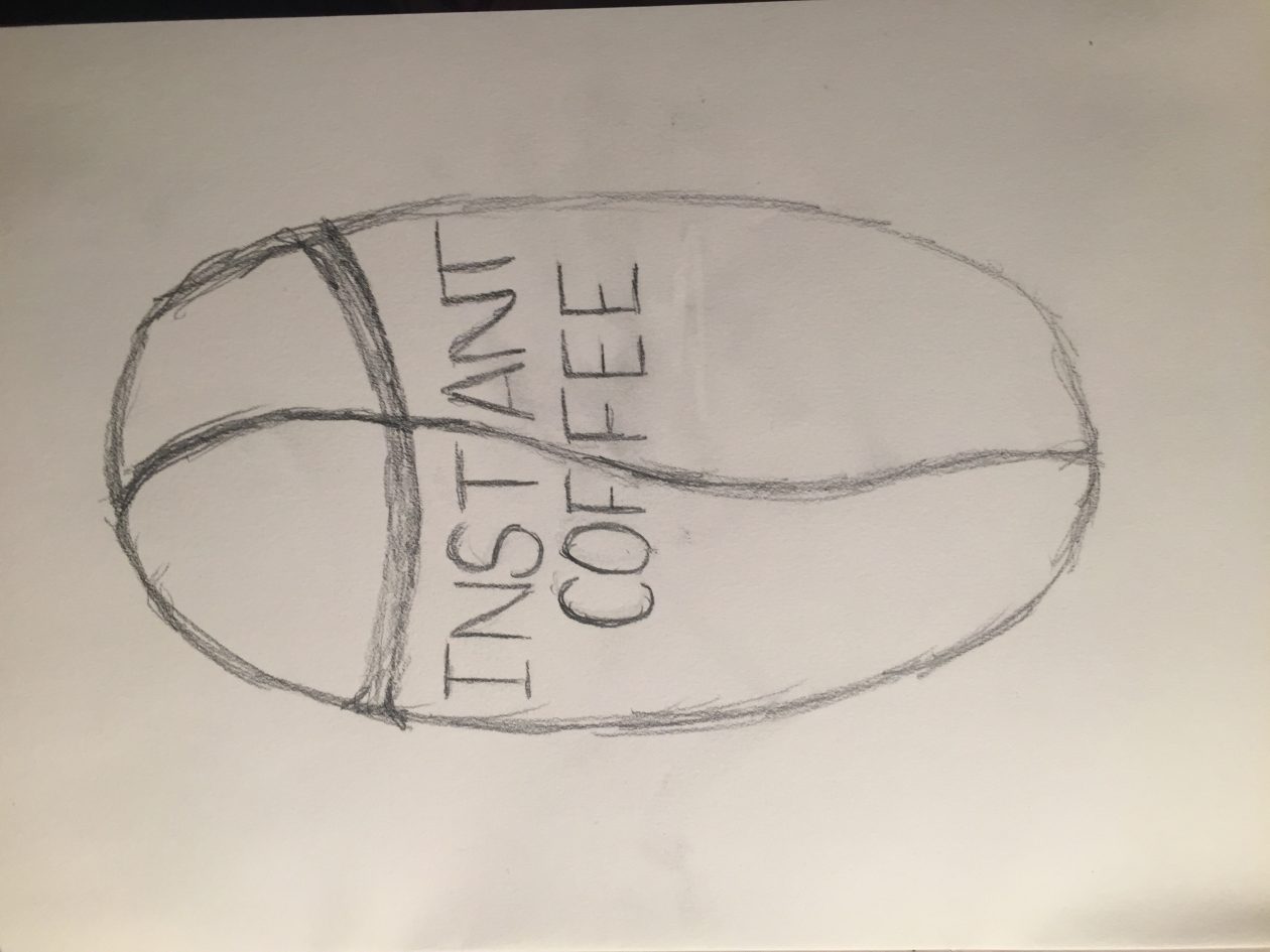
Sketch

Final Design