CSS3 brings two useful methods for creating designs that work on varying resolutions of screen.
Flex
Flex allows you to define how elements will be arranged inside a container. Do you want them stacked in a column, or going horizontally. Do they gather to the left, right or spaced evenly.
As the size of the container changes, the sub items will rearrange to fit.
Grid
Grid allows you to split an area up into rows and columns. This is useful for making the layout of a page or a section of it.
Flex
<!DOCTYPE html>
<html lang="en">
<head>
<title>Flex Test</title>
<style>
.flexbox-container {
display: flex;
flex-direction: row;
flex-wrap: wrap;
}
.flexbox-container div {
background-color: #8888ff;
border: 1px solid black;
margin: 5px;
font-size: 4rem;
width: 15em;
height: 5em;
}
</style>
</head>
<body>
<div class="flexbox-container">
<div>1</div>
<div>2</div>
<div>3</div>
</div>
</body>
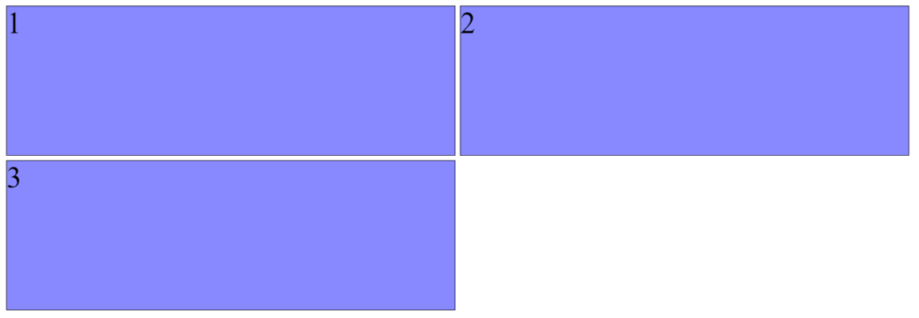
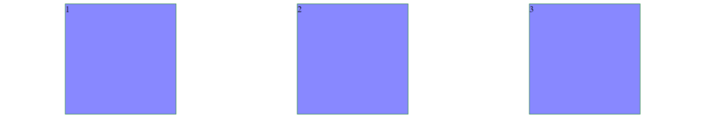
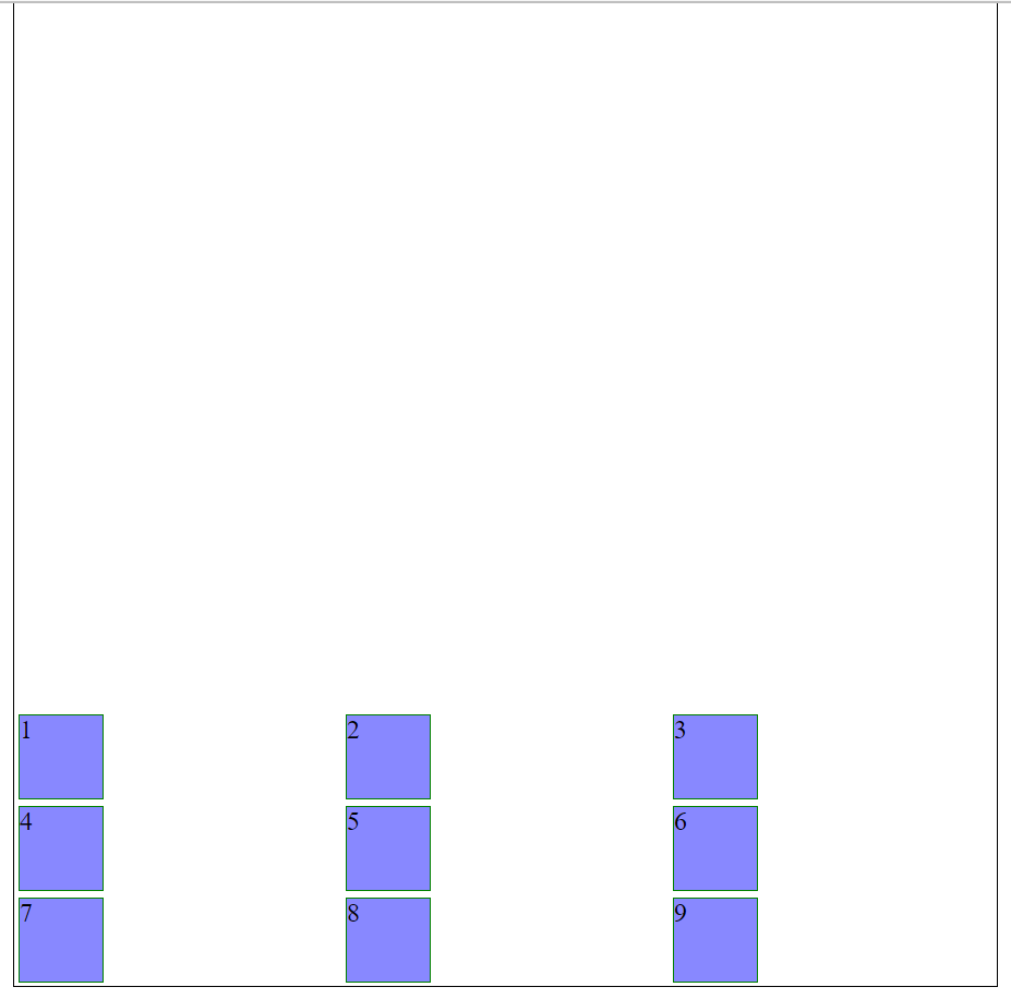
</html>Try changing the direction and wrap rules to see how the display changes.
There are further options. For example, flex-direction can also use row-reverse and column-reverse for values. Flex-wrap can be set to wrap-reverse if you wanted the extra items to wrap to lines above the original.
Here we define a div to be the container by using the display: flex property. We use flex-direction: row to tell the browser to show the sub items of the contain in a horizontal row. We could have used flex-direction: column if you wanted them stacked vertically on top of each other. We use flex-wrap: wrap to say “When you can’t fit all the elements on one line, wrap them onto another one”. If you wanted to force them onto a line you could use flex-wrap: nowrap.
You can ignore all the properties on the the child items as that’s just to make them more visible for the demonstration.
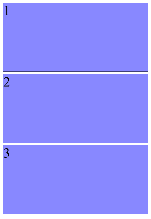
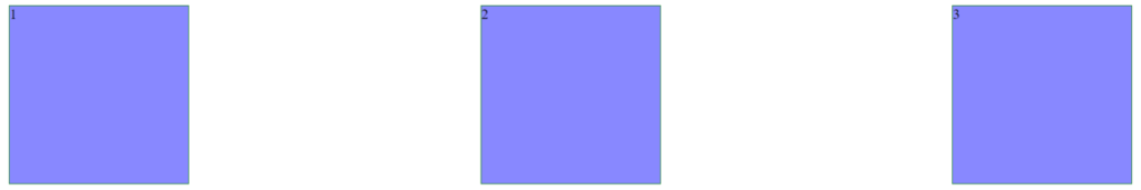
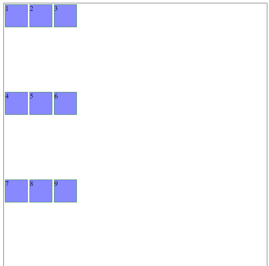
If we look at the same code on a display that can only fit one of the child items into the contain on a row they automatically stack.
If you want to use a percentage of the flex container you could use the flex-basis property on the child elements. So 2 equal columns could use:
.flexbox-container {
  display: flex;
  flex-direction: row;
  flex-wrap: wrap;
}
.flexbox-container > div {
  flex-basis: 50%;
}
Each child div would take up 50% of the width of the parent.
Justify-content
justify-content aligns the items within the container. By default it puts all the items to the left, unless you are using a flex-direction of row-reverse. But it can have the values:
flex-start
All the child elements are aligned to the left side of the container, or right on row-reverse.
flex-end
All the child elements are aligned to the right side of the container, or left for row-reverse.
center

All the child elements are aligned in the center of the container.
space-around
The container works out how many will fit on a row and then divides the width available between the child elements then centre aligns each element in its own section.
space-between
The container works out how many will fit on a row and then puts one to the far left, one to the far right, and the rest are equally spaced between.
Add a justify-content property to your container. Choose whichever value you want.
Align-content
This property controls how the child items are vertically aligned within the container if the container is taller than the items. By default it puts all the items to the top. It can have the values:
flex-start
flex-end
center
space-around
space-between
stretch
Stretch will only be apparent if you haven’t set a height property for the child elements.
Grid
<!DOCTYPE html>
<html lang="en">
<head>
<title>Grid Test</title>
<style>
body {
margin: 0;
}
.grid-container {
display: grid;
grid-template-columns: auto auto auto;
}
.grid-item {
background-color: #8888ff;
border: 1px solid black;
margin: 2px;
height: 5em;
}
</style>
</head>
<body>
<div class="grid-container">
<div class="grid-item">1</div>
<div class="grid-item">2</div>
<div class="grid-item">3</div>
</div>
</body>
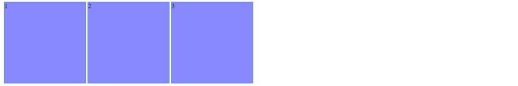
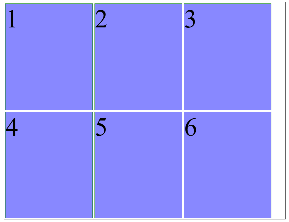
</html>Here we define a div to be our grid container using display: grid, we then use the grid-template-columns: auto auto auto to set the grid to have 3 equally sized colums.

Maybe we want to use this grid for a layout and have a large centre area and different sizes on each side. Instead of using auto auto auto we can set sizes
grid-template-columns: 25vw 70vw 5vw;
A really useful new size unit for grids is fr which stands for fraction of the available space.
grid-template-columns: 1fr 2fr;In the above the 2nd column will be twice the width of the 1st column. And fr ignores any space set aside for gaps between columns.
How to change the number of columns? Change the number of values in the grid-template-column property. So 5 equal columns would be:
grid-template-columns: auto auto auto auto auto;If you want to control the rows rather than columns then it follows the same pattern. Just use the grid-template-rows property instead.
grid-template-rows: 200px 100px 50px;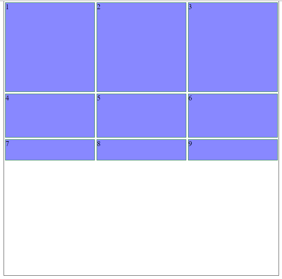
Justify-content
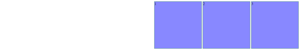
If the items don’t take up the full width of the container then you can use the justify-content property to change how they are arranged:
space-evenly
space-around
space-between
flex-start
center
flex-end
Align-content
If the items don’t take up the full height of the container then you can use the align-content property to change how they are vertically arranged:
space-evenly
space-around
space-between
flex-start
center
flex-end
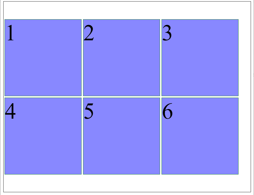
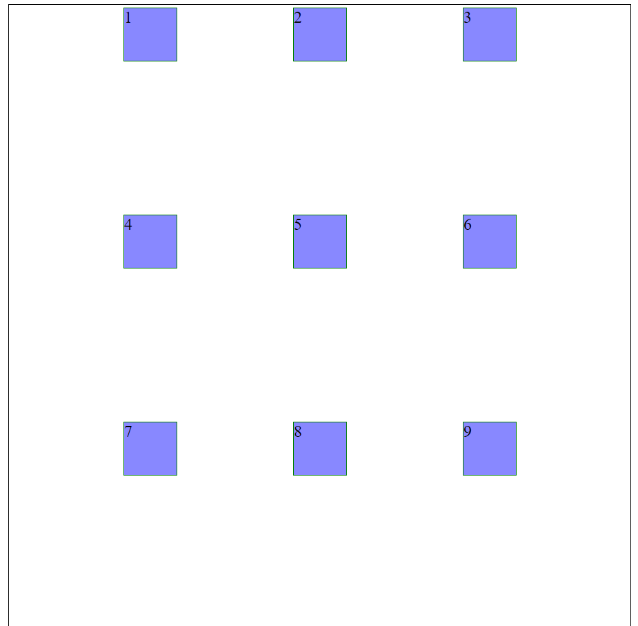
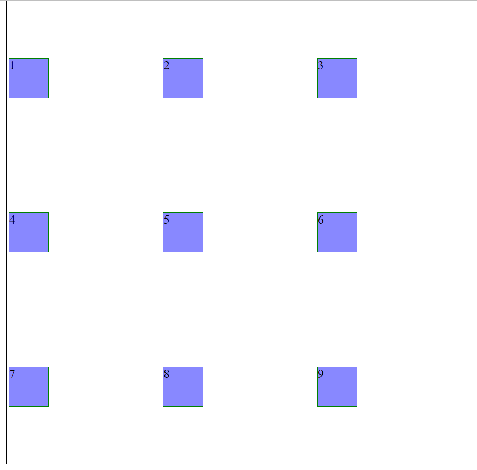
Gaps
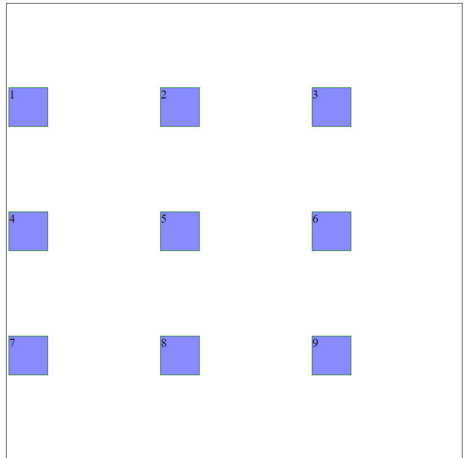
What if your grid items take up the full size but you still want a space between each. Use a gap property.
- column-gap
- row-gap
- gap (this is just shorthand for row-gap and column-gap together)
For example the image to the right has a column-gap of 40px and a row-gap of 10px. This could be done as:
gap: 10px 40px;Or as:
column-gap: 40px;
row-gap: 10px;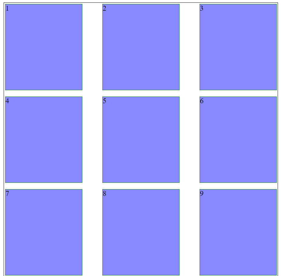
Grid items
Up until now all your styles have been applied to the container. But the items have options too:
- grid-column-start
- grid-column-end
- grid-column (shorthand for “grid-column-start / grid-column-end”)
- grid-row-start
- grid-row-end
- grid-row (shorthand for “grid-row-start / grid-row-end”)
- grid-area (shorthand for “grid-row-start / grid-column-start / grid-row-end / grid-column-end”)
The grid-column property allows you to define the start and end columns of a child item within a grid.
<!DOCTYPE html>
<html lang="en">
<head>
<title>Test</title>
<style>
.grid-container {
grid-template-columns: auto auto auto auto auto auto;
grid-template-rows: auto auto;
display: grid;
height: 600px;
width: 600px;
border: 1px solid black;
}
.grid-item {
background-color: #8888ff;
border: 1px solid green;
margin: 2px;
}
</style>
</head>
<body>
<div class="grid-container">
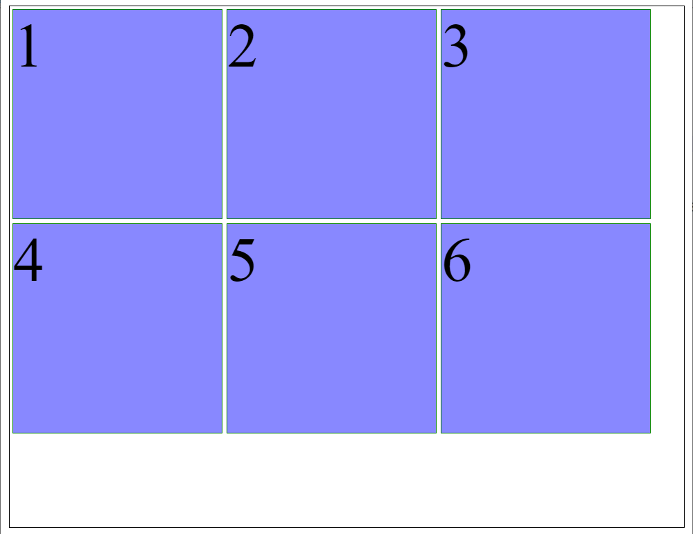
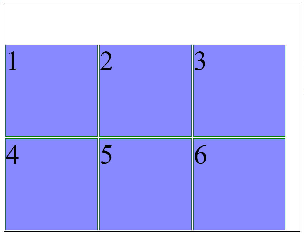
<div class="grid-item" style="grid-column: 1 / 4">1</div>
<div class="grid-item" >2</div>
<div class="grid-item" style="grid-column: 5 / 7">3</div>
<div class="grid-item">4</div>
<div class="grid-item" style="grid-column: 2 / 6">5</div>
<div class="grid-item">6</div>
</div>
</body>
</html>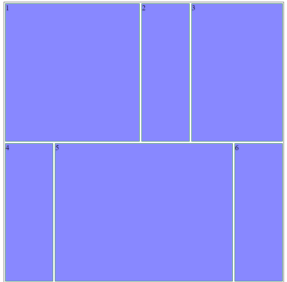
Here we have a grid made up of 2 rows and 6 columns. The first child item has a property of grid-column: 1 / 4 which means “start at column 1 and end at column 4” in other words, start in the first column and span 3 columns. You can even write it that way.
grid-column: 1 / span 3;The grid-row property works exactly the same. State in which row the item should and then say either where it ends or how many it spans.
The grid-area property combines grid-row and grid-column.
grid-area: 1 / 2 / 3 / 4;grid-row-start is set to the first value, grid-column-start is set to the second value, grid-row-end is set to the third value, and grid-column-end is set to the fourth value. So this would be the same as:
grid-row: 1 / 3;
grid-column: 2 / 4;