We will introduce the following rules:
- display (block, inline, none)
- float (left, right)
- clear (both)
- margins/padding
- sizes (height/width)
- position; left, right, top, bottom distance
Display
How HTML elements are displayed can be changed with CSS rules. The rules that can change these HTML elements are:
- block
- inline
- none
The default display setting for most elements is block or inline:
- display:block – an element uses the entire width of its container
- display:inline – an element uses only as much width as necessary
- display:none – an element is not visible
There are many more options that can be used and we will cover some later on. If you use your web browser’s dev tools inspector you can see all the options available.
<!DOCTYPE html>
<html lang="en">
  <head>
    <style>
      p.block-paragraph {display: block;}
      p.inline-paragraph {display: inline;}
      p.hidden-paragraph {display: none;}
    </style>
    <meta charset="UTF-8">
    <title>CSS Testing</title>
  </head>
  <body>
    <main>
      <h1>Display test</h1>
      <p>Paragraph 1</p>
      <p class="block-paragraph">Paragraph 2</p>
      <p class="block-paragraph">Paragraph 3</p>
      <p class="hidden-paragraph">Paragraph 4</p>
      <p class="inline-paragraph">Paragraph 5</p>
      <p class="inline-paragraph">Paragraph 6</p>
    </main>
  </body>
</html>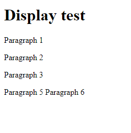
Paragraph 1 is the default. Paragraph 2 and 3 have a display of “block”. Paragraphs by default are block elements so these should look like paragraph 1 and take up the full width available.
Paragraph 4 has a display of “hidden” so doesn’t appear.
Paragraphs 5 and 6 have a display of “inline” so will only take up the width required. So on the display resolution used for the example image both paragraphs can fit side by side.
Float
An element can be set to the left or right of its container, we do this by using the float property.
<!DOCTYPE html>
<html lang="en">
  <head>
    <style>
      .border {border: 1px solid black; margin-top: 20px;}
      .left {float: left;}
      .right {float: right;}
    </style>
    <meta charset="UTF-8">
    <title>CSS Testing</title>
  </head>
  <body>
    <main>
      <h1>Float test</h1>
      <div class="border">
        <p>This is a test paragraph of text to see how the image will behave based on the float value.</p>
        <img src="square-red.png" alt="A small red square" height="40" width="40">
      </div>
      <div class="border">
        <p>This is a test paragraph of text to see how the image will behave based on the float value.</p>
        <img class="left" src="square-red.png" alt="A small red square" height="40" width="40">
      </div>
      <div class="border">
        <p>This is a test paragraph of text to see how the image will behave based on the float value.</p>
        <img class="right" src="square-red.png" alt="A small red square" height="40" width="40">
      </div>
    </main>
  </body>
</html>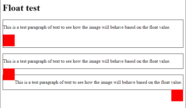
As you can see from the red squares overlapping the borders that float completely ignores where it should be in the relation to its parent element.
Clear
Floating elements continue down the page until we use a property called clear. You can clear left, right or both. Meaning that nothing can float to the left, right or both sides.
If we wanted three elements <header> , <nav> and <main> to remain unaffected by any float properties elsewhere in the page, we need to use clear:both.
header, nav, main {
  display:block;
  clear:both
}
Clearfix
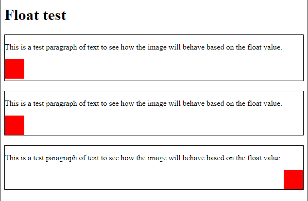
Because floating elements are removed from the regular box model, they can make it hard to style the parent containers. To get around this you use a clearfix style on the container to the float elements. This works by adding an empty piece of content that has to clear the space taken up by the float objects.
.clearfix::after {
  clear: both;
  display: table;
  content: ""
}
While floating objects is still useful for small parts of a website, it is better to use flex or grid for greater control over how a website is arranged and how it changes on smaller devices. These rules are covered in their own lesson later on.
<!DOCTYPE html>
<html lang="en">
  <head>
    <style>
      .border {border: 1px solid black; margin-top: 20px;}
      .left {float: left;}
      .right {float: right;}
      .clearfix::after {
        clear: both;
        display: table;
        content: "";
      }
    </style>
    <meta charset="UTF-8">
    <title>CSS Testing</title>
  </head>
  <body>
    <main>
      <h1>Float test</h1>
      <div class="clearfix border">
        <p>This is a test paragraph of text to see how the image will behave based on the float value.</p>
        <img src="square-red.png" alt="A small red square" height="40" width="40">
      </div>
      <div class="clearfix border">
        <p>This is a test paragraph of text to see how the image will behave based on the float value.</p>
        <img class="left" src="square-red.png" alt="A small red square" height="40" width="40">
      </div>
      <div class="clearfix border">
        <p>This is a test paragraph of text to see how the image will behave based on the float value.</p>
        <img class="right" src="square-red.png" alt="A small red square" height="40" width="40">
      </div>
    </main>
  </body>
</html>
Margins and padding
Margins and padding are used to move and push content from the edges of elements. This is a lot like a box and is therefore referred to as the box model.
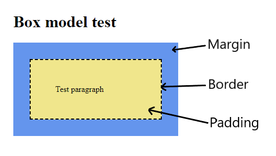
Margin: An around the outside of an element.
Border: Between the padding (inside the element) and the margin (outside the element)
Padding: An area inside the edge of the element around the content itself.
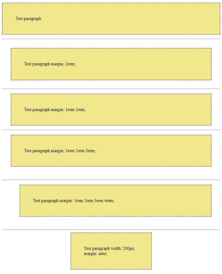
In the example above, the paragraph has a padding of 3rem and a margin of 2rem.
We have five different properties that can be used to set the margin:
- margin-top
- margin-right
- margin-bottom
- margin-left
- margin
margin-top, margin-right, margin-bottom and margin-left can be used to set individual sizes for that size. The margin property can either be given a single value to set all sides to the same amount. Two values will set the top and bottom equal to the first value and the left and right to the second value. Three values will set the top equal to the first value, left and right equal to the second value, and the bottom equal to the third value. Four values will set each side in the order: top, right, bottom, left. A margin also has properties associated with it:
- auto (size calculated by the browser)
- length (stated in pixels (px, em, rem, percentage))
Padding follows the same rules as margin so you can use:
- padding-top
- padding-right
- padding-bottom
- padding-left
- padding
The padding property can be given the same types of values as the margin property.
Border
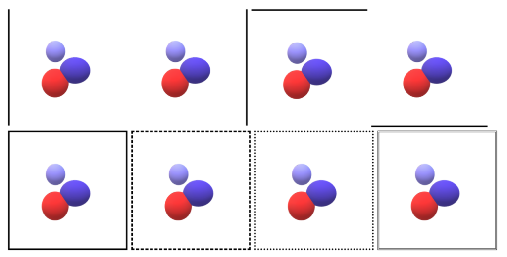
The border property allows you to set a border around the element. It requires a width, style and colour. The usual options are:
The width can be thin, medium, thick or a size such as 10px.
The style can be none, dotted, dashed, solid or double.
p {
  border: 3px solid red;
}
If you only need a border on one side you can use the CSS properties:
- border-top
- border-right
- border-bottom
- border-left
Sizes
Webpages often must have a fixed size or should change size due to content or screen size. We set the size of a section of a webpage using the body property:
body {
  width: 400px;
}
This will keep the body of the webpage at a fixed width of 400px. You can also use the properties of min-height and min-width to set a minimum size for an element.
You can and should use measurements other than px such as:
- cm – centimeter
- rem – the font-size of the root element
- em – the font-size of the parent element
- % – percentage of the container’s width
- vh – viewport height (0-100 is 100% of viewport height)
- vw – viewport width (0-100 is 100% of viewport width)
You should use rem, em, vh and vw so that the content scales either with the font size or the viewport size.
Positioning
The position property specifies the method used to position an element. The possible values are:
- static – the default
- absolute – relative to the first non-static ancestor element
- fixed – relative to the browser window
- relative – position relative to the element’s “normal” position
- sticky – based on the user’s scroll position. So it could scroll into view, then stick in the same place while the container is on screen, and then scroll out of view when the container leaves the viewport.
An element with a non-static position can have this position altered using the left, right, top and bottom properties. The lengths can be in rem, em, vh, vw or other length units. Negative values are also allowed.
Colours
The most common method of showing colours on websites will use a hexadecimal RGB code (Red Green Blue) to define the strength of each colour. A hexadecimal value goes from 0 to F. Black is everything set to 0:
#000000
White is everything set to F:
#FFFFFF
If you see an eight character hexadecimal code then the last two values control the transparency. 00 is completely transparent and FF is completely opaque. There are also 140 predefined keyword colours such as red, blue, white etc if you don’t need a specific shade.
Remember if you are using properties that refer to colours to use the American spelling of colour.
p.red {
  background-color: red;
}
Backgrounds
The background property can be used as shorthand to change the colour, image, repetition, attachment, and position for the background of an HTML element.
- Colour is the regular hexadecimal code or keyword.
- Image would be the path to an image file.
- Repeat controls if the image should be repeated, either no-repeat, repeat-x, repeat-y or just repeat.
- Attachment controls if the background image scrolls with the page
- Position anchors the background image based on either keywords: left top, bottom right etc, or percentages in the x and y axis.
For example:
header{
  background: teal url("nature.png") no-repeat fixed center;
}
Because there are so many background properties you are more likely to use the individual properties such as:
div {
  background-color: red;
}
div {
background-image: url("large-logo.png");
background-position: left 80%;
background-attachment: fixed;
background-repeat: no-repeat;
}The easiest way to see the possible values is to use your browser’s dev tools inspector on your code to see how they can be altered.