All the content so far has been about the user of the website consuming the content on the page. But what about when they need to provide information? This could be something like the items in a shopping cart, payment details or a feedback form.
To do this you need to use form elements. At the top level is the <form> tag. Any form elements within this tag are considered part of the same form. When that form is submitted, all the values on those elements is sent off.
Attributes control where a form sends the data, something is going to need to process it. The most commonly used attributes are:
- Action – The page to which the data is sent
- Method – The HTTP method used to send the data such as POST or GET
GET sends the data as part of the URL. If you’ve ever seen a URL like:
https://www.example.com/blog.php?page=123&command=editIt is sending two variables to the blog.php page. PHP is a commonly used programming language for web applications. The variables are: page with a value of “123” and command with a value of “edit”.
POST sends the data in its own packet to the page so the values aren’t visible in the URL. Most forms will use POST because of this.
<form action="form_results.php" method="POST">
...
</form>
The above example would send the data to a page named form_results.php using the POST method.
The <form> can contain one or more of the following form elements:
- <button>
- <input>
- <label>
- <select>
- <option>
- <textarea>
- <optgroup>
- <fieldset>
Button
The <button> tag defines a clickable button.
Inside a <button> element you can put text and tags like <i>, <b>, <strong>, <br>, <img>, etc.
Always specify the type attribute for a <button> element, to tell browsers what type of button it is. This attribute can be: button, reset or submit.
Edit your index.html file and we’ll add the following link to the nav menu beneath the existing Home link.
<a href="/forms.html">Forms</a>Make a copy of your index.html file and save it as forms.html. Edit forms.html for the rest of the examples on this page
<!DOCTYPE html>
<html lang="en">
  <head>
    <link rel="stylesheet" href="/style.css">
    <script type="text/javascript" src="/script.js"></script>
    <meta charset="UTF-8">
    <meta author="Your name here">
    <title>Forms</title>
  </head>
  <body>
    <header>
      This is my website name
    </header>
    <nav>
      <a href="/index.html">Home</a>
      <a href="/forms.html">Forms</a>
    </nav>
    <main>
      <h1>Forms test page</h1>
      <form>
        <button type="button">Click Me</button>
      </form>
    </main>
    <footer>
      This is the footer.
    </footer>
  </body>
</html>
Input
The <input> tag specifies an input field where the user can enter data.
The <input> element is the most important form element.
The <input> element can be displayed in several ways, depending on the type attribute.
The different input types are:
- <input type=”button”>
- <input type=”checkbox”>
- <input type=”color”>
- <input type=”date”>
- <input type=”datetime-local”>
- <input type=”email”>
- <input type=”file”>
- <input type=”hidden”>
- <input type=”image”>
- <input type=”month”>
- <input type=”number”>
- <input type=”password”>
- <input type=”radio”>
- <input type=”range”>
- <input type=”reset”>
- <input type=”search”>
- <input type=”submit”>
- <input type=”tel”>
- <input type=”text”>(default value)
- <input type=”time”>
- <input type=”url”>
- <input type=”week”>
<input> attributes
Inputs can also have attributes to limit the options available to them. For example a checkbox can be marked as checked.
<input type="checkbox" name="confirm" value="1" checked>Inputs could be set to required so a value has to be entered.
<input type="text" name="first_name" required>They can have minimum and maximum values.
<input type="text" name="age" required min="0" max="120">Or minimum and maximum length of characters entered
<input type="text" name="first_name" required maxlength="100">Label
The <label> tag defines a label for several elements.
Proper use of labels with the elements to the right will benefit:
- Screen reader users – The reader will read out load the label when the user is focused on the element
- Users who have difficulty clicking on very small regions such as checkboxes. The user can now click on the label text and it will behave as if they clicked on the form element.
- <input type=”checkbox”>
- <input type=”color”>
- <input type=”date”>
- <input type=”datetime-local”>
- <input type=”email”>
- <input type=”file”>
- <input type=”month”>
- <input type=”number”>
- <input type=”password”>
- <input type=”radio”>
- <input type=”range”>
- <input type=”search”>
- <input type=”tel”>
- <input type=”text”>
- <input type=”time”>
- <input type=”url”>
- <input type=”week”>
- <meter>
- <progress>
- <select>
- <textarea>
<!DOCTYPE html>
<html lang="en">
  <head>
    <link rel="stylesheet" href="/style.css">
    <script type="text/javascript" src="/script.js"></script>
    <meta charset="UTF-8">
    <meta author="Your name here">
    <title>Forms</title>
  </head>
  <body>
    <header>
      This is my website name
    </header>
    <nav>
      <a href="/index.html">Home</a>
      <a href="/forms.html">Forms</a>
    </nav>
    <main>
      <h1>Forms test page</h1>
      <form>
        <label for="full_name">Name: </label>
        <input type="text" name="full_name" id="full_name"><br>
        <button type="button">Click Me</button>
      </form>
    </main>
    <footer>
      This is the footer.
    </footer>
  </body>
</html>
Select and option
The <select> element is used to create a drop-down list.
The <option> tag defines an option in a select list.
The <select> element is most often used in a form, to collect user input.
The name attribute is needed to reference the form data after the form is submitted (if you omit the name attribute, no data from the drop-down list will be submitted).
The id attribute is needed to associate the drop-down list with a label.
The <option> tags inside the <select> element define the available options in the drop-down list.
The <option> tag can be used without any attributes, but you usually need the value attribute, which indicates what is sent to the server on form submission.
Always add the <label> tag for best accessibility practices.
You can use the selected attribute on an option to automatically select one of the options.
Textarea
The <textarea> tag defines a multi-line text input control.
The <textarea> element is often used in a form, to collect user inputs like comments or reviews.
A text area can hold an unlimited number of characters, and the text renders in a fixed-width font (usually Courier).
The size of a text area is specified by the cols and rows attributes (or with CSS).
The name attribute is needed to reference the form data after the form is submitted (if you omit the name attribute, no data from the text area will be submitted).
The id attribute is needed to associate the text area with a label.
Tip: Always add the <label> tag for best accessibility practices.
<!DOCTYPE html>
<html lang="en">
  <head>
    <link rel="stylesheet" href="/style.css">
    <script type="text/javascript" src="/script.js"></script>
    <meta charset="UTF-8">
    <meta author="Your name here">
    <title>Forms</title>
  </head>
  <body>
    <header>
      This is my website name
    </header>
    <nav>
      <a href="/index.html">Home</a>
      <a href="/forms.html">Forms</a>
    </nav>
    <main>
      <h1>Forms test page</h1>
      <form>
        <label for="full_name">Name: </label>
        <input type="text" name="full_name" id="full_name"><br>
        <label for="salutation">Title: </title>
        <select id="salutation" name="salutation">
          <option value="0">Mr</option>
          <option value="1">Ms</option>
          <option value="2">Mrs</option>
          <option value="3">Miss</option>
          <option value="4">Dr</option>
        </select><br>
        <label for="comments">Comments: </label>
        <textarea name="comments" id="comments"></textarea><br>
        <button type="button">Click Me</button>
      </form>
    </main>
    <footer>
      This is the footer.
    </footer>
  </body>
</html>
Fieldset and legend
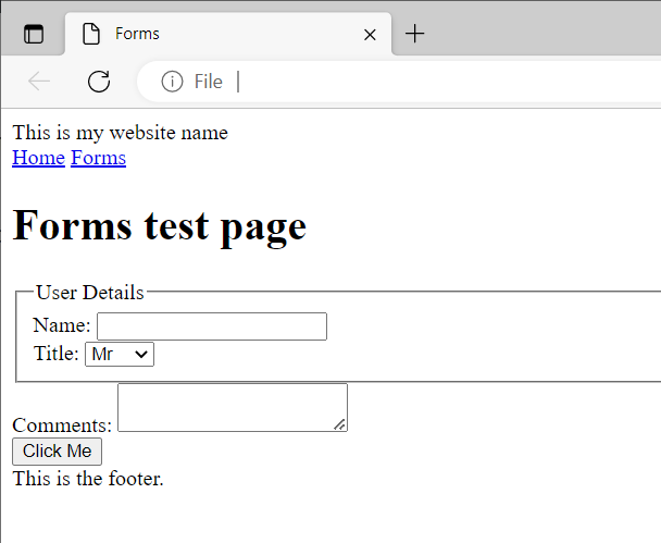
The <fieldset> tag is used to group related elements in a form.
The <fieldset> tag draws a box around the related elements.
The <legend> tag is used to define a caption for the <fieldset> element.
<!DOCTYPE html>
<html lang="en">
  <head>
    <link rel="stylesheet" href="/style.css">
    <script type="text/javascript" src="/script.js"></script>
    <meta charset="UTF-8">
    <meta author="Your name here">
    <title>Forms</title>
  </head>
  <body>
    <header>
      This is my website name
    </header>
    <nav>
      <a href="/index.html">Home</a>
      <a href="/forms.html">Forms</a>
    </nav>
    <main>
      <h1>Forms test page</h1>
      <form>
        <fieldset>
          <legend>User Details</legend>
          <label for="full_name">Name: </label>
          <input type="text" name="full_name" id="full_name"><br>
          <label for="salutation">Title: </title>
          <select id="salutation" name="salutation">
            <option value="0">Mr</option>
            <option value="1">Ms</option>
            <option value="2">Mrs</option>
            <option value="3">Miss</option>
            <option value="4">Dr</option>
          </select><br>
        </fieldset>
        <label for="comments">Comments: </label>
        <textarea name="comments" id="comments"></textarea><br>
        <button type="button">Click Me</button>
      </form>
    </main>
    <footer>
      This is the footer.
    </footer>
  </body>
</html>