Last week you learned how to go through the stages of a project and saw an example from the initial client brief through to the delivered and tested website.
While the client never mentioned that the website should work on a mobile phone in portrait mode it is an unspoken requirement. A website should be usable on any common web browsing device. More and more people use their phones to access websites so this should be kept in mind when you are designing one.
With CSS you can use the @media rule that could be used to only apply certain CSS rules when a screen was above or below a certain width. You could also use it to detect the orientation of a phone so that you would know if it was being used in portrait or landscape mode.
We will use these rules to make the garage website more responsive. But first we need to design what the site will look like at different screen widths. Will we just have the two different designs, one wide for desktops, one narrow for phones. Or will we have three or more that alter the layout as the screen gets wider.
For this project lets keep it simple with just two designs. Pick a width, on screens more narrow than that the narrow content CSS loads, for those at or above that width the wide content CSS loads.
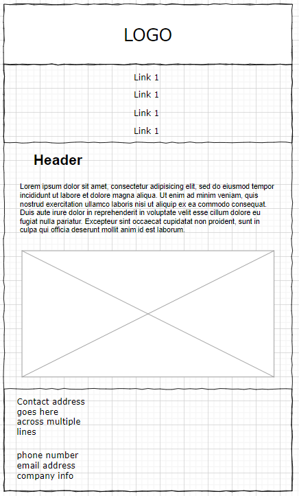
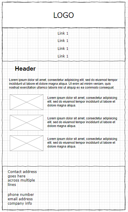
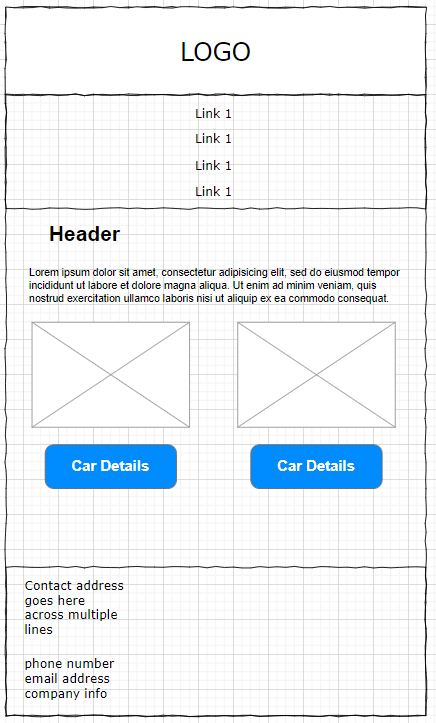
Now look at your existing site and think about which parts would be hard to read or use on a portrait mobile device. A full width block of text or image is fine. They can still take up the full width although the text will now spread over more rows. Where you have side by side columns it is worth converting them into full width containers that stack vertically. This applies to menus too. If there are enough items in the menu that it might be difficult to select the right link when they are crushed together horizontally then it is worth converting to a vertical list.
You don’t need a new wireframe for the printed details page as that still comes out of a printer rather than displayed on a screen.
If the container on the wide layout was using flex then you can just change the flex direction from rows to columns for the narrow layout and adjust the child elements to take up the full width of the flex container.
If the container on the wide layout was using grid then you can change the number of columns in the grid to 1 for the narrow layout.
<!DOCTYPE html>
<html lang="en">
<head>
  <title>Mobile Test</title>
  <style>
#grid {
  background-color: cyan;
  display: grid;
  grid-template-columns: auto auto auto;
}

#flex {
  background-color: pink;
  display: flex;
  flex-wrap: wrap;
  flex-direction: row;
}
#flex div {
  flex-basis: 33.33%;
}
@media screen and (max-width: 768px) {
  #grid {
    grid-template-columns: auto;
  }

  #flex {
    flex-direction: column;
  }
  #flex div {
    flex-basis: 100%;
  }
}
  </style>
</head>
<body>
  <div id="grid">
    <div>1</div>
    <div>2</div>
    <div>3</div>
  </div>
  <hr>
  <div id="flex">
    <div>1</div>
    <div>2</div>
    <div>3</div>
  </div>
</body>
</html>
In the above example both the grid and flex containers have 3 child elements. On screens that are no more than 768px wide then the child divs are stacked vertically. Once the screen is at least 769px wide then the child divs are placed beside each other in a horizontal row.
The @media rule is used in media queries to apply different styles for different media types/devices. This allows for more responsive designs to be tailored to different formats.
Media queries can be used to check many things, such as:
- width and height of the viewport
- width and height of the device
- orientation (is the tablet/phone in landscape or portrait mode?)
- resolution
You can combine or exclude options with the and or not keywords.
You can also apply styles based on media types. These types are:
- all – The default. Used for all media type devices
- print – Used for printers
- screen – Used for computer screens, tables, smart phones etc
- speech – Used for screen readers
The most common feature choices are:
- height – The viewport height
- max-height – The maximum height of the display area
- min-height – The minimum height of the display area
- width – The viewport width
- max-width – The maximum width of the display area
- min-width – The minimum width of the display area
- orientation – The orientation of the viewport (landscape or portrait mode)
Examples
Use the print type to change the styles for clearer printing:
@media screen {
  body {
    color: greeen;
  }
}

@media print {
  body {
    colour: black;
  }
}
Use width checks to make responsive designs: On screens that are 992px wide or less, go from four columns to two columns
.column {
  width: 25%;
}
@media screen and (max-width: 992px) {
  .column {
    width: 50%;
  }
}
On screens that are 600px wide or less, make the columns stack on top of each other instead of next to each other
@media screen and (max-width: 600px) {
  .column {
    width: 100%;
  }
}
Now go and make mobile friendly designs for your websites and then alter the CSS to allow for the site to respond to changes in viewport width.