
Graphical data presentation includes anything where data is presented in a form where it is seen and then interpreted.
It includes diagrams, pictures and many different forms of graphs:
A systems diagram is made up of words or short phrases (often in boxes) which are linked by lines and arrows.
They are often used to summarise a complicated concept or portray relationships within a system.
Useful when:
-
There are too many concepts for an easy explanation in words, but not too many that the diagram is cluttered and more confusing
-
There is a clear start/end point
-
Different thicknesses of arrows can be used to show amounts/proportions
-
Accompanied by a written description – it should act as an aid, not a replacement, for a description
Question: Which of these sets of data would best be presented as a systems diagram?
A – Demonstrating the relationship between type of soil, fertility and the agricultural output of the Fife peninsula
B – The size and orientation of corries in the NW Highlands
C – The global incidence of cholera in developing and developed countries
Worked example
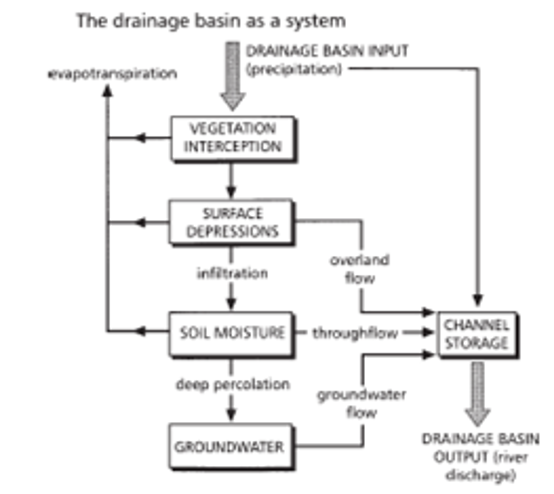
Starting at the top of the diagram and working down the page, we can see that the input into the drainage basin is precipitation. Most of the precipitation falls onto the vegetation and from there some of it is lost through evapotranspiration. Of the remainder, the water flows from the vegetation down into surface depressions where again some is lost through evapotranspiration and some becomes overland flow into channel storage.
The rest infiltrates into the soil to become soil moisture and again some is lost through evapotranspiration and some becomes throughflow into channel storage. Some of the soil moisture then percolates deep into the rocks to become groundwater which flows into channel storage.
Imagine having to read the above paragraph without the data being presented graphically. It would be mind boggling! This demonstrates a good use of a systems diagram.
By using the same terms as the diagram, and putting them in bold, it’s easy to refer between the diagram and text.
Systems diagrams provide an overview of complicated systems, which helps the reader understand the relationships between the stages.
-
A well constructed system diagram is easy to read and follow.
-
They can demonstrate cause-and-effect relationships, helping demonstrate how a change in one part affects the rest of the system.
-
Different colours/box shapes/connectors can be used to further categorise data (for e.g. inputs, processes and outputs).
-
Systems diagrams require careful and time consuming planning to ensure all stages are included and it can be followed.
-
They can become too complex if there’s too much information included and, overall, they take a long time to produce.
-
Most system diagrams don’t show quantitative data, only the relationships, so they can’t be used for numerical analysis.
Activity
This text talks about the inputs, stores, outputs and transfers involved in the glacial system. Using the terms in the text, create a systems diagram.
The glacial system consists of inputs, stores, transfers and outputs. Understanding the connections and relationships between the different components of the system helps indicate how a change in one component results in consequential changes throughout the system.
Inputs – The main input to the glacier system is through precipitation in the form of snow. Ice and snow can also be inputted to the glacial system through avalanches which can occur both naturally and due to human activity in mountain areas. Inputs to a glacier result in accumulation.
Stores – The mass of ice within a glacier is a store that can be added to (accumulation) or lost (ablation). Material that is carried by the glacier is also known as a store.
Transfer – The transfer is the movement of a glacier due to gravity, gradient and increasing accumulation at the glacier source. In mountainous areas this movement is much quicker than that of ice sheets, which are often on a flatter surface. The main movement is downhill although, unlike water, ice has the capacity to move uphill if the ice pressure behind is great enough, resulting in the over-deepening of glaciated valleys.
Outputs – The main output is the loss of water vapour from the evaporation of water from the glacier’s surface. If, under certain circumstances, snow and ice converts directly to water vapour without going through the liquid water stage it is known as sublimation.
Another output is calving which is where blocks of ice break off at a glacier’s snout. Usually this occurs where glaciers end in lakes or the sea, but it can also occur when ice falls off the end of a hanging valley glacier.
The other main water output from a glacier is where water leaves the snout of the glacier in liquid form as meltwater streams.
All these outputs from a glacier’s ice store are known as ablation. Solid material leaving the glacier can also be included as an output. As a glacier retreats (melts towards its source), rocky material will be washed out of the glacier, known as moraine.
Bipolar Analysis
Bipolar analysis is used to compare two different things. Average values are calculated for each category from questionnaire or survey results.
A dot showing the average value is placed on the diagram and the dots for different categories joined together.
Useful when:
-
The categories/ratings are descriptive, rather than numerical (qualitative data vs quantitative data).
-
There are “high” and “low” categories.
-
There are 2-3 things being compared, with an expected difference. More than this, a bipolar analysis diagram can be too confusing, with the lines and dots becoming difficult to interpret.
-
Accompanied by a written description/interpretation of the results
Question: Which of these sets of data would best be presented as a bipolar analysis?
A – A study of land use from the CBD to the Suburbs in Inverness
B – Opinions related to crime in rural and urban environments in the Highlands
C – The links between preparation and response to Hurricane Katrina
Worked example
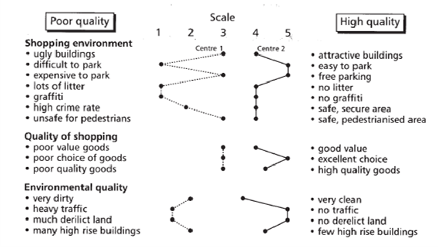
The diagram clearly shows that the new shopping centre (Centre 2) is perceived to be more attractive than the established centre (Centre 1).
The main aspects of difference are the provision of parking spaces, cleanliness, safety, pedestrianisation and variety of shops.
Centre 1 contrasts unfavourably for things such as graffiti, litter, poor parking, heavy traffic and derelict land. However, there is less difference between the quality of shopping at each.
The description highlights the overall pattern and then goes in to look at some of the detail behind it. It’s important to talk about the areas in which the shopping centres are similar, as well as those which differ greatly.
Bipolar analysis is used to compare areas, people or gathered data.
-
Bipolar analysis allows a large variety of variables to be plotted in a relatively small space.
-
Patterns can be identified quickly and easily.
- Relatively quick to plot
- Colour can be used to enhance analysis
-
They can be used with qualitative data, where people give their own perceptions or opinions.
-
However, the perceptions will be subjective which means that different people may give different judgements at the same location.
-
The technique only works well for two or three areas which have significant differences; otherwise the lines become cluttered and crossing which makes it difficult to interpret.
- The results are based on people’s perceptions, which may be biased
Activity
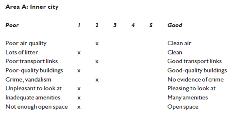
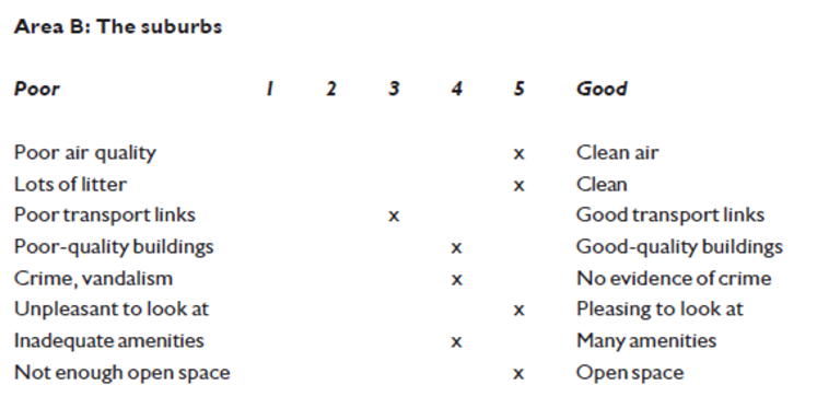
An environmental quality survey was undertaken in two contrasting mountain resorts. Resort B is in an area which has seen government investment in ski infrastructure and facilities. The results for each resort are shown below; a score of 1 in a row means that the area is bad, 5 means it is good.
Look at the survey scores for the two resorts (A and B) and create a bipolar diagram.
Compare the two resorts by looking at their respective results and explain the differences.
Resort A: No government investment
Logarithmic Graphs
Logarithmic graphs are used to compare things that are very different in size, for example the populations of the continents.
Logarithmic graphs are drawn on special graph paper where the logarithmic scale compresses the range of values.
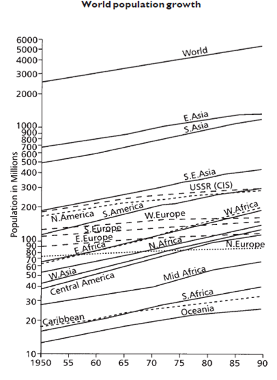
On the vertical (y-axis) scale, there are cycles of values. These increase by a set amount – usually the power of ten.
Useful when:
-
There is a wide range of data – from very small values to very large values. More space is given to the smaller values and less to the larger values.
-
Data on a linear (normal scale) graph would be difficult to interpret.
Question: Which of these sets of data would best be presented on a logarithmic graph?
A – The relative size of sediment samples along the River Tay
B – A comparison between the number of population employed in agriculture worldwide and the GDP
C – A comparison between the height of mountains in the Cairngorms and their recreational use
Worked example
Compare this linear graph (normal axis) with the logarithmic graph shown above. The data in the two is identical – both graphs show the population of different states in India. However, the logarithmic graph allows us to see the detail of those smaller states, which is entirely lost in the linear graph.
Google Sheets and Microsoft Excel both make it easy to switch between linear and logarithmic scales – simply explore the customisation options for the axis.
Logarithmic graphs are used when the data set has a very large range. They have a logarithmic scale on one, or both, axes.
-
For data sets with large ranges, logarithmic graphs are more appropriate than linear graphs.
-
The log scale compresses large numbers and spreads out small ones, whilst on a linear scale the small values would be too clustered to see properly.
- Allow you to see increased detail at smaller values, whereas larger values are compressed.
-
Logarithmic graphs can’t plot 0 values.
-
Positive and negative values can’t be put on the same graph.
-
They are difficult and more time consuming to construct than linear graphs.
-
They are more difficult to interpret, which leaves data interpretation open to more errors.
Activity
Varanasi is a city on the Ganges River in the Northern Plains region of India. It is an important site of pilgrimage for many Hindus.
The data for Varanasi’s monthly precipitation is shown. Plot the data in two ways:
-
As a linear bar graph
-
As a logarithmic bar graph
You can access a suitable, printable logarithmic graph paper here.
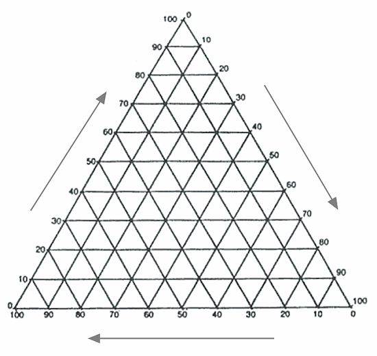
Triangular Graphs
Triangular graphs are used to show data that can be divided into three parts. Just like a triangle, they have three sides! They are sometimes known as ternary plots.
Useful when:
-
Large amounts of numerical, percentage based data need to be plotted
-
Groups of data can then be identified – and often are then assigned a name (e.g. soil types)
-
Care is taken to plot points correctly – it can be easy to get confused. Check you have followed the arrows correctly and that the values for each data point add up to 100%.
Question: Which of these sets of data would best be presented on a triangular graph?
A – Percentage of minerals (quartz, feldspar, mica) in rocks from the W-E coasts of the Scottish Highlands
B – The links between the distance from the city centre and the annual gross income
C – Study of the effects of the albedo on coloured surfaces in a controlled environment
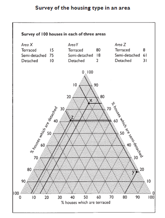
Worked example
There are three components for each data point – the % of houses which are terraced, semi-detatched and detached. By plotting the points on the graph we can see that areas X and Z are similar, with area Y being very different.
Triangular graphs are used to display data between three variables (only).
-
Large amounts of data can be plotted in a relatively small space and can be used to identify the direction of correlation (or none).
-
Clusters can emerge, which makes it easier to identify relationships/trends.
-
However, large clusters might make it difficult to interpret the individual figures for the data points.
-
Data must be in the form of percentages.
-
Drawing or reading the graph is difficult and it is easy to make errors.
-
It is easy to identify anomalies in the data.
-
Large amounts of data can be shown on one graph.
Activity
Soil texture is a key factor when it comes to determining the appropriate planting of agricultural land. Whilst some plants thrive on a sandy soil, others need a “perfect” loam with a balance of sand, silt and clay sized particles.
Soil samples are collected from farmland in the area surrounding Varanasi, India. Use the soil texture diagram to answer the following questions:
1) Read off the values for soil sample:
A
B
C
D
2) On a copy of the soil texture diagram, plot and match the correct names to the following samples:

3) Which of the soil samples is:
-
Likely to be free draining?
-
Likely to have formed from sandstone?
-
Likely to be difficult to drain?
-
Likely to have formed from river sediments?

Kite Graphs
Kite diagrams are most useful for making observations at regular points along a transect line.
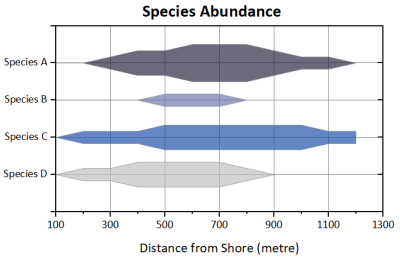
The data on a kite graph/diagram is plotted above and below the zero line. It is always symmetrical. The data points are then joined and the area shaded in, giving the kite appearance.
Useful when:
-
Each “row” has a different category (e.g. species of plant, sediment size)
-
The rows are spaced out so that the highest value doesn’t interact with the next category
-
Data appears and disappears – for example in the kite graph shown, the Species B only appears between 400 and 800m.
Question: Which of these sets of data would best be presented on a kite diagram?
A – Characteristics of the A9 and their relationship to accident rates 20019-2024
B – Comparing the speed of a river in the upper, middle and lower courses
C – Types of green space across the Burgess model of urban development
Worked example
Footpath erosion occurs when visitors to an area cause the widening of paths. This can contribute to land use conflicts in an area as a cause of visual pollution and a reduction in biodiversity. Many land owners need to invest time and money in path maintenance in order to prevent the erosion of footpaths.
A popular footpath on an estate in the NW Highlands has been studied to establish a baseline. The study will be repeated in a year to see if erosion is worsening.
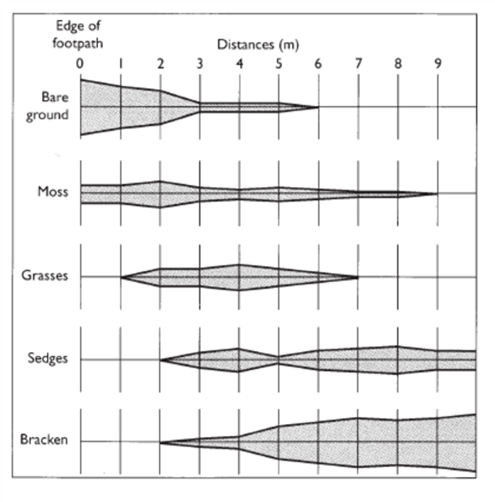
At the very edge of the footpath is mainly bare ground with some moss. As you move away there continues to be bare ground until around 3m where the amount drops significantly and grasses, sedges and bracken take hold.
The grasses increase until their maximum at 4m and then disappear again at 7m. Bracken is the dominant vegetation type after 5m.
Kite diagrams are a graphical way of showing changes over distance.
-
They are commonly used to show changes in the % cover of plant species/vegetation over slopes, sand dunes or away from a footpath.
-
They clearly show the density and distribution along a transect.
-
They are quite easy to construct as they are a mirrored line graph.
-
It is visually clear and easy to distinguish one category (e.g. type of vegetation) from each other
-
The scale can influence the visual effect, as it is mirrored on both sides. Changes can seem bigger than they are.
-
They are time consuming to construct by hand, as data has to be plotted twice.
Activity
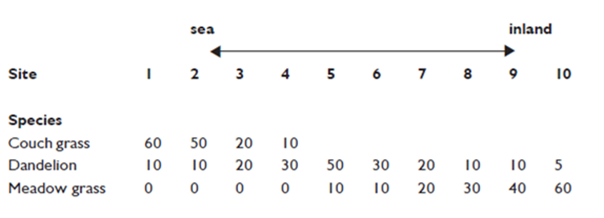
Another area in the NW Highlands which sees land use conflicts is the shoreline. Dune systems are under pressure from:
-
climate change
-
grazing
-
visitors
NatureScot is studying the presence of different species along a transect on a vulnerable dune system. The data is shown – plot this as a kite diagram.
Polar Graphs
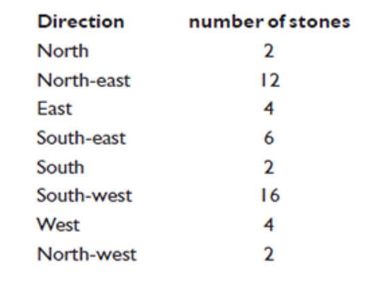
Polar graphs (or rose diagrams) are used to show direction as well as magnitude.

Polar graphs are used to plot data which is directional. This can be using:
-
Compass directions (e.g. north-north west)
-
Bearings (e.g. 272 degrees – these are usually grouped into, for example, 0-40 degrees)
A scale is used which relates to the radius of the diagram. The scale and intervals will depend on the size of the diagram and range of data being collected. It is usually numbered along the north axis, or another appropriate space with little data (e.g. north-east in the example shown).
Some polar graphs may go further and show another level of detail. A wind rose will show not just the occurrence of winds from different directions but also the wind speed.
Useful when:
-
Data is directional
Question: Which of these sets of data would best be presented on a polar graph?
A – The direction of travel on the M25 ring-road, London
B – The orientation of rocks in a glacial deposit from the Loch Lomond Readvance.
C – A comparative study of long-shore drift on the north and west coasts of Scotland.
Worked example
You learned in Higher Geography that “corries form on north/north-east facing slopes where more snow falls in the winter than melts in the summer”. Well – does the data show that?
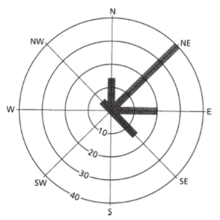
The data plotted on this polar graph shows that most corries in the Lake District face northwards and eastwards, and by reading off the scale (located between the south and south-west points) it can be seen that 40 corries face in a north-easterly direction, 20 in an easterly direction and 15 in a northerly direction.
Polar graphs show the direction of data along with its magnitude.
-
They can be used for data sets with an orientation. Commonly this is the aspect of corries, slopes and wind direction.
-
They are one of the few ways we can visually demonstrate data with a direction.
-
They can also show the frequency and strength of, for example, wind.
-
Towards the middle of the polar graphs it can be they can be more difficult to read the scale as it becomes cluttered.
-
Patterns (such as prevailing wind direction) can be very quickly identified.
-
The way that the bars radiate out can make larger values dominate and stand out.
-
It is difficult to spot anomalies.
Activity
The planting of trees on land has been part of the Scottish Government’s push to meet climate targets and join the carbon market. Some planting schemes have made the news for being unsuccessful, with saplings dying. This has kick started a discussion on the suitability of some areas for planting.
In order to learn more about this, the success of plantations on slopes with different aspects in the Cairngorms has been studied. Plot the results on the polar graph and interpret the results.
Dispersion Diagrams
These involve plotting the values of a single variable on an axis to graphically represent the frequency of data.
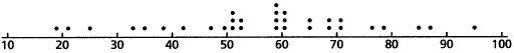
Dispersion diagrams show how data is grouped and spread (dispersed). It is often used alongside statistics such as the median, mode and inter-quartile range.
Useful when:
-
Describing one set of data or looking at the difference between how two sets of data are distributed
-
Calculating suitable divisions used on a choropleth map
-
Using numerical data or data in frequency format
Question: Which of these sets of data would best be presented on a dispersion diagram?
A – A study of the measured noise pollution adjacent to quarries in the North of Scotland
B – Globalisation and me: the geographical distribution of iPad parts
C – A comparison of the geographical boundaries of the MacKenzie and MacLeod clans
Worked example
In this example, two dispersion diagrams are used to compare data. Area A and Area B are both suburbs of a town, but the close proximity of an airport to Area B is reflected in the house prices.
As well as the prices being lower, they are also much more grouped together. If calculating the range or inter-quartile range, we would expect it to be much smaller in Area B.
Dispersion diagrams show the spread and distribution of data around a median.
-
They can be used to compare the spread/distribution of similarly sized data sets.
-
They clearly show anomalies or outliers in data
-
They allow for illustration and calculation of the inter-quartile range.
- They can show the spread/distribution around the median.
Activity
A contrail is a condensation trail, which forms behind airplanes which cruise at high altitudes. They appear in the sky as long, thin clouds.
The number of contrails recorded in the sky was measured across 30 weeks at two locations. Plot the results of these on a dispersion diagram.
Once you have done this, briefly describe what the dispersion diagrams show.
Location A: 43, 30, 39, 56, 32, 46, 40, 19, 45, 26, 36, 38, 43, 20, 51, 45, 32, 45, 21, 34, 48, 23, 24, 37, 43, 37, 32, 28, 19, 22.
Location B: 23, 18, 27, 16, 12, 20, 31, 23, 18, 25, 31, 12, 9, 25, 13, 22, 23, 12, 17, 26, 10, 9, 25, 31, 25, 30, 16, 19, 12, 19.
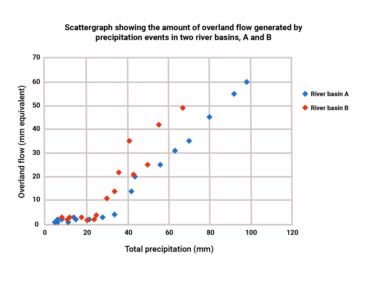
Scatter Graphs
Scatter graphs are used to plot two sets of data with the intention of finding out the relationship between them. To do this, the data is plotted as points and a best fit line is drawn.
Dispersion diagrams show how data is grouped and spread (dispersed). It is often used alongside statistics such as the median, mode and inter-quartile range.
The independent variable (in this case total precipitation) always goes on the x-axis, whilst the dependent variable (overland flow) is on the y-axis.
Useful when:
-
Plotting two sets of numerical data
-
Identifying whether there’s a relationship between the data
-
Used with data of which there could be a relationship – don’t just use it for anything and everything!
-
There are few anomalies. These are data points which are widely different from the rest. Sometimes, you may choose not to include these if you know the reason for them.
-
Used alongside inferential statistics such as Spearman’s Rank and Pearson’s Product
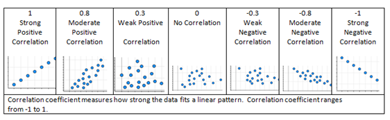
When talking about a relationship between datasets, we use the term correlation. A correlation can be described in different ways.
The above graph of total precipitation and overland flow would have a positive correction – as one gets bigger so does the other. River Basin A has a more strong correlation – we can be more certain here that precipitation does have an impact on overland flow.
Question: Which of these sets of data would best be presented on a scatter graph?
A – Changes in water velocity in the long-profile of the River Tay.
B – An in-depth look at differences in GDP per capita between countries in Asia in 2025.
C – Energy prices and poverty: does one affect the other?
Worked example
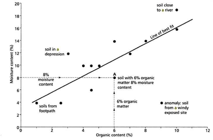
A series of soil samples have been collected from across National Trust sites in Northern Scotland. The project aims to determine whether there’s a relationship between the organic content of the soil and it’s ability to retain moisture. Both the organic content and soil moisture have an influence on soil fertility.
At Inverewe Gardens the soil sample collected had 6% organic matter and 8% moisture content. This is shown plotted on the scatter graph.
A correlation was identified, so a line of best fit was drawn. The correlation is weak and positive. The anomaly was disregarded.
Plotting the data on a scatter graph allows gardeners to make a prediction of the organic content simply by knowing the moisture content. This is useful, as moisture content can be read with a simple meter in the field, whilst organic content involves burning off organic material in a lab environment.
Scattergraphs are used to display data between two variables (only).
-
Large amounts of data can be plotted in a relatively small space and can be used to identify the direction of correlation (or none).
-
Anomalies/outliers can also be identified easily as they stand out on the graph.
-
When working with large datasets, it can be easy to make mistakes when plotting points and data sets can’t have the same value – they would plot “on top” of each other.
-
A weak correlation shouldn’t have a best fit line added – an inferential statistical test should be carried out to determine whether the relationship is significant.
Activity
High levels of silt in a river can affect the populations of fish and invertebrates which are able to survive there. As we suffer from longer periods of drought, river discharge will drop. This might have an impact on river siltation.
To find out if this is the case, data has been collected from different rivers. Plot this data on a scatter graph and, if there’s a correlation, draw a line of best fit.
-
Check you’ve identified the independent and dependent variable.
-
Does what you’ve found out make sense geographically? Can you explain why this might be?
| Site | Discharge m3/sec | Suspended load (g/m3) |
| 1 | 0.45 | 10.8 |
| 2 | 0.42 | 9.7 |
| 3 | 0.51 | 11.2 |
| 4 | 0.55 | 11.3 |
| 5 | 0.68 | 12.5 |
| 6 | 0.75 | 12.8 |
| 7 | 0.89 | 13.0 |
| 8 | 0.76 | 12.7 |
| 9 | 0.96 | 13.0 |
| 10 | 1.26 | 17.4 |