Inspired by Holbein’s The Ambassadors.
We liked the weird distorted painting of the skull at the Ambassadors’ feet. So we tried to make our own ‘anamorphic’ pictures. Can you work out what is the best perspective to view them from?
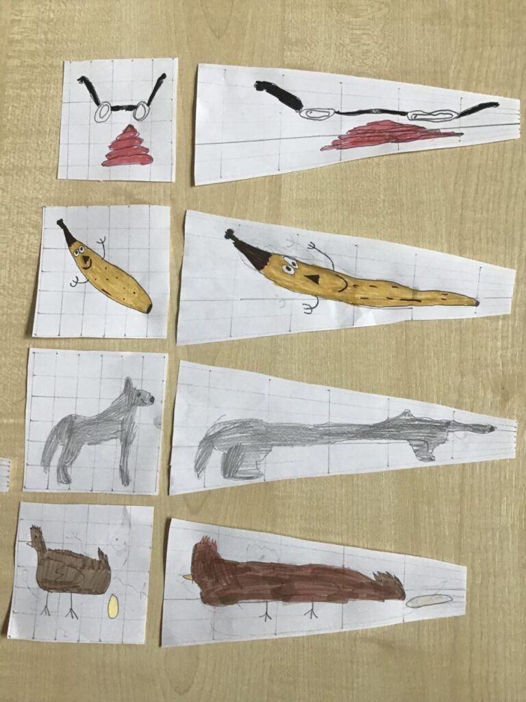
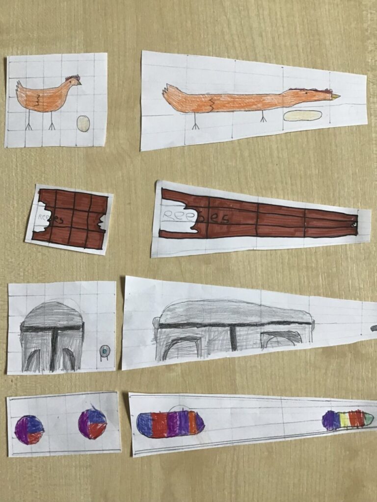
We liked the weird distorted painting of the skull at the Ambassadors’ feet. So we tried to make our own ‘anamorphic’ pictures. Can you work out what is the best perspective to view them from?


We decided to use what we have learned about composition, space, light, scale and colour to capture areas of the school in photographs. Here are some of the results. Which element do you think is strongest?
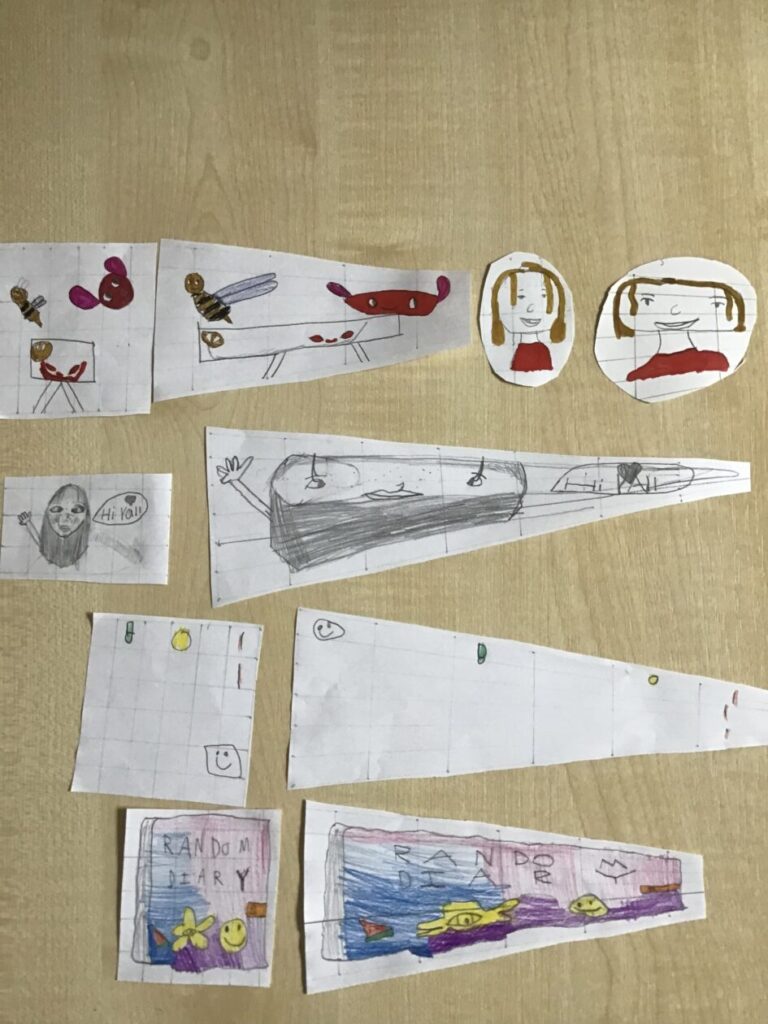
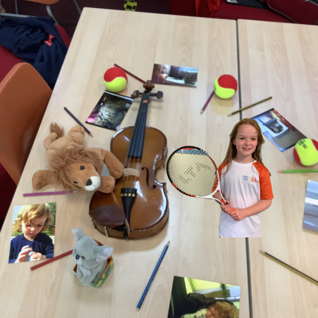
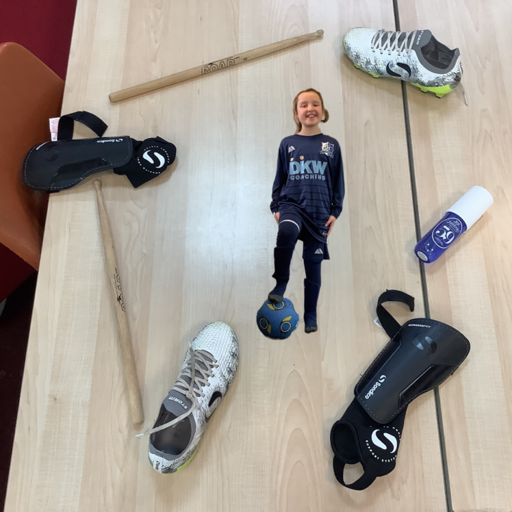
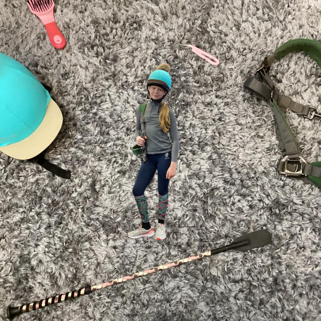
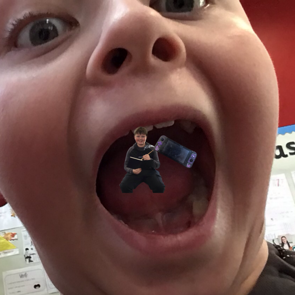
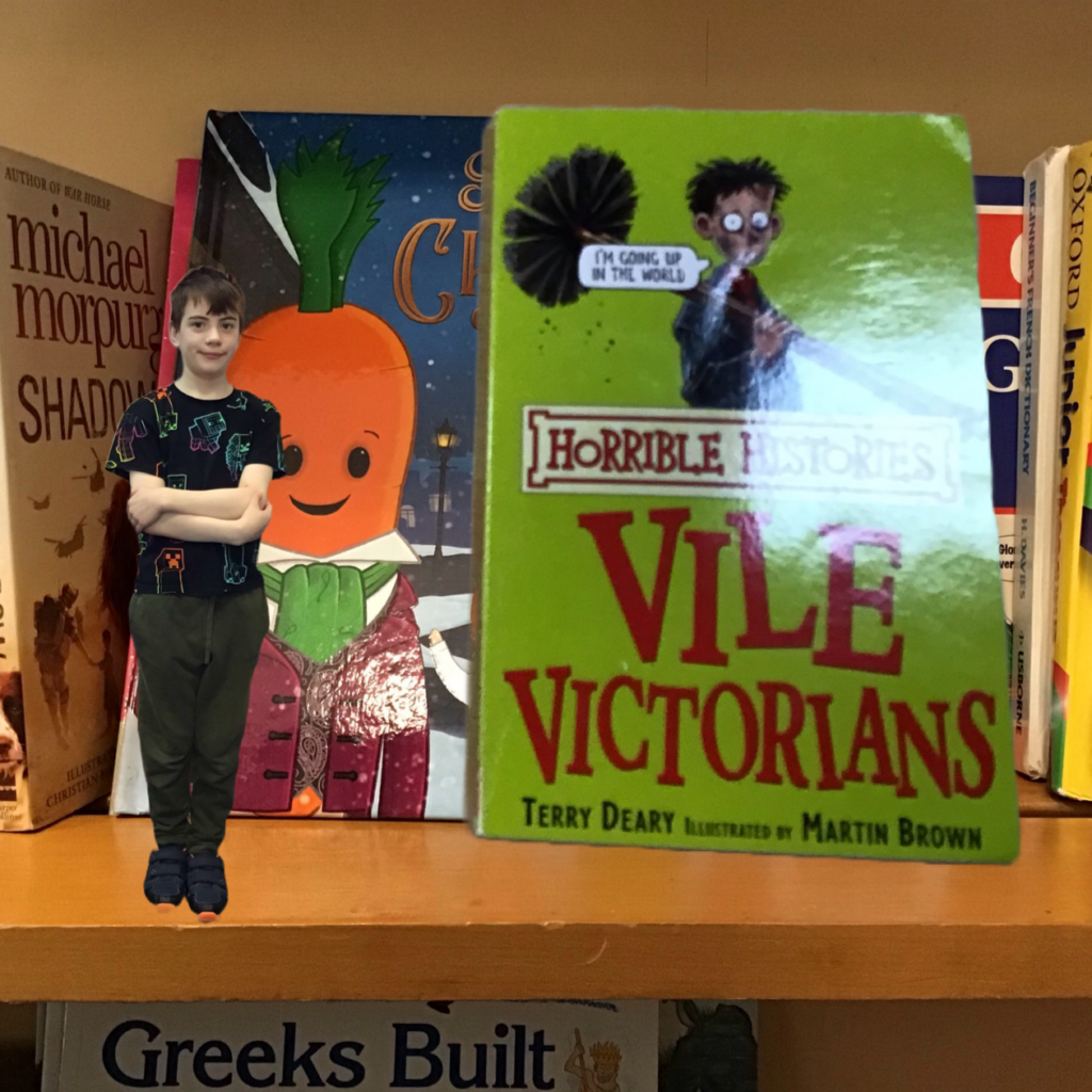
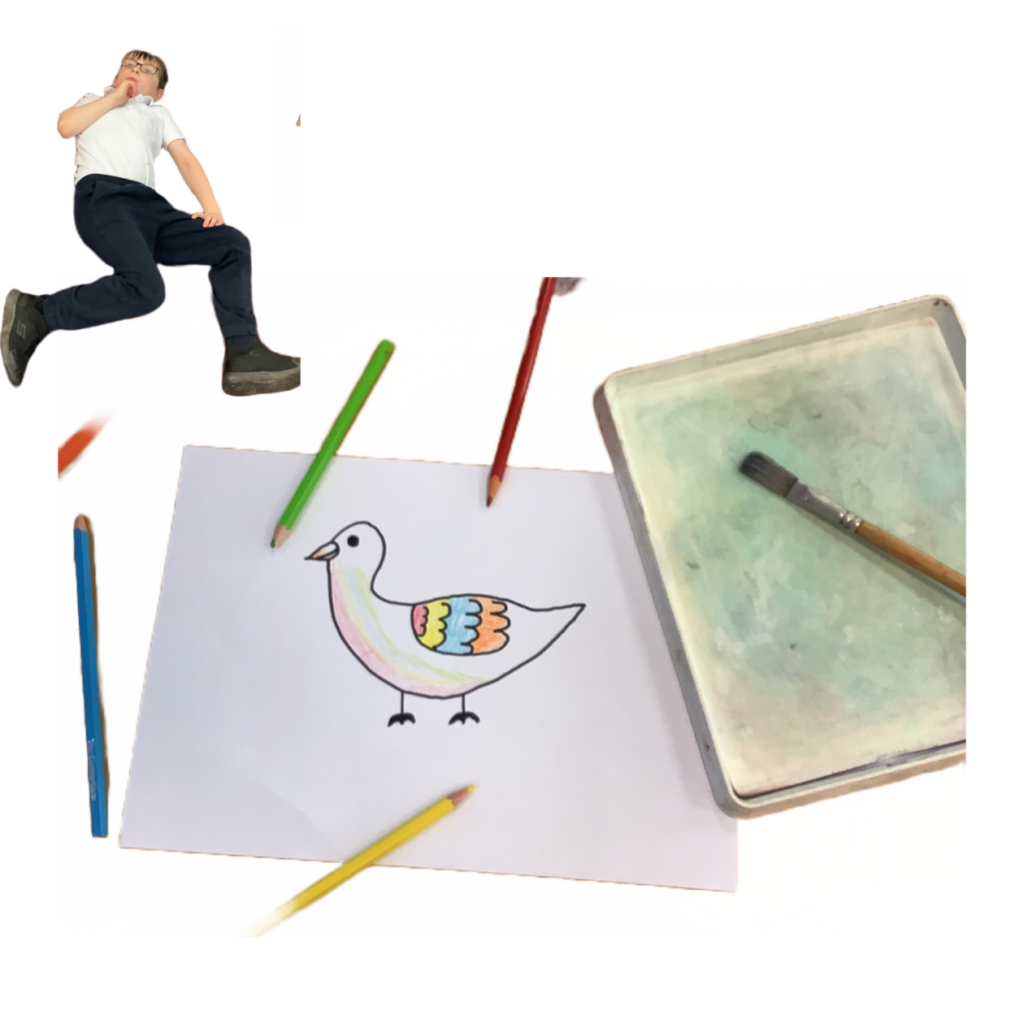
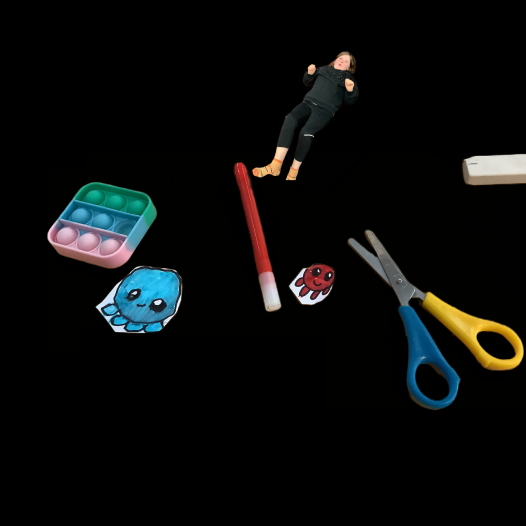
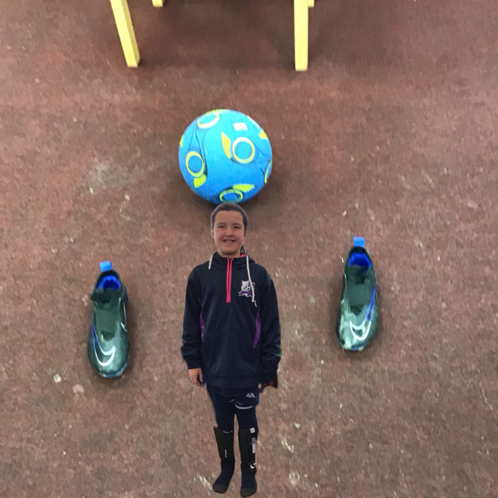
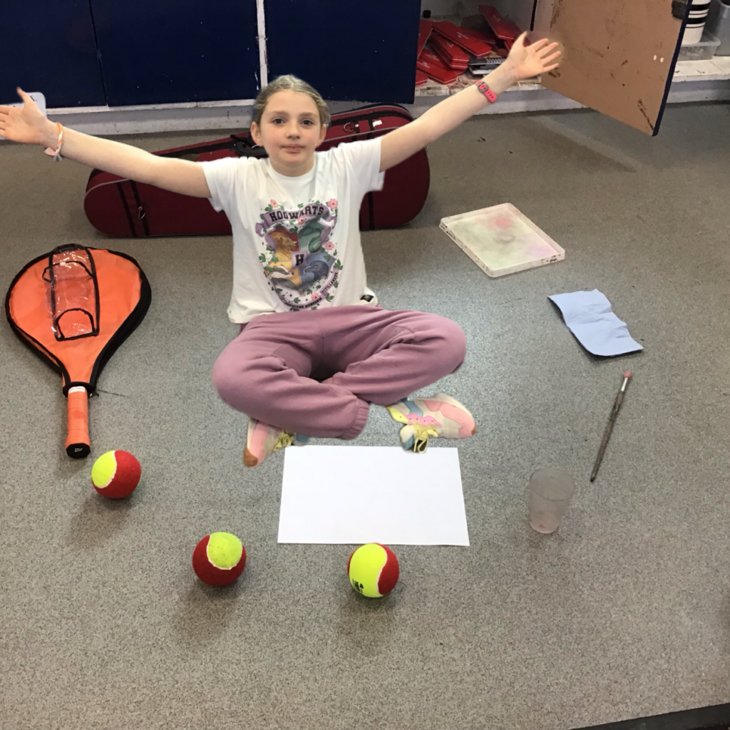
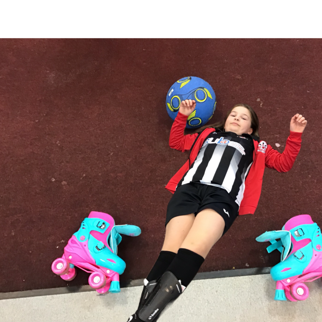
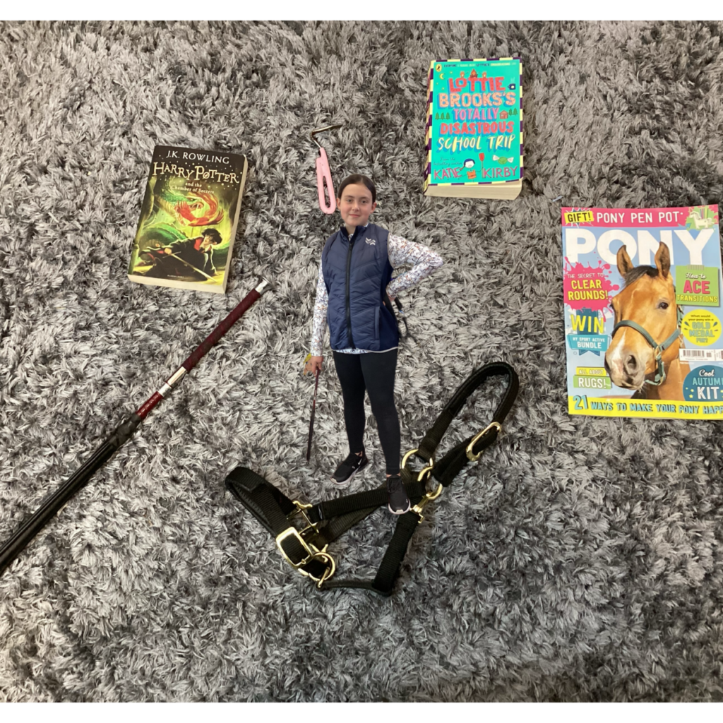
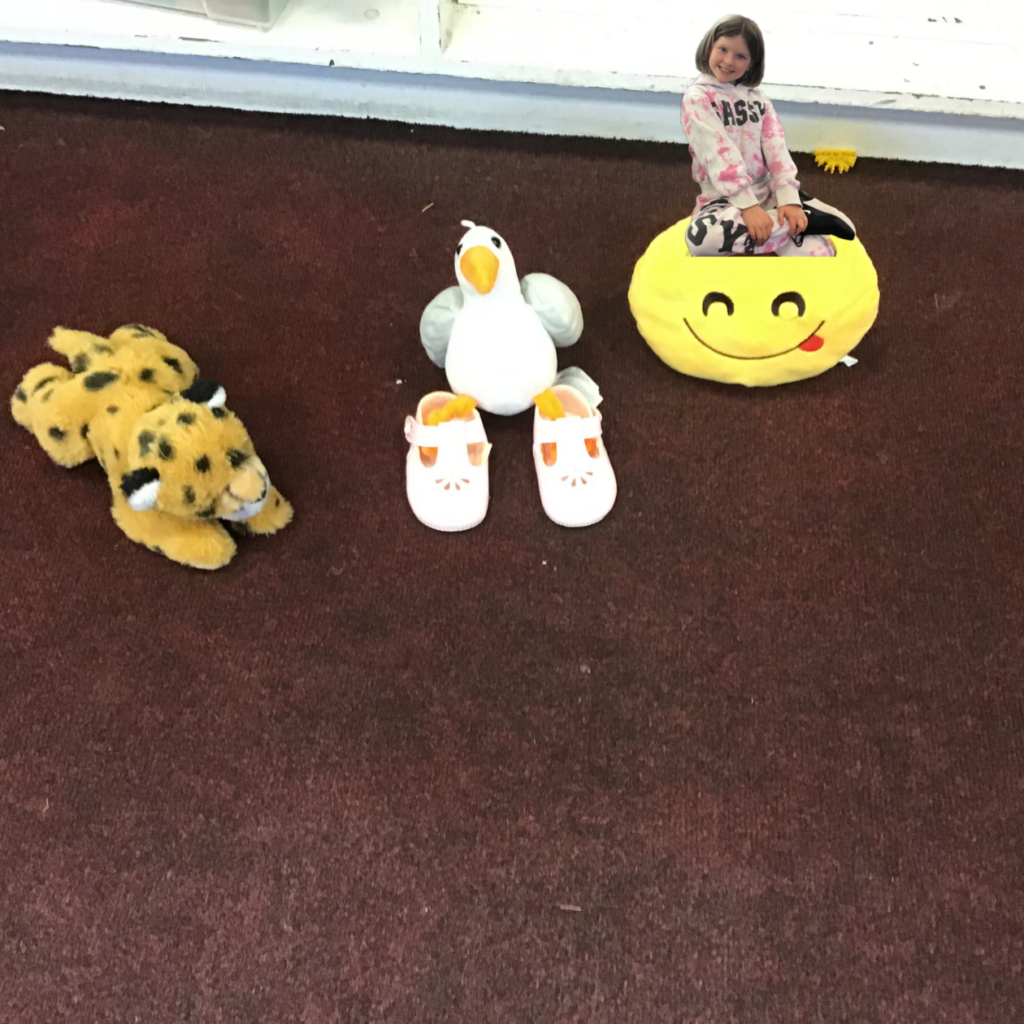
We’ve been looking at the theme of identity across three paintings in The Superpower of Looking this term. From this we created our own ‘identity’ portraits by composing two photographs and using an AI app to merge them together. We tried to show what is important to us, or how we wanted people to see us – and had some fun.
We looked at the stand out shapes and where the artist Ford Maddox Brown had placed them in the painting The Last of England:
Then we composed our own pictures live in the classroom and photographed them:
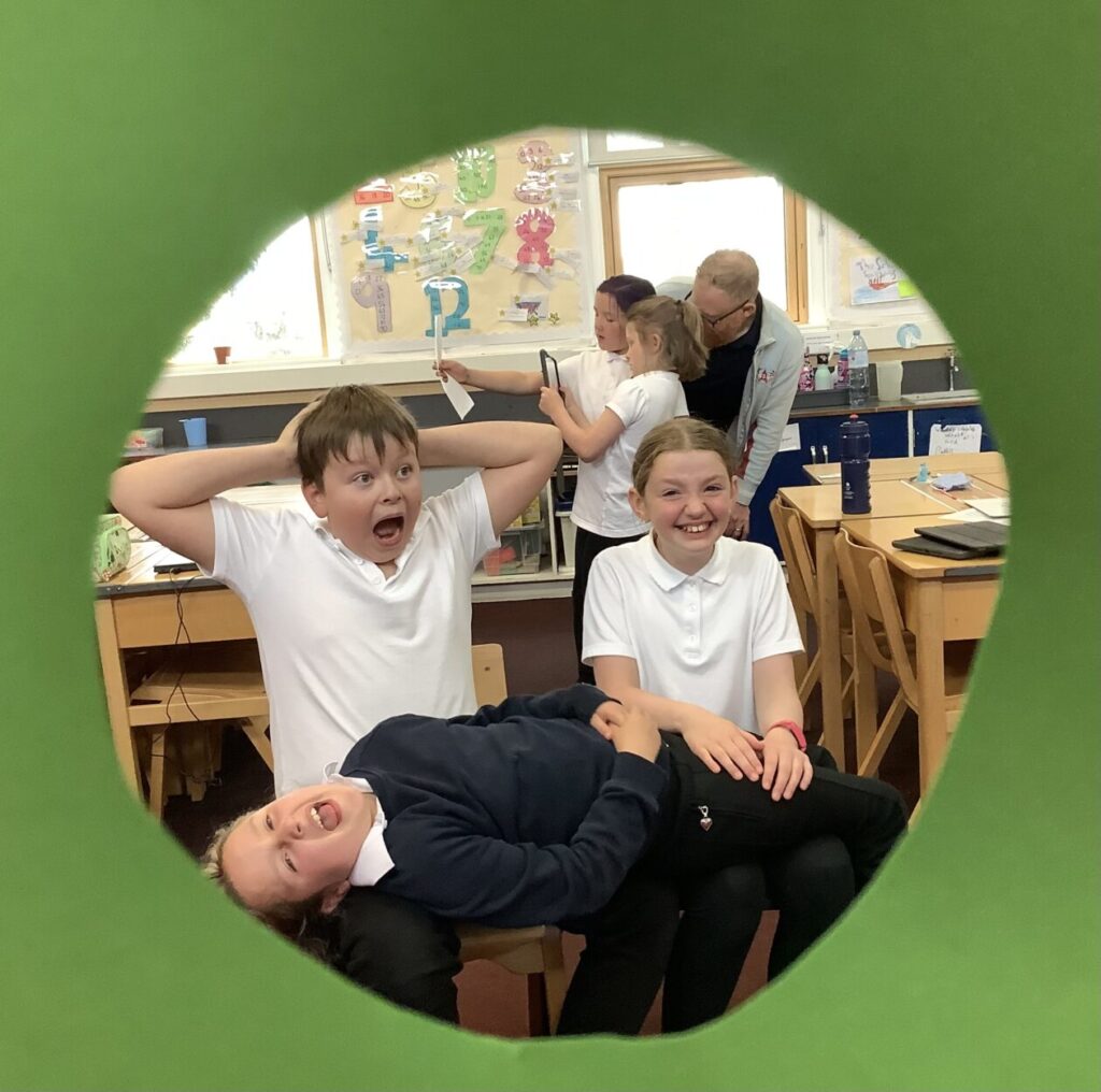
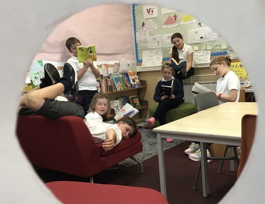
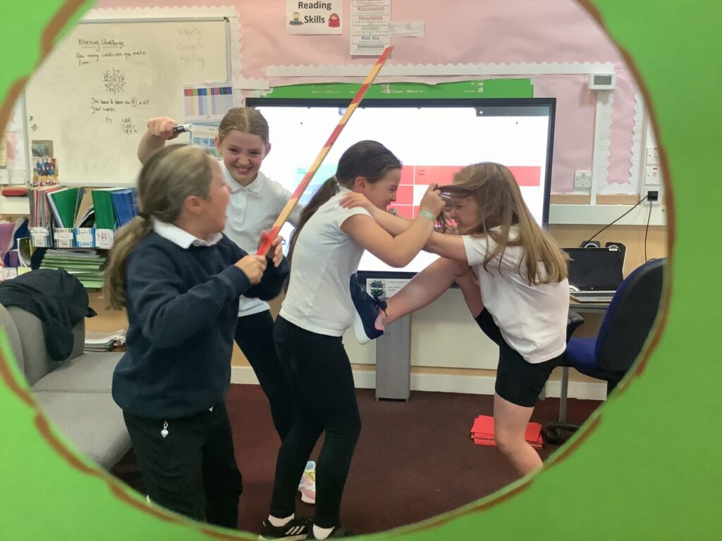
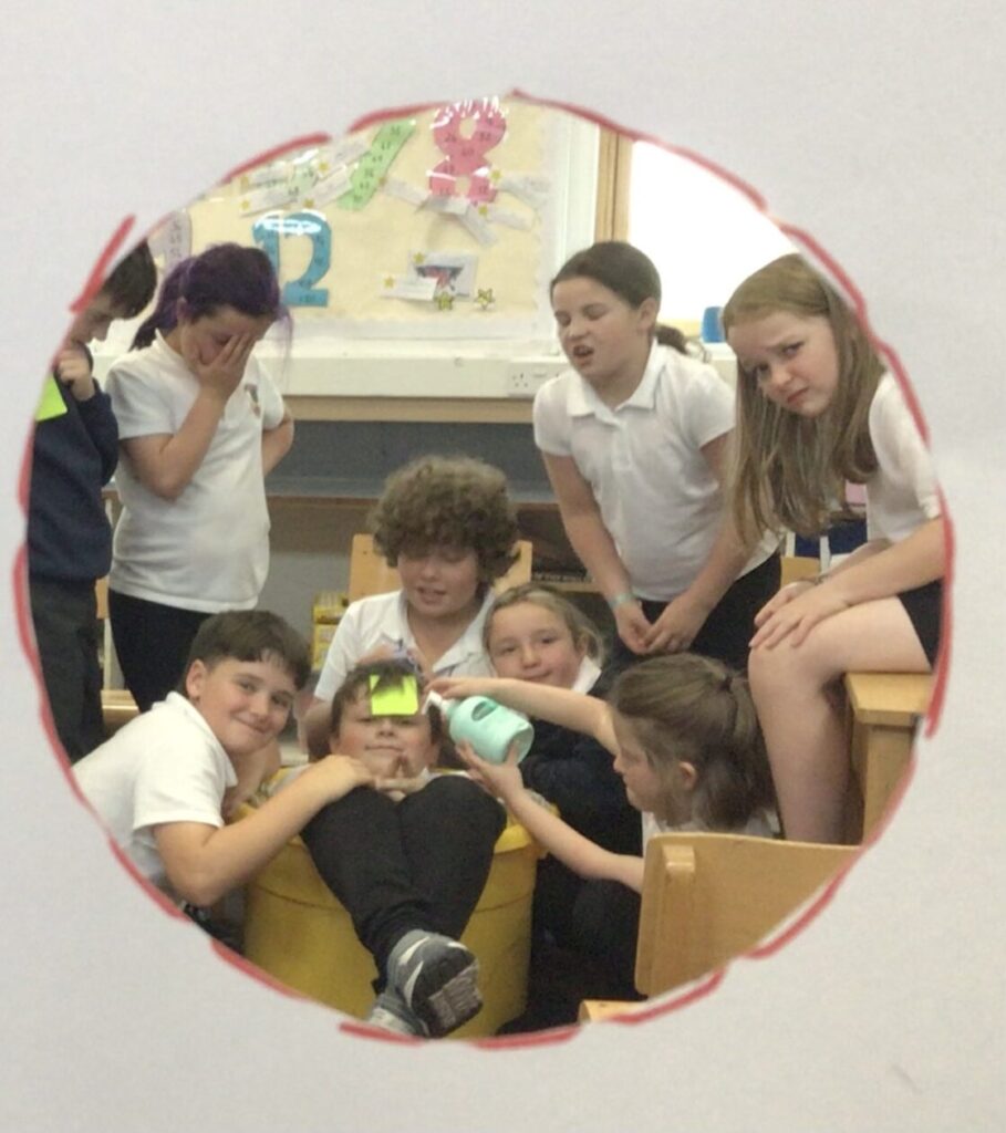
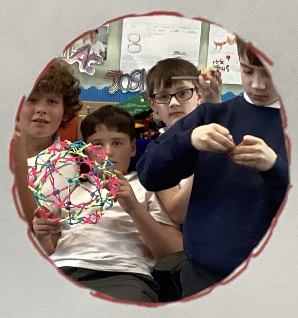
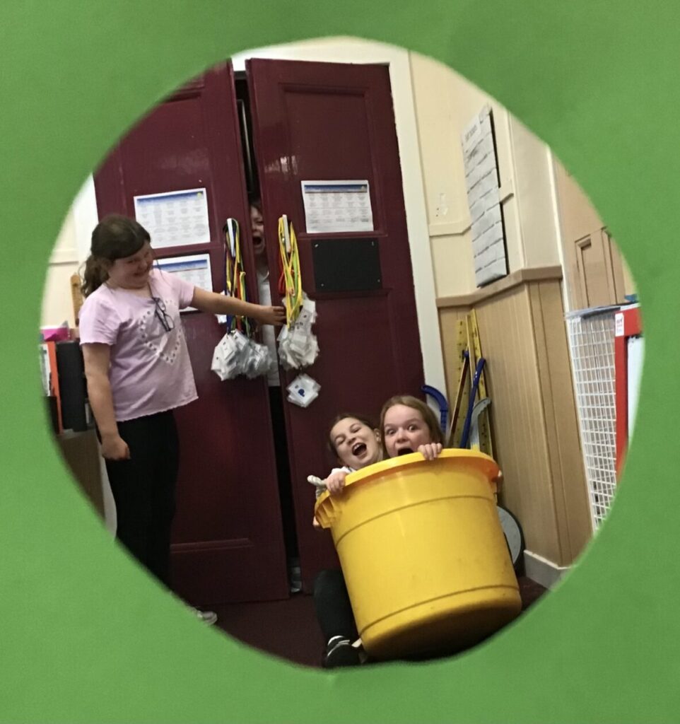
Life in P5-7!
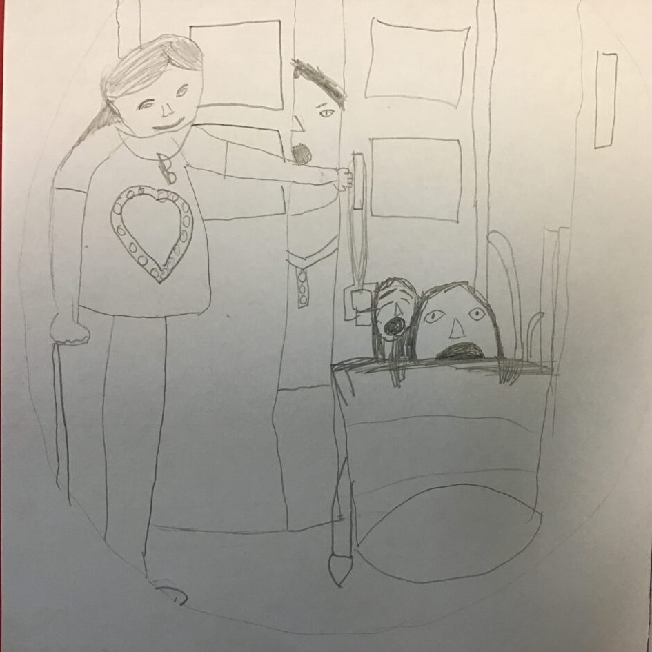
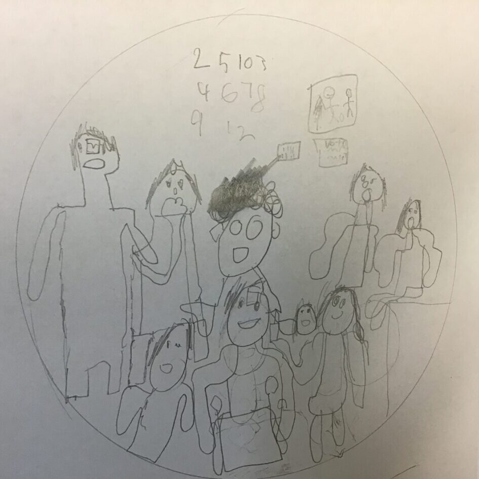
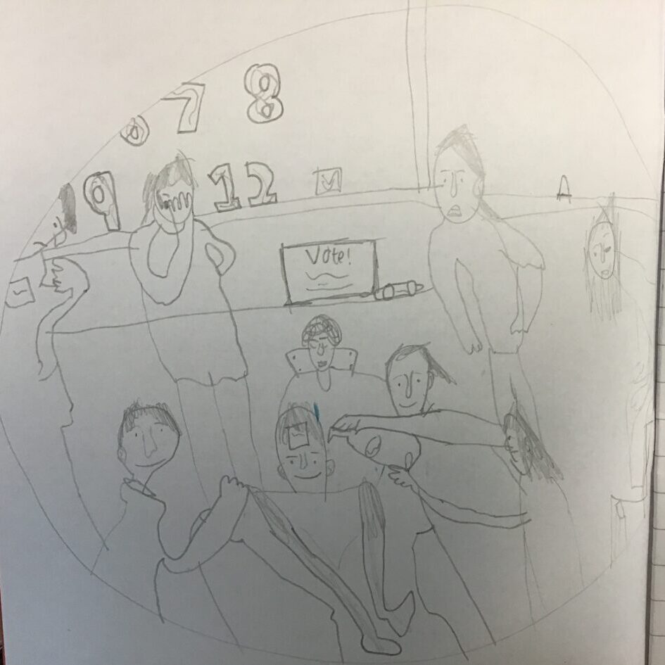
We then used our photographs to compose our own sketches:
We looked at how Hogarth represented space in Chairing the Member. We decided what we thought was foreground, middleground and background then cut the picture up to show it. We also used an editing app to magnify some of the things we noticed in the painting.
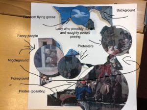
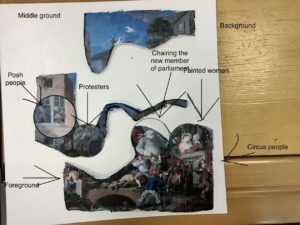
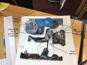
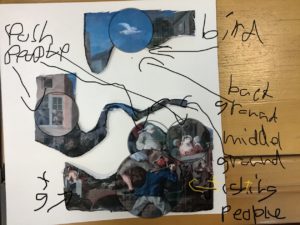
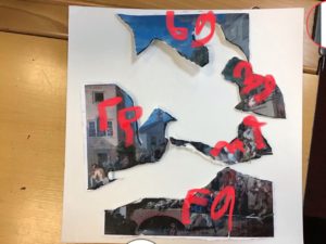
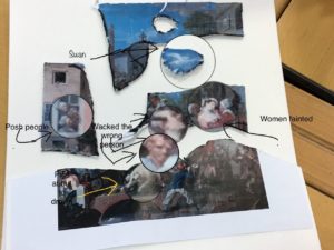

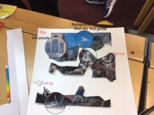
Here’s a link to the original painting by William Hogarth: Chairing the Member
Art UK who run the Superpower of Looking lessons were so impressed with your chiaroscuro art that they have put examples on their web page for this lesson. Remember this is a national site, being used by schools right across the UK. Here’s the link to the page, scroll down to see our bit.
We interviewed each other to find out what we thought about The Scullery Maid and how she was depicted in the painting.
We looked at The Scullery Maid by Jean-Baptistery Siméon Chardin. We had a long discussion about the maid, the expression on her face, her posture, her clothes and what she was doing. Here is a link to the original: The Scullery Maid
These were inspired by William Wright of Derby’s painting: Experiment on a Bird in the Air Pump
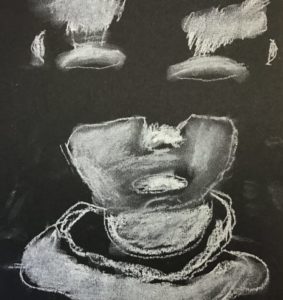
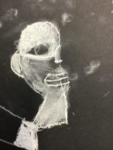
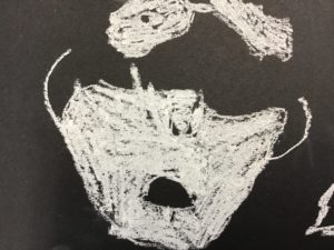
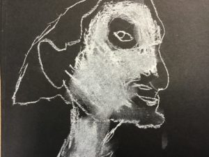
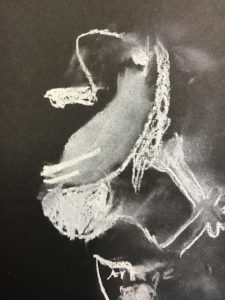
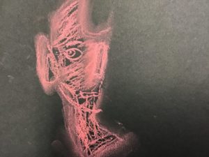
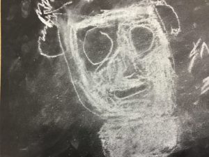
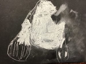
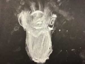
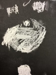
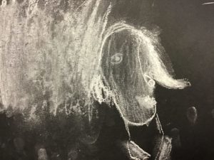
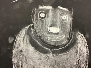
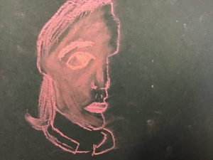
We looked at An Experiment on a Bird in the Air Pump by Joseph Wright of Derby. We looked at how he used light and dark. We decided to make our own chiaroscuro pictures.
Here’s a link to the original: An Experiment on a Bird in the Air Pump